The DO Loop
Statistical programming in SAS with an emphasis on SAS/IML programs
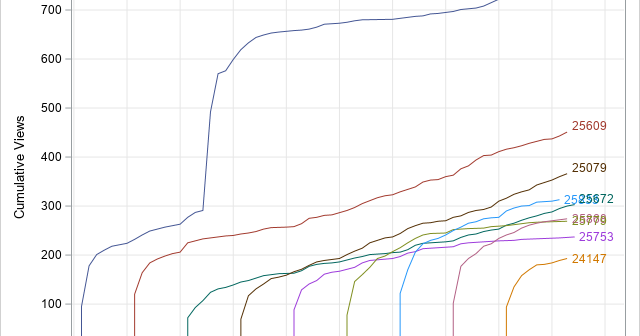
A cumulative curve shows the total amount of some quantity at multiple points in time. Examples include: Total sales of songs, movies, or books, beginning when the item is released. Total views of blog posts, beginning when the post is published. Total cases of a disease for different countries, beginning

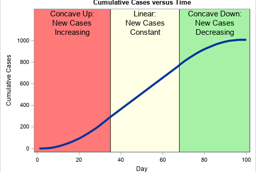
During an outbreak of a disease, such as the coronavirus (COVID-19) pandemic, the media shows daily graphs that convey the spread of the disease. The following two graphs appear frequently: New cases for each day (or week). This information is usually shown as a histogram or needle plot. The graph

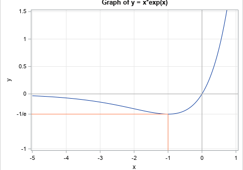
When you create a graph by using the SGPLOT procedure in SAS, usually the default tick locations are acceptable. Sometimes, however, you might want to specify a set of custom tick values for one or both axes. This article shows three examples: Specify evenly spaced values. Specify tick values that
