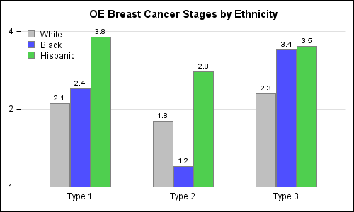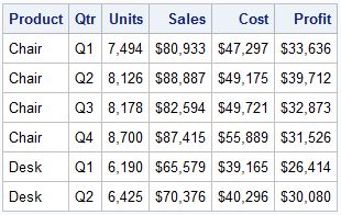
A parametric bar chart in SG Procedure and GTL parlance is a simplified version of the regular bar chart, where the data is assumed to be summarized prior to its usage inside the SG procedures or GTL. So, multiple occurrences of the same category and / or group combination is
Tag: SGPLOT
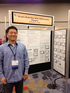
PharmaSUG 2012 conference drew to a close today, concluding two and a half days packed with papers, presentations, posters, hands-on demos and super demos by SAS staff. While the weather outside was a bit chilly from time to time, the conference what hopping with many user papers on how to
Recently I posted an article on this blog on how to create bar charts with log response axes in response to a question by a user. This generated some feedback suggesting that bar charts should not be used with log response axes or with a baseline of anything other than
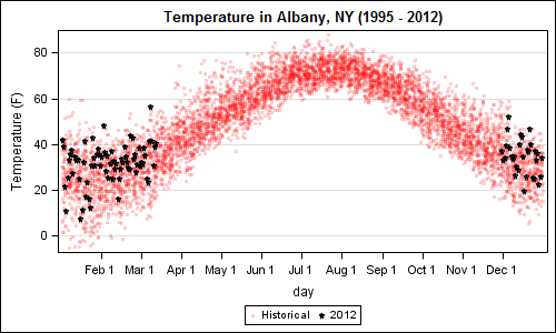
A recent article in the SAS and R blog was about current winter temperatures in Albany, NY. The temperature data for the recent winter (Dec 2011 - Mar 2012) was plotted on a polar graph. Robert Allison posted an article on displaying the same data as a Polar Graph using SAS/GRAPH . Here is his
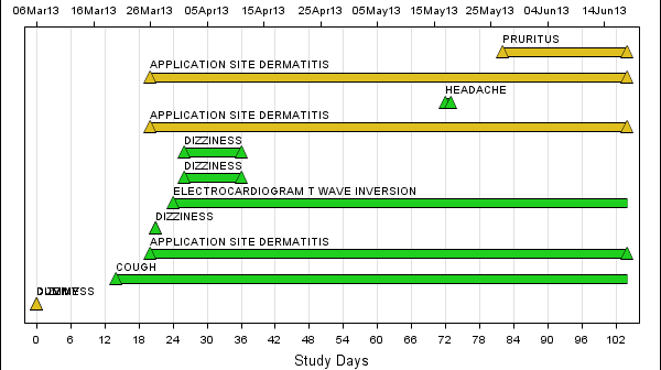
The Adverse Event Timeline graph posted earlier used the MARKERCHAR option of the SCATTER plot to draw the AE names. This option places a center-justified label at the marker position. There is no option in SAS 9.2 version to right-justify the label. Hence, we have to compute an offset in data
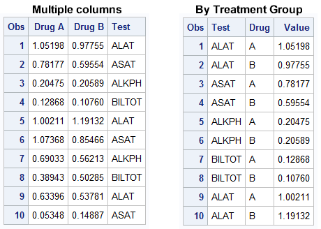
The graph showing the distribution of the maximum liver function test values by treatment for all participants in a study is commonly used for the analysis of safety data in clinical trials. The data is often structured in multiple columns (one per treatment) as below on the left, or grouped by
A new book from SAS Press, "Statistical Graphics Procedures by Example" co-authored by Dan Heath and I has now been published (phew!). For both Dan and I, this was our first foray into writing a book, so it was highly educational to say the least. The key idea behind the presentation