Tag: SG Procedures

Data Visualization
Sanjay Matange 4
Report from WUSS 2012

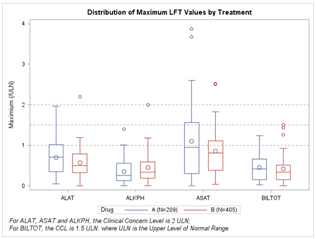
A week ago, SAS "wusses" got together in Long Beach, California for another successful WUSS conference.  Personally, I really enjoy all SAS user conferences as it gives me an opportunity to see the creative ways in which SAS users are exploiting our software. One such case was the paper "Power

Data Visualization
Sanjay Matange 1
Bar chart on interval axis

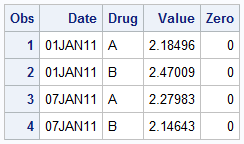
Recently, a user asked about creating a Bar Chart of Value by Date, where the dates are displayed on a scaled interval axis.   Consider this simulated data set of value by date and treatment shown below.  This data set only has one value for each date and treatment combination. We can use the VBAR statement

Data Visualization
Sanjay Matange 1
High resolution graphs

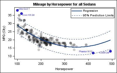
Creating a graph that looks nice, with readable, high resolution fonts is important and should be easy to do.  With SG procedures and GTL, this is easy to do with a simple option, but not the default. Creating a high resolution (image) for a graph consumes higher system resources.  When working on a graph,