Rick Wicklin's blog post on using abbreviations provided a solution for a long standing pain. When writing a new GTL program for simple graph, often the bulk of the code is boiler plate. To create a simple scatter plot of weight by height, you need to type in the following program:
English
In this blog we will discuss many aspects of the SG Procedures. This article will cover some basic features and workings of the SGPLOT procedure to establish a baseline. The single-cell graph is the work horse for data visualization. From the simple bar chart to the complex patient profiles for clinical
The Unicode character table contains a vast array of characters and symbols that can be quite useful for making your text more descriptive in your graph. These characters can be inserted into any viewable string that you can define in the GTL or SG procedure syntax. These strings include titles,
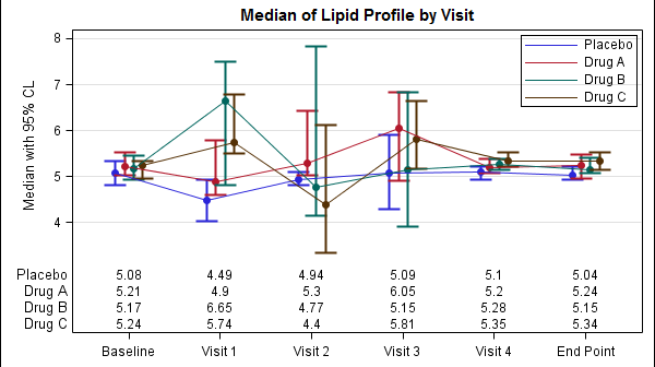
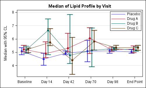
The display of statistics, aligned with graphical plot of the data, is a common requirement for graphs, especially in the Clinical Research domain. In the previous post on Discrete Offset, I used an example of the Lipid Profile graph. Now, let us use the same example and add the display of statistics in
Often we have the need to display multiple columns of data in a graph, and we want to introduce some separation into their placement in the graph. Or, we want to display a bar chart of multiple response variables, and place the values side-by-side, like in a grouped bar chart. For both
Welcome to this new blog on data visualization at SAS. Our goal is to engage with you on a discussion about analytical and business graphics for reporting and interactive applications. Our primary focus will be on ODS Graphics and related topics, but we look forward to a lively discussion on all things