Off and on, users have expressed the need to include multiple blank categories on a discrete axis. Often, this is desirable to separate groups of bars (or categories) in a graph due to some difference their definition. Such a case was discussed in this blog article on using non breaking spaces to create this effect.
The reason this is not trivial is because a category axis aggregates the response values for unique category values. So, if there are two occurrences of 'A', then, only one category 'A' is shown on the axis, the responses (or frequencies) are summarized. So, if you want two blank spaces on the axis, providing two categories with blank values does not work, as they get aggregated into one category. Multiple blanks get compressed into a single blank, so that does not work either. Also, just as a fyi, any preceding blanks to a category are stripped.
A non breaking space (nbsp) is the 'A0'x character in ASCII encoding. It is considered as a "real" character and not compressed or stripped. So, you can have one category with 1 nbsp character and a category with 2 nbsp characters, and these will be considered different, but still blank. In the article above, that is the trick we used to put two blank spaces on the x-axis.
With SAS 9.4M3, we added the ability to specify character formats on a discrete axis on the VALUESFORMAT option. Prior to that, while you could set a format on a data set column variable, you could not set the format on the category axis. There is an interesting difference in the ways these two work.
In the data for the graph below, I have two category values with values 'A' and 'B', along with other values. The first few values display values aggregated for the full year - 2014, 2015 and 2016. The middle values are by Quarter. The values on the right are by month. 'A' and 'B' are used to create a separation.
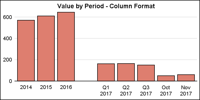
 Now, we want to get rid of 'A' and 'B' on the x-axis. A simple approach would be to define a character format using PROC FORMAT, and then set the values of 'A' and 'B' to blank. Now, we can apply that format to the category column. Here is the program and the graph.
title 'Value by Period - Column Format'; proc sgplot data=gaps noborder; format cat $blank8.; vbar cat / response=value nostatlabel fillattrs=graphdata2; xaxis display=(noline noticks nolabel) discreteorder=data; yaxis display=(noline noticks nolabel) grid; run; |
Note, we did get one blank category, but the other one is gone. This is because the two values are formatted BEFORE they are sent to the graph. So, both 'A' and 'B' are formatted to blank, and the axis just aggregates this to one blank.
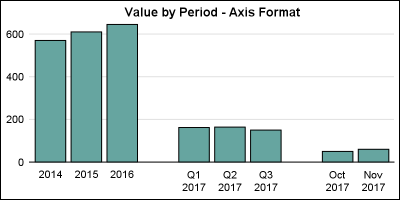
However, instead of setting the format on the variable in the data set, now you can set the format on the x-axis using the VALUESFORMAT option as shown below.
proc sgplot data=gaps noborder; vbar cat / response=value nostatlabel fillattrs=graphdata3; xaxis display=(noline noticks nolabel) discreteorder=data valuesformat=$blank8.; yaxis display=(noline noticks nolabel) grid; run; |
Now we have the result we want. This time, we did not set the format on the data set variable. So, the 'A' and 'B' did not get formatted to blank before they were sent to the graph. Now, the axis reserves the two spaces for the two distinct values. However, before displaying the values, the axis formats them using the provided VALUESFORMAT. So, now the formatting is done AFTER the axis is built, giving us the result we want.
Having said that, there may be other ways to show the data segments. In the example below, I have removed the two extra categories entirely, and added reference lines to the right of the segments. DISCRETEOFFSET=0.5 can be used from the appropriate category value to get a reference line between the mid point values.
title 'Value by Period - Refline'; proc sgplot data=gaps_2 noborder; vbar cat / response=value nostatlabel fillattrs=graphdata4 barwidth=0.7; refline '2016' / axis=x discreteoffset=0.5; refline 'Q3 2017' / axis=x discreteoffset=0.5; xaxis display=(noline noticks nolabel) discreteorder=data; yaxis display=(noline noticks nolabel) grid; run; |
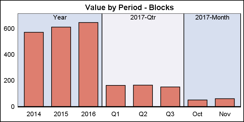
Even better may be to use the BLOCK plot statement to draw the segments in alternating colors. Now, I have added a column to indicate the segment, such as 'Year', 'Qtr' and 'Month'. This can be used with a BLOCK plot, except now I have to use the VBARPARM to allow overlay of these different types of plots.
proc sgplot data=gaps_2 noborder; block x=cat block=agg / filltype=alternate; vbarparm category=cat response=value / fillattrs=graphdata1 barwidth=0.7; xaxis display=(noline noticks nolabel) discreteorder=data; yaxis display=(noline noticks nolabel) grid offsetmax=0.1; run; |
Finally, I can use the block titles to indicate some information, and make the axis less busy.
Here, I added the '2017' information to the block labels, and thus simplified the axis. This provides a nice, uncluttered appearance. Full code is linked below.
Full SGPLOT Code: Blank_Categories


1 Comment
Hey Sanjay, nice article. I continuous read it because of the mentioned graphs...those graphs show your research & knowledge. Thanks for sharing.