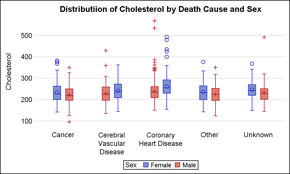
A grouped box plot created by SGPLOT VBOX / HBOX statement or GTL BOXPLOT statement will display groups within categories using group colors and puts the color swatches representing the group values in the legend. This works well for a color graph created as shown below.
title 'Distribution of Cholesterol by Death Cause and Sex'; proc sgplot data=sashelp.heart nowall noborder; vbox cholesterol / category=deathcause group=sex clusterwidth=0.5; xaxis display=(noline nolabel noticks); yaxis display=(noline noticks) grid; run; |
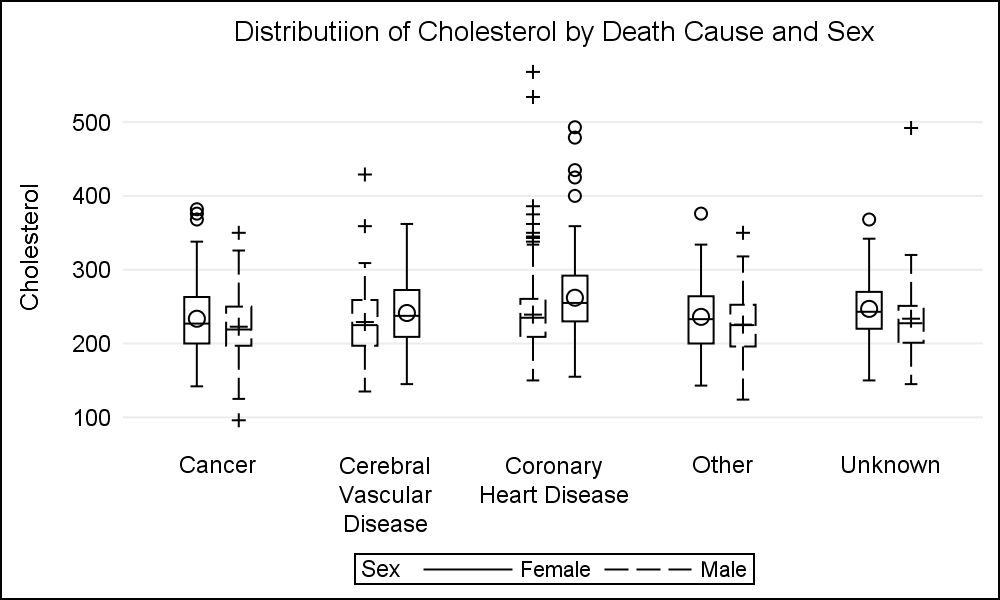
Often, users have expressed the need to render such graphs in black and white for submission to a journal. Many journals specify that graphs should be black and white. The good news is that you can do that by simply setting the STYLE=JOURNAL2 which produces a black and white graph with empty boxes as shown below.
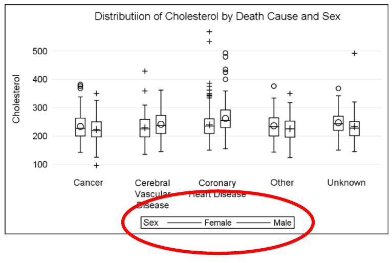
One problem with this graph (for me) is the usage of patterned lines for the boxes and the whiskers. Personally, I an not a fan of patterned lines for boxes and short whiskers. I would much rather prefer solid lines as shown below. This can be done by using the box plot options LINEATTRS and WHISKERATTRS to set the pattern to solid. The resulting graph is shown below.
Now, the boxes and whiskers look nice and clean. But the legend does not provide good information on the classification. Now the legend contains two line segments both of which are solid black for Female and Male.
To fix this required some creative coding. However, with SAS 9.40M2 this has become easier. Now we have a new feature to display different legends based on TYPE, which filters what is shown in the legend. The syntax is as follows.
KEYLEGEND / TYPE=FILL | FILLCOLOR | LINE | LINECOLOR | LINEPATTERN | MARKER | MARKERCOLOR | MARKERSYMBOL; |
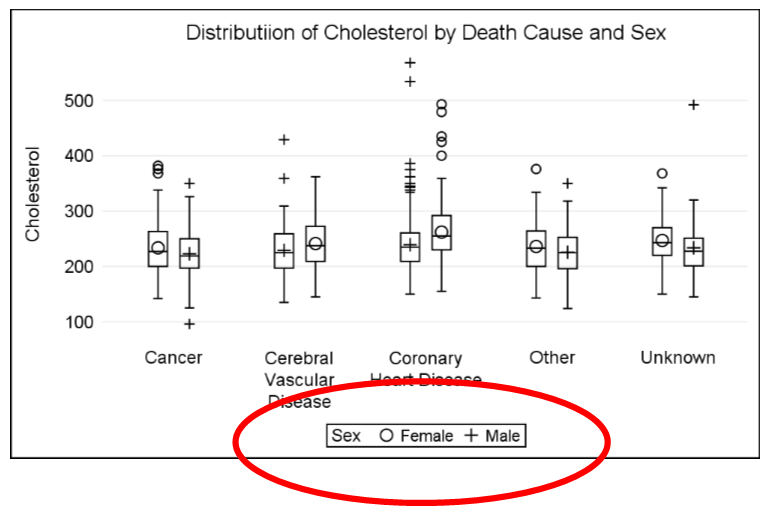
Now, you can specify to see just markers, or markercolor or markersymbol in the legend. Markers means display the marker symbol with their color. MarkerColor will show only the color swatches for the markers, and MarkerSymbol will show only the symbol. The symbol displayed is the one used for displaying the mean value.
Using this option on the legend gets what we want as shown below. Note, now the legend displays the mean symbols for each group. If the graph was using a color style, the symbol color would also be displayed.
title 'Distributiion of Cholesterol by Death Cause and Sex'; proc sgplot data=sashelp.heart nowall noborder; vbox cholesterol / category=deathcause group=sex clusterwidth=0.5 meanattrs=(size=7) lineattrs=(pattern=solid) whiskerattrs=(pattern=solid); xaxis display=(noline nolabel noticks); yaxis display=(noline noticks) grid; <strong>keylegend / type=marker;</strong> run; |
Full SAS 9.40M2 code: BoxLegendMarkers



4 Comments
Hi Sanjay,
I am running 9.4 (TS1M4) at work but, is SAS 9.40M2 different from our version, as I might suspect? Thanks.
Akira Kondo
This should work with your SAS 9.4 (TS1M4). SAS 9.40M2 is same as SAS 9.4 (TS1M2).
This is a good tip, but it works best when there are outliers that show up as markers. Otherwise only the mean marker shape indicates group membership (male/female).
The data should be sorted before calling PROC SGPLOT so that the male/female groups appear in a consistent manner. Notice in the colored image that females are the LEFT boxes for three categories, but are the RIGHT boxes for two categories. If you sort the data, they will be consistent:
Hi Sanjay,
Can I display symbol and line in same legend for ex. for Male "--+--" and for female "--O--".
Thanks in advance for your answer.
Harish Kumar