Uncategorized

Rick Wicklin 0
How to specify mosaic plot colors in SAS

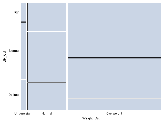
The mosaic plot is a graphical visualization of a frequency table. In a previous post, I showed how to use the FREQ procedure to create a mosaic plot. This article shows how to create a mosaic plot by using the MOSAICPARM statement in the graph template language (GTL). (The MOSAICPARM

David Loshin 0
Big data and data enrichment

Last time we explored consumption and usability as an alternative approach to data governance. In that framework, data stewards can measure the quality of the data and alert users about potential risks of using the results, but are prevented from changing the data. In this post we can look at