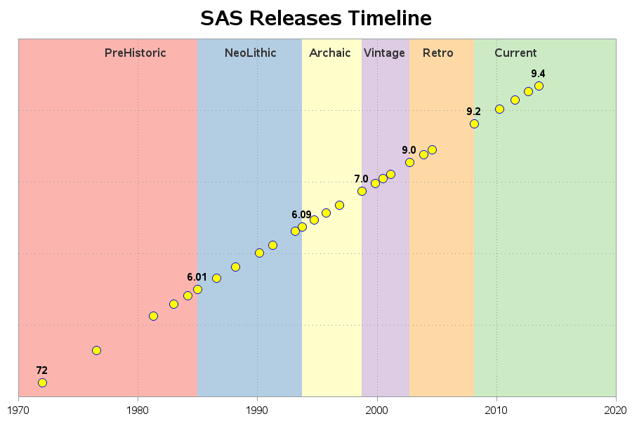
Uncategorized

Data Visualization
Sanjay Matange 0
Graphs at WUSS - Part 2

Last week I covered some of the interesting graph-related papers presented at WUSS.  There were quite a few, so I broke up the report into two parts.  Here is the second installment. In the paper  Creating Graphical Patient Profiles using SAS by William Garner of Gilead Sciences, the author describes how to create

0
Understanding analytics: the bird’s eye view

Our blog editor extraordinaire Shelly Goodin brings you tips and information on technical content from our books that you can use immediately in your work. But what if you’re not there yet? What if you want to start with a 50,000-foot level view of analytics overall? Or learn how forecasting