Tips and Tricks

Tips and Tricks

Data Visualization
Sanjay Matange 0
Graph Table with Class

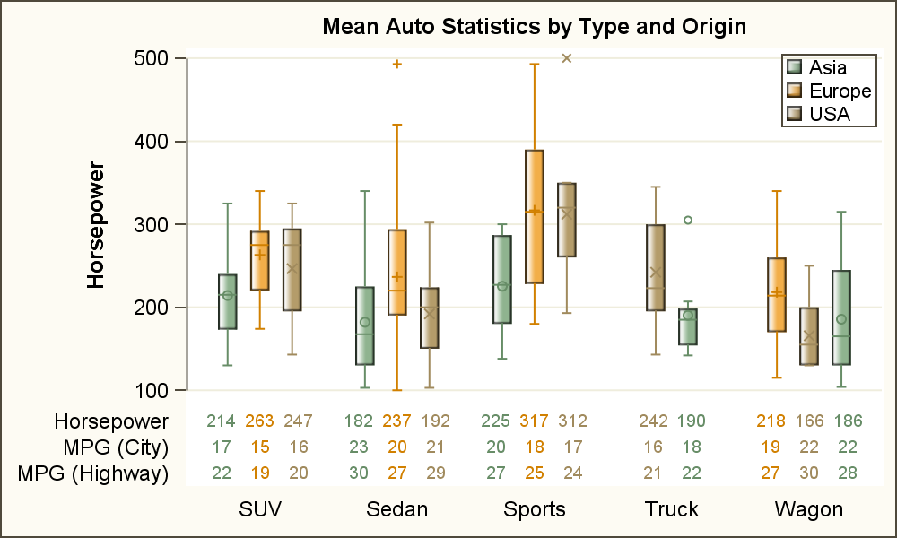
As often is the case, this article is prompted by a recent post on the SAS/GRAPH and ODS Graphics page communities page.  A user wanted to create a Graph Table showing a bar chart with tabular data for each of the category values along the x-axis.  The user was creatively using

Data Visualization
Sanjay Matange 0
Polar Graph - Wind Rose

Last week I posted an article on displaying polar graph using SAS.  When the measured data (R, Theta) are in the polar coordinates as radius and angle, then this data can be easily transformed into the XY space using the simple transform shown below.     x=r*cos(theta * PI / 180);     y=r*sin(theta * PI

Data Visualization
Sanjay Matange 0
Polar Graph

There are many situations where it is beneficial to display the data using a polar graph.  Often your data may contain directional information.  Or, the data may be cyclic in nature, with information over time by weeks, or years.  The simple solution is to display the directional or time data

1 42 43 44 45 46 114