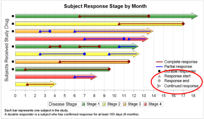
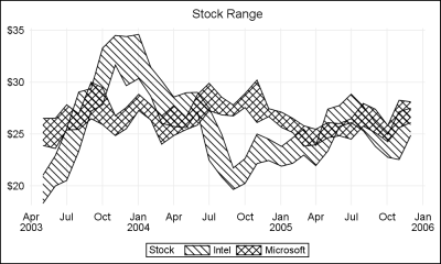
Feature du jour

Feature du jour

Data Visualization
Sanjay Matange 0
Sochi Medal Graphs

The attention of the world is now on Sochi and the Winter Games.  Gold, Silver and Bronze medals are being earned by these amazing athletes, and everyone has an eye on the tally.  Andre sent me a link to TRinker's R Blog, showing a graph of the current tally.  Andre

Data Visualization
Sanjay Matange 0
Survival Plot

One of the most popular graph amongst clinical and pharmaceutical users is the Survival Plot as created from the LIFETEST Procedure.  This is one graph that users most often want to customize.  See Creating and Customizing the Kaplan-Meier Survival Plot in PROC LIFETEST - Warren F. Kuhfeld and Ying So, SAS Institute

Data Visualization
Sanjay Matange 0
More symbols, you say?

Users have often expressed the need for more marker symbols.  ODS Graphics supports over  30 scalable marker symbols, both filled and empty.  As mentioned in an earlier article, with SAS 9.4, filled markers can now have outlines and fills, and can also have special effects. Also with SAS 9.4, now you

Data Visualization
Sanjay Matange 0
Two-in-one Graphs

A large variety of graphs fall in the category of what I call a "Single-Cell" graph.  This type of graph consists of a single data region along with titles, footnotes, legends and other ancillary objects.  Legends and text entries can be included in the data area.   The data itself is displayed

Data Visualization
Sanjay Matange 0
Broken Axis

In my previous post I described the new Polygon plot statement that is included with the SAS 9.4M1 release.   So, a valid question is - what is my motivation for discussing the new features in SAS 9.4M1 when most users are at SAS 9.3 or SAS 9.2 versions?  Here are a

Data Visualization
Sanjay Matange 0
New Polygon Plot

The SAS 9.4 Maintenance 1 release is now shipping to users. This is great news for GTL and SG procedures users as this release includes some useful new features. Some of these are in direct response to your requests, and others are enhancements that we think you will come to like.

Data Visualization
Sanjay Matange 0
Survey Charts

Often we have situations where the category values on the graph have long character strings.  This is often the case when graphing survey responses to questions.  The questions may be sentences, sometimes moderately long. With SAS 9.4, GTL and SG now support the ability to display tick values split over

Data Visualization
Sanjay Matange 0
Graphs at WUSS - Part 1

It is always a pleasure to attend SAS user conferences, regional conferences and in-house events.  In addition to presenting papers, seminars and super demos to the attendees myself, my favorite activity is to attend presentations by users that include graphical data visualization.  These include using SG procedures, GTL, Designer or SAS/GRAPH.  This year

Data Visualization
Sanjay Matange 0
R U Graphing with SAS?

In recent conversations with many SAS users at NESUG, SESUG and WUSS, a pattern emerges on the question of creating graphs with SAS or R.  Many SAS users are aware of the new graph features in SAS that create high quality graphs with minimum fuss.  But, many have not actually used

Data Visualization
Sanjay Matange 0
Comparative Histograms

In reference to a previous article on Violin Plots, a reader asked about creating comparative mirrored histograms to compare propensity scores.  While I had my own understanding of "Mirrored Histograms", I also looked this up on the web.  Google showed many cases of two histograms back to back, either horizontally or vertically. 

Data Visualization
Sanjay Matange 0
Healthcare.gov numbers

Working at SAS, I consider myself fortunate to have the best employee benefits in the industry.  That is one of the factors placing SAS as one of the best companies to work for worldwide, and often THE best company to work for in USA. Given that, I was curious to know the kind

Data Visualization
Sanjay Matange 0
Schedule Chart

Last week Bruno asked about creating a Schedule Chart using SG Procedures.  To me, such projects are very interesting and challenging...How much mileage can we get out of the current set of SGPLOT procedure features to create a visual that was not part of the original requirements? The clear choice for

Data Visualization
Sanjay Matange 0
Video says it better

SAS 9.4 was released a month ago, and we are excited about all the new features in SG Procedures, GTL and Designer.  I wrote an article on SAS 9.4 graph features last month, and promised more to come. What then could be better than this Tech Talk video hosted by our

Data Visualization
Sanjay Matange 0
Schematic Plot

Recently a user chimed in on the SAS Communities page, requesting a way to add some observation level annotation to a box plot.  Wendy was delighted to see a graph created by the UNIVARIATE procedure called "Schematic Plot".  In this graph, the box plot of the analysis variable is shown with

Data Visualization
Sanjay Matange 0
Animation using SGPLOT

Often we want to visualize the relationship between variables over time.  The understanding of such data can be improved by viewing the animated graph over time.  With SAS 9.4, you can create animated graphs using the new animation options on the OPTIONS statement and the PRINTER destination. A popular example an

Data Visualization
Sanjay Matange 0
Report from PharmaSUG 2013

The PharmaSUG 2013 conference in Chicago this week was awesome.  From the perspective of graphics, there was great interest in using SG Procedures, Designer and GTL for building clinical graphs.  It was nice to see many papers by users on how they are using these tools for creating graphs on a daily

Data Visualization
Sanjay Matange 0
Clark Error Grid Graph

The SAS Global Forum conference last week was awesome.  From the perspective of graphics, there were more papers from uses on graphics and ODS graphics then in recent times.  I will post a summary shortly. One of the interesting papers was "#113-2013 - Creating Clark Error Grid using SAS/GRAPH and Annotate..."

1 4 5 6 7 8

Back to Top