Feature du jour
Little things go a long way

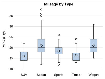
In my previous post, I described a new options to control the widths of the caps for Whiskers, Error and Limit bars. This topic could have been titled "Little things go a long way", as such details really make for a good graph. In a similar manner, another detail issue