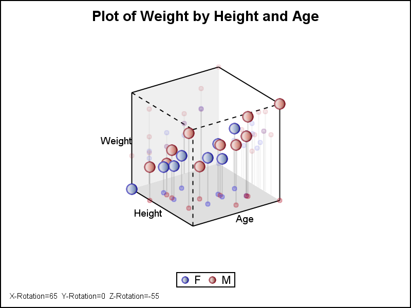
Feature du jour

Feature du jour

Data Visualization
Sanjay Matange 0
Margin Plots

Last week a user wanted to view the distribution of data using a Box Plot.  The issue was the presence of a lot of "bad" data.  I got to thinking of ways such data can be visualized.  I also discussed the matter with our resident expert Rick Wicklin who pointed

Data Visualization
Sanjay Matange 0
Cancer Deaths Averted

Significant progress in reduction of Cancer mortality is shown in a graph that I noticed recently on the Cancer Network web site.  This graph showed the actual and projected cancer mortality by year for males.  The graph is shown on the right. The graph plots the projected and actual numbers

1 35 36 37 38 39 79

Back to Top