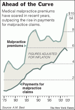
Difference can be misleading

A very common type of graph contains two series plot, where the user is expected to evaluate the difference visually. I saw one such plot on the web today shown on the right. This graph has two curves, one for malpractice premiums and one for claims, with a shaded band