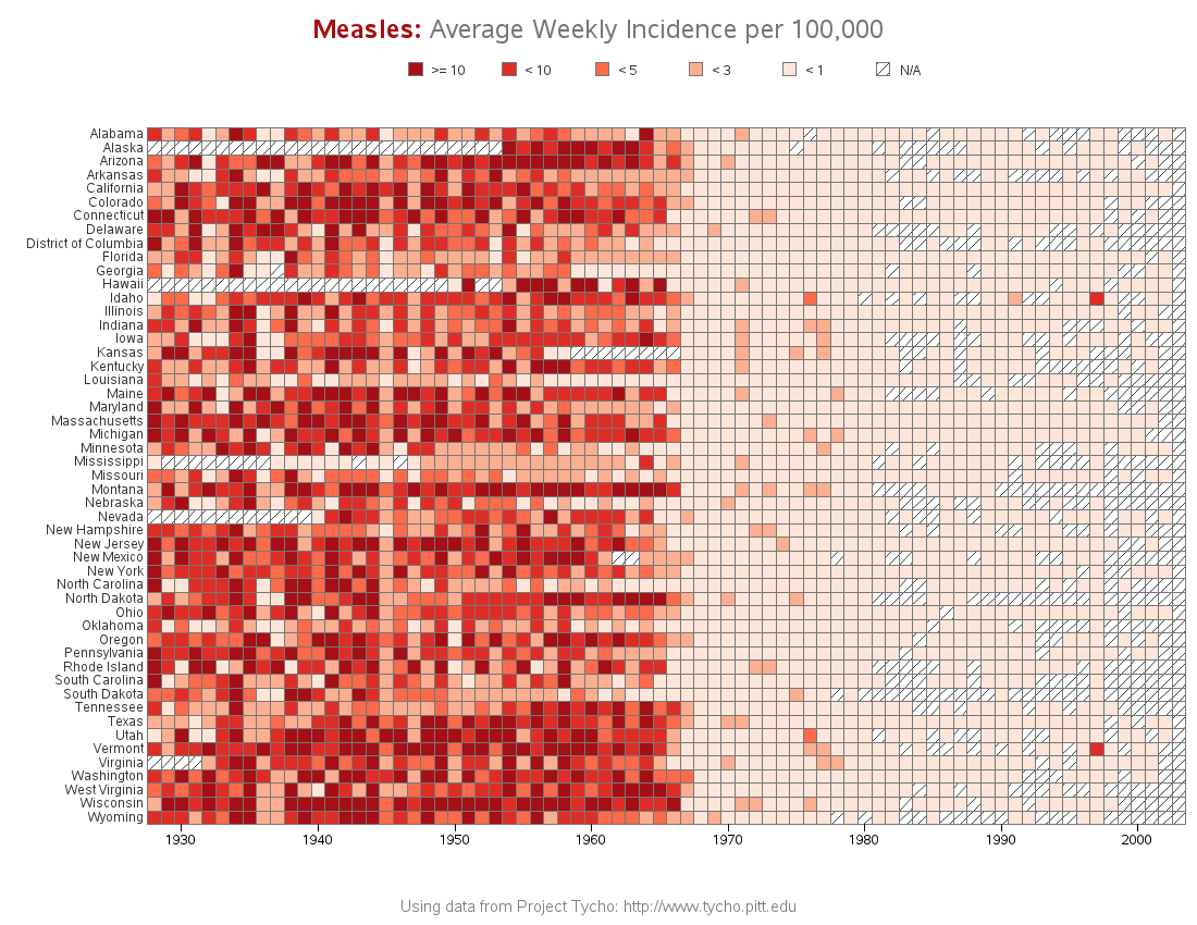
The Wall Street Journal recently published some graphs about seven infectious diseases, and I tried using SAS to improve the graphs ... it's a veritable infectious disease (graph) bake-off! Let's start with Measles ... here's a screen-capture of WSJ's measles graph: In general, their graph is eye-catching, and I learned a lot
Author
How to make infectious diseases look better
Have a traditional SAS/Graph Valentine's Day!
Nobody puts an arrow through a heart any better than Sam Cooke & Cupid ... but SAS/Graph comes close! If you've been following my blog, you know that my favorite of all the SAS Procedures are the traditional SAS/Graph Procs, such as GPlot and GMap. They're rock-solid reliable, and flexible
Geographical hotspot visualization of election data
I'm ramping up my visualization skills in preparation for the next big election, and I invite you to do the same! Let's start by plotting some county-level election data on a map... To get you into the spirit of elections, here's a picture of my friend Sara's dad, when he was