In a previous blog post, I showed how to layer colored areas on a SAS map to show both countries, and the areas within countries that had cases of Ebola. But as the Ebola epidemic has spread, more data has become available, and in this blog I show how to represent that additional data by annotating bubble markers on the map.
While perusing the Internet for the latest Ebola information, I came across a map that the World Health Organization maintains. It is interactive, and lets you pan and zoom the map. And as you zoom, it shows progressively more detail. It's a pretty cool map. After zooming-in, I did a screen-capture to include below:
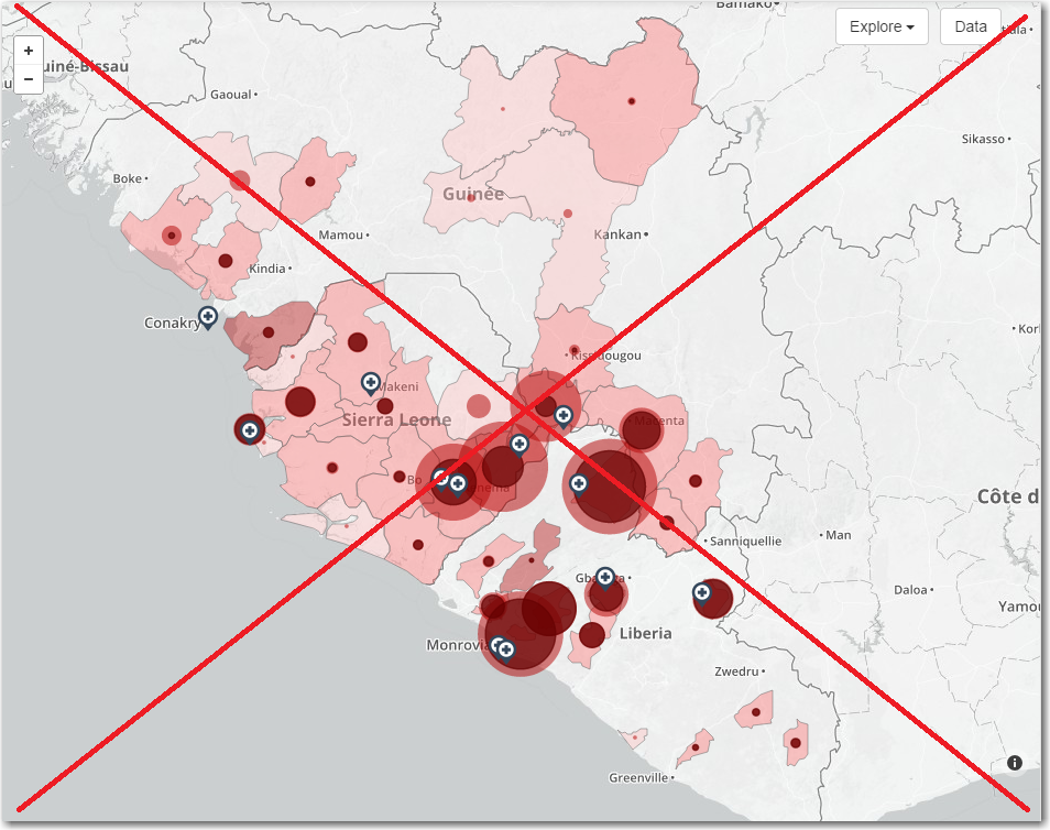
But as I studied the map to try to determine the current status of Ebola, I noticed a few problems. The shades of color for the land were very similar to the colors of the bubbles, even though they were representing slightly different things. Also, the colors used were transparent, and therefore when they overlapped (such as bubbles overlapping other bubbles, or overlapping land) then the transparent colors combined and produced darker colors -- which made it very difficult to determine which legend colors they matched.
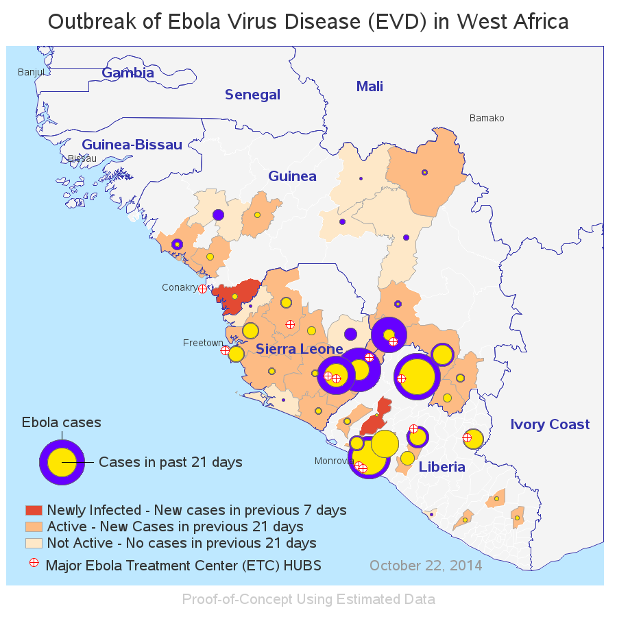
Therefore I decided to create my own SAS map, and use solid/non-transparent colors (so there was no color blending), and also use very different/distinct colors for the land and the bubbles (so it is easier to match up to the legend).
For the main bubbles, I used the SAS %centroid() macro to determine the location of the center of each region in the map, and I then used the annotate pie function to draw the bubbles.
I used specific lat/long coordinates for the locations of the Ebola Treatment Centers, and overlaid several pieces of geometry (all using variations of the annotate pie function) to create a white bubble with a red cross.
Below is a snapshot of my SAS version of the map. Click here to see the interactive version, which has html hover-text over all the land areas and bubbles, and drill-down for the Ebola Treatment Centers.
Here is a link to the SAS code, if you'd like to experiment with the map.