As I was doing my taxes, I wondered where the government is spending my tax dollars. And being a SAS user, I decided to find out using a graph ...
I did a few Google searches on "tax graphs" and found one on the CNN web site that I liked - it was very clean & simple, and easy to read.
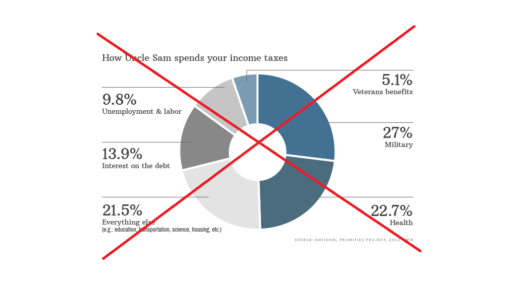
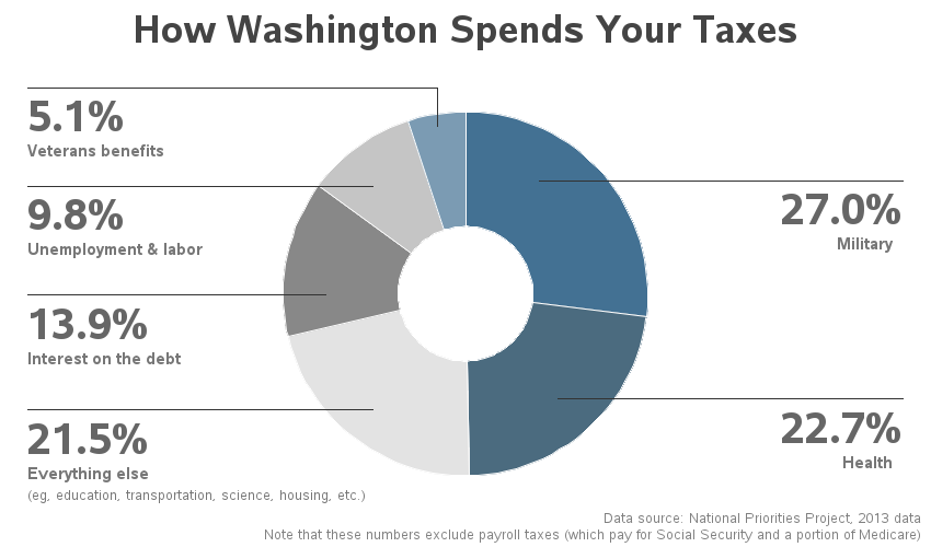
So I set about creating my own version using SAS. I used a Proc Gchart 'donut' chart for the slices, and then used annotate for the labels (to get them just like the original). One small change ... the original CNN version had the "Veterans benefits" slice on the left, but the label on the right (which caused me a bit of confusion at first). In my version I put this label on the left. Here's my version of the chart:
I was really happy with this graph, until way down at the bottom of the CNN article, I noticed in the fine print that these numbers exclude payroll taxes (such as Social Security and part of Medicare). Hmm ... well no wonder the military spending looks so big, leaving out those other huge chunks of the federal budget!
So I set about finding another graph (ala, "bring me another shrubbery!") that would perhaps provide a bit more of the complete story...
I found this one on the National Priorities web site that looks a bit more all-inclusive ...
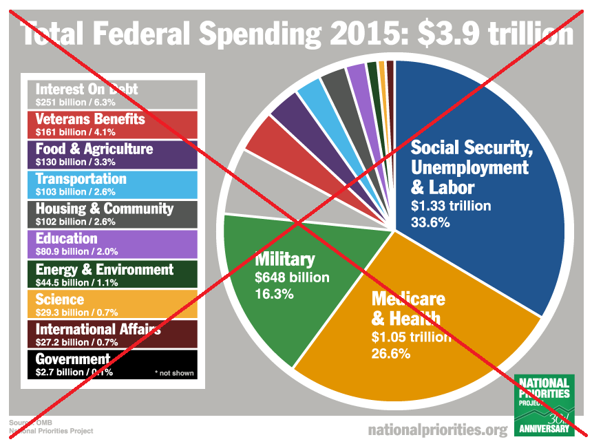
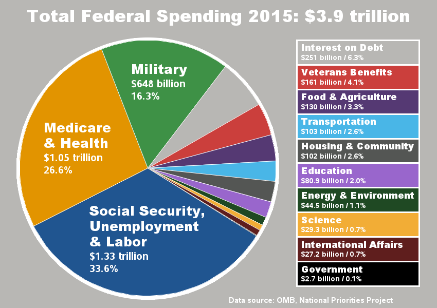
I then set about creating my own SAS version. I used a Proc Gchart pie chart to create the slices, and annotate to create the custom color legend. I also annotated a large white pie behind the pie chart (slightly larger) so that the pie could have a thicker white border around it.
The pie probably has 'too many' slices, and I found it difficult to match the colors in the pie to the colors in the legend. Therefore in my version, I rotated the pie so that the smaller slices (needing a legend) were right beside the color legend, and my pie slices are in the exact same order as the legend (rather than the reverse order in the original chart). Here's how my version came out:
Now it's your turn! Tell us how you like to visualize the tax data! :)


1 Comment
Thanks for the improved graph! I'd be curious to see what portion Social Security is, separate from Labor/Unemployment. Same for Medicare (separate from other health costs). I like the smaller pie slices... They highlight the relatively miniscule funding for science.