With all the recent news reports about the missing Flight 370, I wondered what other airplanes have disappeared without a trace ... and I used SAS to visualize that data!
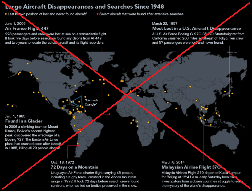
There was in interesting infographic on the Bloomberg website that sort of answered my question, but their map just had dots on it, with no hover-text or drilldowns to find out more info about each missing plane. It basically just showed the geographical distribution of lost flights.
I found a great website maintained by the Aviation Safety Network (ASN) that had the data I was looking for – they list all aircraft (certified to carry 14+ passengers, and corporate jets) that have disappeared without a trace (meaning that no debris, oil slick, or bodies were found) since 1948. Their site has an interactive map, but it just wasn't the kind of map I was looking for.
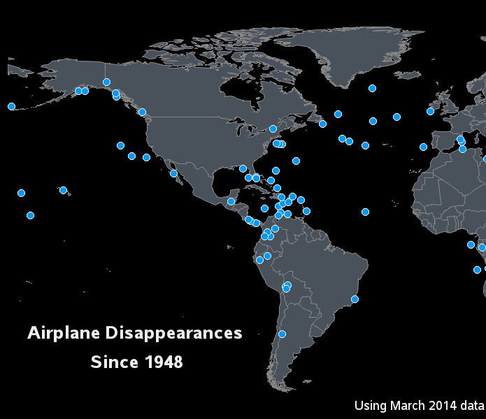
So I downloaded the ASN data, and created my own map using SAS. It’s visually similar to the Bloomberg map, but mine has hover-text for each missing airplane marker, and you can click the markers to see the ASN page with all the details about each flight.
Below is a snapshot of a piece of my map - click it to see the full-globe interactive map, with the hover-text and drilldowns!
Have you ever been on an airplane that you thought was going to be 'lost' ... or heaven forbid, that actually crashed?!? Feel free to leave a comment to share your experience!


24 Comments
There were definitely times due to my paranoia that I would just think "Woah, what if this plane would just get lost all of a sudden" or "I really wonder how getting lost in the Bermuda Triangle would feel." However, I definitely wouldn't want that to happen to me or anyone at all! What's painful for situations like these are the family members who know they've lost their loved ones and the closure they don't get because of the many unanswered questions.
Pingback: Using SAS analytics to monitor blog posts | The SAS Training Post
Hi Robert I really appreciate your work but could you give me or post a map for 2013&2014 of planes that have disappeared ? Thank you "
I could create such a map, but it would only have 2 dots on it - one plane in 2013 and one in 2014! :)
Thank you for including the May 26, 1972 disappearance of a Navy P-3 Orion. I am related to one of the lost crewmen. This tragedy isn't mentioned very often, but is not forgotten.
Pingback: How Bayesian analysis might help find the missing Malaysian airplane - Subconscious Musings
Pingback: How could SAS be used to help find missing planes? - The SAS Training Post
This is really a curiosity booster, and I'm amazed to see so many planes have disappeared without a trace. Thanks for making the map simple enough for the general public to understand. Kudos to SAS, and to you for sparking interest in this important issue. Hopefully your map will renew interest in trying to find closure for the loved ones left behind. I like the idea of focusing on the Bermuda Triangle mysteries. When my husband was a Navy pilot in the early 1960's, he flew through that area several times.
Robert...PLEASE do that Bermuda Triangle analysis!
I will start checking into this! :)
Great information here. Just curious, it seems that the infamous Bermuda Triangle is not as treacherous as other locations, or am I reading this wrong.
I was a big fan of stories about the mysterious "Bermuda Triangle" when I was young, and I was also expecting to see many more of the disappearing planes in that area. But after examining a list of Bermuda Triangle disappearances, I see that many of them were ships & submarines, and smaller (military/fighter) planes, and also many of the famous (or infamous) disappearances happened before 1948. Hmm... perhaps I should do a graphical analysis of Bermuda Triangle disappearances next?!? :)
I would love to see a more in depth view of the Bermuda triangle! there seems to be other areas that are "more prone" to disappearances.
Thanks for this! This is an awesome interactive graphic. I've spent way too much time on it today (but it is a great way to avoid writing the proposal I'm supposed to be doing). It's enlightening. Sometimes the world seems like a small place, but it is, in fact, huge.
My only suggestion is to have the dots turn a different color (or take on a different-color border?) when you click on them, sort of like links. Sometimes if I'm clicking in one area, I'll forget which ones I've already clicked and end up clicking on the same one multiple times.
Ah yes - that could be useful!
I would probably have to use something a bit more powerful than the simple png file and html tags I'm currently using though (maybe something like java, or Flash ... but one trade-off is that if I get too fancy, it might not work in all browsers!)
Pingback: SAS engineer’s graphic tracks tragic missing aircraft mysteries
This is great plot, Robert.
I have one suggestion: use a heat or color gradient map to display the year of disappearance. That should add some more information to the graph.
BTW, since you asked, in 2007 I was on a properller plane of Lao airline going from Chiang Mai in the North of Thailand to Vientiane in Lao. Somewhere near the border between the two countries, right int the middle of tropical jungle, one propeller stopped. The plane rolled to one side and went like that for a while, before the pilot put it back horizontal. After that, the pilot announced he would do his "best for safe landing". Fortunately we were able to land safely at Luang Prabang airport where we changed to another plane.
Hi Michele - thanks for sharing your scary flight story. Glad you didn't become a "missing without a trace" statistic!
Per your suggestion - yes, it might be useful to incorporate some additional variables into the visualization (such as year, size of airplane, number of people on board, etc). We could use discrete or gradient colors, size of markers, shape of markers, etc. I like looking at the data in several different ways, starting with a 'simple' visualization, and then creating various different versions to answer specific questions. I love how it's so easy to make several variations with a computer -- as opposed to in the past when it was a time-consuming task to create multiple versions of a map by hand! :)
Great presentation of the information. I have been looking at code to produce this type of map for a project.
It does appear you are missing one dats point but it may be due to the criteria used. In 1950 a Northwest plane went down over Lake Michigan. They have never found the plane and all 58 souls were considered dead.
Thanks for sharing.
Hi Barb - glad you liked my map! :)
You are correct - that particular flight didn't meet the criteria for this particular list. This one only includes flights that disappeared 'without a trace' whereas they were able to find debris from the 1950 Northwest flight (according to the Wikipedia page http://en.wikipedia.org/wiki/Northwest_Orient_Airlines_Flight_2501).
this is a GREAT general interest graphic...and so timely! nice
Thanks Sharon!
This is exactly the kind of information display I, for one, need to create more of . On postings like this it would be quite helpful to include a little of the coding "tricks" used. Not suggesting a printout of the program, but highlighting a couple of the features that were used would be instructive.
Great Stuff! Thank you.
Lloyd Nace
Good suggestion Lloyd! - Here's a page where you can get the complete SAS code used to create the map!
http://robslink.com/SAS/democd70/missing_aircraft_info.htm