Have you heard the old saying that "Banks only loan money to people who don't need it"? Let's analyze the data and see if that is true!...
I'm very much a car-guy, and I love learning about all the new vehicles, and love the new-car feel ... and even the smell. It's hard to not like a nicely detailed sporty vehicle. For example, here's a picture of the Miata a co-worker (and fellow car enthusiast) recently bought. Looks really nice sitting there on the Blue Ridge Parkway, doesn't it!
... and with the price of vehicles these days, most people need a loan to buy one. Speaking of car loans, I recently saw a very interesting article by Liberty Street Economics where they showed how much $ in car loans was made, grouped by credit score.
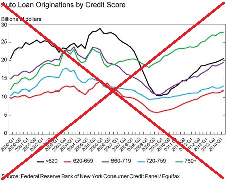
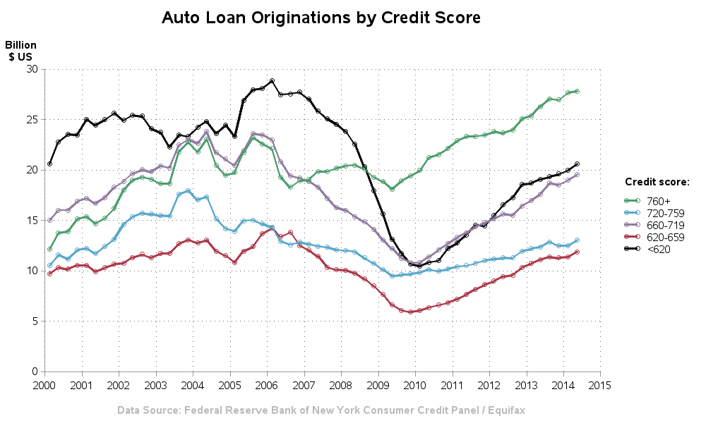
I found the raw data, downloaded it, and created my own SAS version of the graph. I kept mine very similar to their original, but cleaned up the time axis a little (only showing the year at each tick mark), stacked the color legend values, and included markers on the lines (which I think provides a little more visual insight into how fast the data is changing, etc).
As you can see in the graph, subprime lending (to people with lower credit scores) took the biggest hit during the recent recession, but is currently making a comeback.
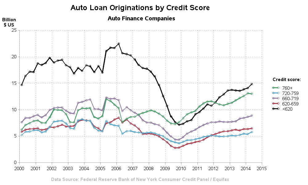
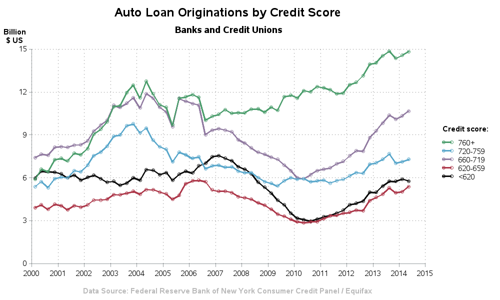
Later in the article, they show the same graph split into 2 categories - auto finance companies, and banks & credit unions. The auto finance companies tend to cater towards the subprime lending more than the banks & credit unions. Rather than scaling them both to the same axis of the first graph ($30 billion), I let each of these auto-scale to show the spread of the data in my SAS version.
And, I guess in answer to the original question, it appears that banks do loan money to people who need it (ie, people who have low credit scores) - close to $6 billion this year. But they loan a lot more money to people with higher credit scores.
Anybody got any inside-insight into this data, or ideas about other ways to graph this data? - Feel free to share it in a comment!




3 Comments
My brother loves car as well. I think that he will love this article as well. I'll surely share this to him. Thanks for sharing this very interesting article.
Hi Robert, great post! The link for the chart data has changed: http://www.newyorkfed.org/medialibrary/media/research/blog/2014/hhdc/autos_data_download.xlsx .
Thanks! - I'll update that in my blog!