We had some fierce wind storms all across the United States yesterday, which even spawned some tornadoes!
It looks like we weathered the storm OK here in Cary (but I still need to run out to the lake and make sure my pontoon/houseboat is still there, agh!).
Anyway ... as with other natural disasters, it got me thinking about ways SAS could be used to visually analyze the data. I found that NOAA's Storm Prediction Center website has historical data about tornadoes, and they've even plotted the data on a map!
I decided to use SAS to create a map similar to theirs ... and make a few improvements (here's the code). The map below is my SAS version (click to see full-size/interactive map):
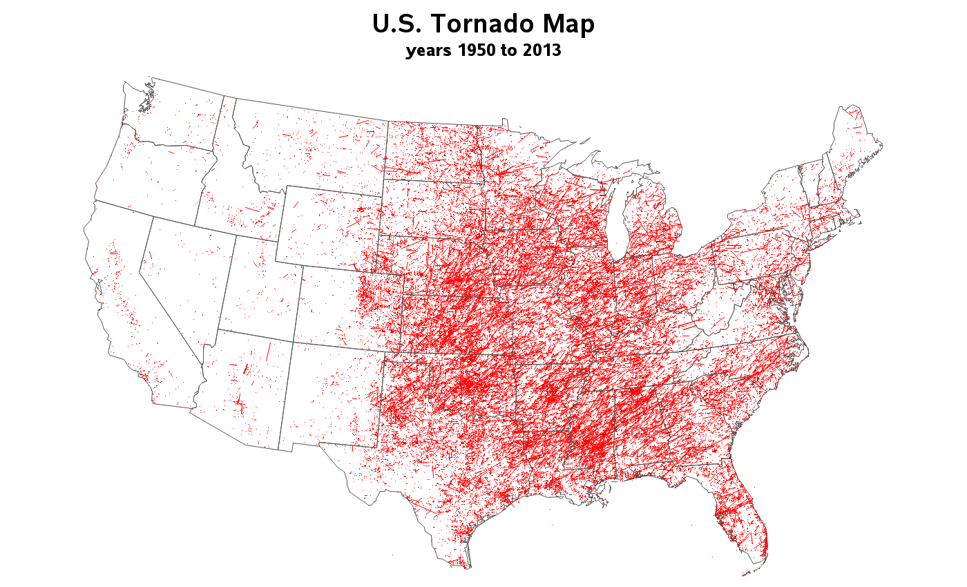
Note that this SAS version has the following improvements over the original:
- In addition to the tornado paths that have a beginning & ending coordinate, I also plot a single 'point' for the tornadoes that only have a beginning coordinate in the data (this fills-in a lot of points in Florida, for example).
- I make the state borders gray, rather than black, to de-emphasize them -- the red tornado data is the most important thing, and should stand out the most.
- I add a descriptive title above the map.
- I also used ods html to create mouse-over text, so you can hover and see the state names.
- And, you can scroll down to see each year plotted separately.
Assuming you were born after 1950, you can even scroll down and see the tornadoes during the year you were born -- that's pretty darn cool, eh?!?
Food for thought: What data does your company have that could be plotted on a map this way? :-)


3 Comments
Pingback: Analyzing 60 years of tornado data with animation | SAS Training Post
Pingback: NewsSprocket | U.S. Tornado Map: 1950 to 2012
Pingback: Using SAS to track the spread of Walmarts | The SAS Training Post