A few weeks ago I posted a cliffhanger-of-a-blog-post. I left my readers in suspense about which of my physical activities are represented in different sets of accelerometer data that I captured. In the absence of more details from me, the internet fan theories have been going wild. Well, it's time for the big reveal! I've created a SAS Visual Analytics report that shows each of these activity streams with the proper label:
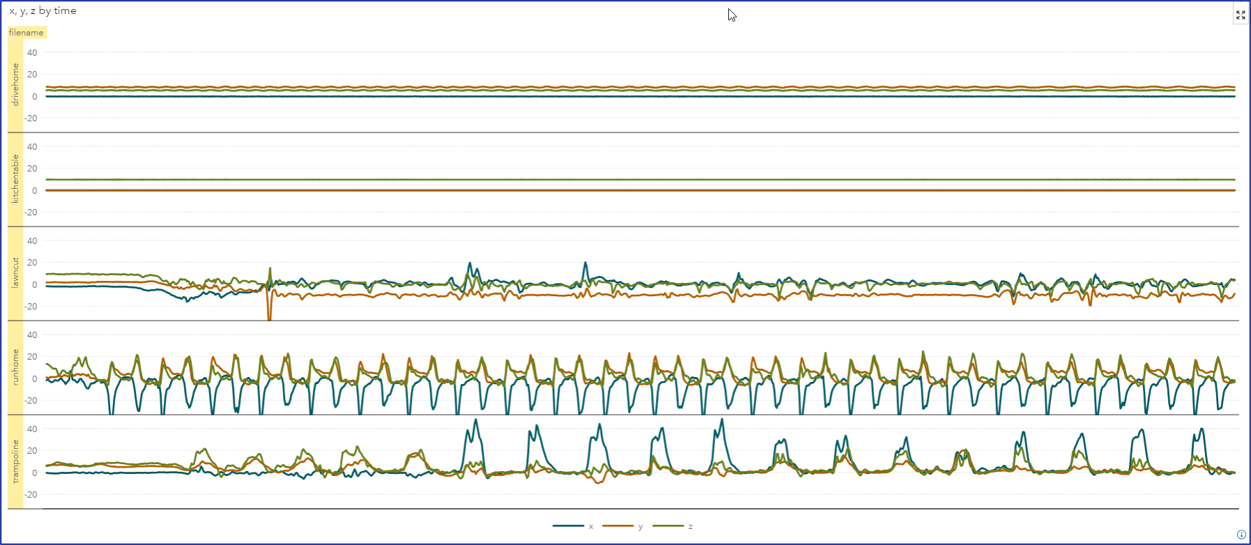
Were your guesses confirmed? Any surprises? Were you more impressed with my safe driving or with my reckless behavior on the trampoline?
Collecting and preparing accelerometer data
You might remember that this entire experiment was inspired by a presentation from Analytics Experience 2018. That's when I learned about an insurance company that built a smartphone app to collect data about driving behavior, and that the app relies heavily on accelerometer readings. I didn't have time or expertise to build my own version of such an app, but I found that there are several good free apps that can collect and export this data. I used an app called AccDataRec on my Android phone.
Each "recording session" generates a TSV file -- a tab-separated file that contains a timestamp and a measurement for each of the accelerometer axes (X, Y, and Z). In my previous post, I shared tips about how to import multiple TSV files in a single step. Here's the final version of the program that I wrote to import these data:
filename tsvs "./accel/*.tsv"; libname out "./accel"; data out.accel; length casefile $ 100 /* to write to data set */ counter 8 timestamp 8 timestamp_sec 8 x 8 y 8 z 8 filename $ 25 tsvfile $ 100 /* to hold the value */ ; format timestamp datetime22.3 timestamp_sec datetime20.; /* store the name of the current infile */ infile tsvs filename=tsvfile expandtabs; casefile=tsvfile; input counter timestamp x y z filename; /* convert epoch time into SAS time */ timestamp=dhms('01jan1970'd, 0, 0, timestamp / 1000); /* create a timestamp with the precision of one second */ timestamp_sec = intnx('second',timestamp,0); run; |
Some notes:
- I converted the timestamp value from the data file (an epoch time value) to a native SAS datetime value by using this trick.
- Following advice from readers on my last post, I changed the DLM= option to a more simple EXPANDTABS option on the INFILE statement.
- Some of the SAS time-series analysis doesn't like the more-precise timestamp values with fractions of seconds. I computed a less precise field, rounding down to the second, just in case.
- For my reports in this post, I really need only 5 fields: counter (the ordinal sequence of measurements), x, y, z, and the filename (mapping to activity).
The new integrated SAS Viya environment makes it simple to move from one task to another, without needing to understand the SAS product boundaries. I used the Manage Data function (that's SAS Data Management, but does that matter?) to upload the ACCEL data set and make it available for use in my reports. Here's a preview:
Creating a SAS Visual Analytics report
With the data now available and loaded into memory, I jumped to the Explore and Visualize Data activity. This is where I can use my data to create a new SAS Visual Analytics report.
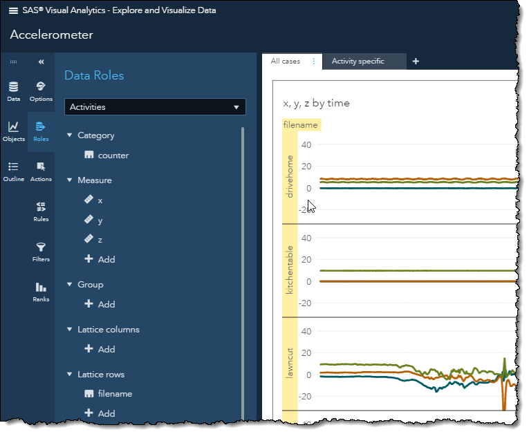
At first, I was tempted to create a Time Series Plot. My data does contain time values, and I want to examine the progression of my measurements over time. However, I found the options of the Time Series Plot to be too constraining for my task, and it turns out that for this task the actual time values really aren't that important. What's important is the sequence of the measurements I've collected, and that's captured as an ordinal in the counter value. So, I selected the Line Plot instead. This allowed for more options in the categorical views -- including a lattice row arrangement that made it easy to see the different activity patterns at a glance. This screen capture shows the Role assignments that I selected for the plot.
Adding a closer view at each activity
With the overview Line Plot complete, it's time to add another view that allows us to see just a single activity and provide a close-up view of its pattern. I added a second page to my report and dropped another Line Plot onto the canvas. I assigned "counter" to the category and the x, y, and z values to the Measures. But instead of adding a Lattice Row value, I added a Button Bar to the top of the canvas. My idea is to use the Button Bar -- which is good for navigating among a small number of values -- as a way to trigger a filter for the accelerometer data.
I assigned "filename" to the Category value in the Button Bar role pane. Then I used the Button Bar options menu (the vertical dots on the right) to add a New filter from selection, selecting "Include only selection".
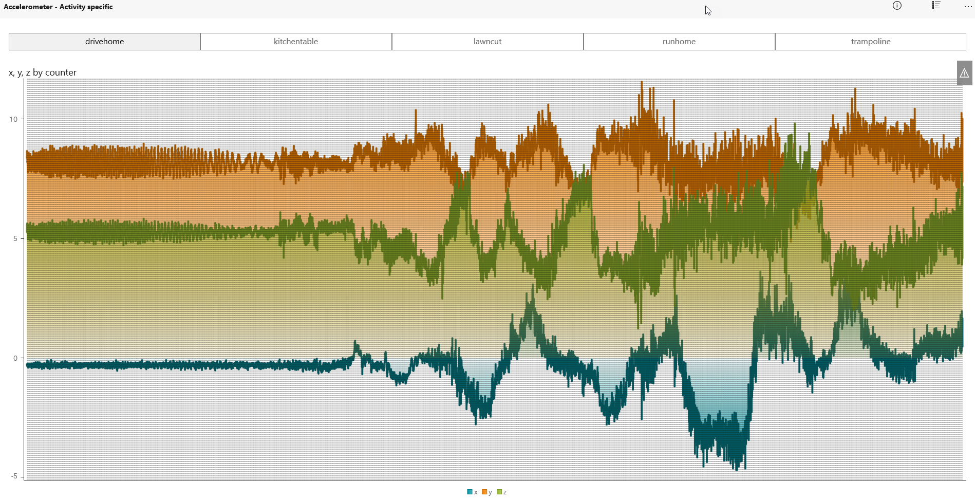
With this Button Bar control and its filter in place, I can now switch among the data values for the different activities. Here's my "drive home" data -- it looks sort of exciting, but I can promise you that it was a nice, boring ride home through typical Raleigh traffic.
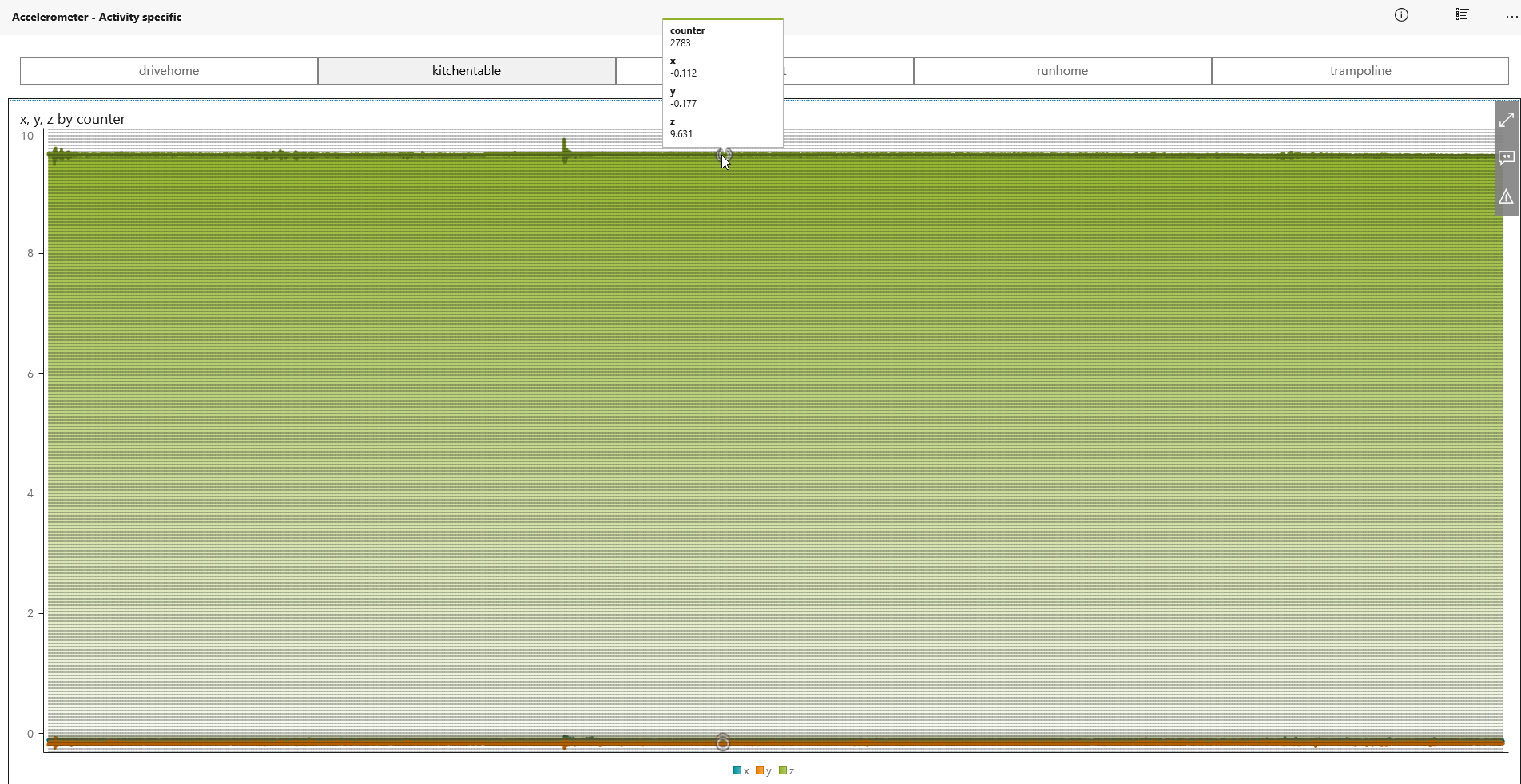
The readings from the "kitchen table" activity surprised me at first. This activity was simply 5 minutes of my phone lying flat on my kitchen table. I expected all readings to hover around zero, but the z axis showed a relatively flat line closer to 10 meters-per-second-per-second. Then I remembered: gravity. This sensor registers Earth's gravity, which we are taught is 9.8 meters-per-second-per-second. The readings from my phone hovered around 9.6 -- maybe my house is in a special low-gravity zone, or the readings are a bit off.
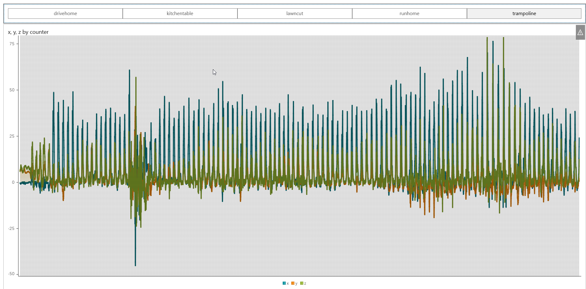
Finally, let's take a closer look at my trampoline workout. Since I was holding my phone upright, it looks like the x-axis felt the brunt of the acceleration forces. According to these readings, my phone was subjected to a g-force of 7 or 8 times that of Earth's gravity -- but just for a split second. And since my phone was in my hand and my arm was flailing around (I am not a graceful rebounder), my phone was probably experiencing more force than my body was.
Some love for the Windows 10 app
My favorite method to view SAS Visual Analytics reports is through the SAS Visual Analytics application that's available for Windows 10 and Windows mobile devices. Even on my desktop, where I have a full web browser to help me, I like the look and feel of the specialized Windows 10 app. The report screen captures for this article were rendered in the Windows 10 app. Check out this article for more information about the app. You can try the app for free, even without your own SAS Viya environment. The app is hardwired with a connection to the SAS demo reports at SAS.com.
See also
This is the third (and probably final) article in my series about accelerometer data. See these previous posts for more of the fun background information:



2 Comments
I have an embarrassingly simple question. What is a good way to explain when to use percent and when to use row percent in sas readout.
Using PROC TABULATE maybe? Here's a communities discussion with a use case.