Tag: Discrete Offset

Data Visualization
Sanjay Matange 3
Butterfly plots

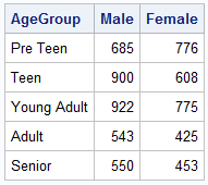
When comparing results by category and group,  putting the items to be compared close together usually leads to a graph that is easier to decode.  Take the case of the data (simulated) shown below. Here we have population by age group and sex.  To compare the population by sex, it is

Data Visualization
Sanjay Matange 6
Bar chart with response sort

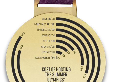
A graph in a recent article in Fortune magazine caught my eye.  The graph shows the cost of hosting the Summer Olympics over the past eight events.  Here is what I termed the "Medal" graph. Now, practitioners of the art of Effective Graphics would likely find some shortcomings in the graph.  Clearly

Data Visualization
Sanjay Matange 4
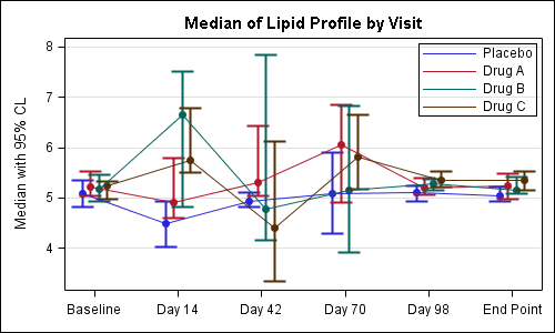
It pays to be discrete

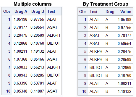
Often we have the need to display multiple columns of data in a graph, and we want to introduce some separation into their placement in the graph. Or, we want to display a bar chart of multiple response variables, and place the values side-by-side, like in a grouped bar chart. For both