Search Results: seriesplot (23)

Data Visualization
Sanjay Matange 5
Adding a spark to your data

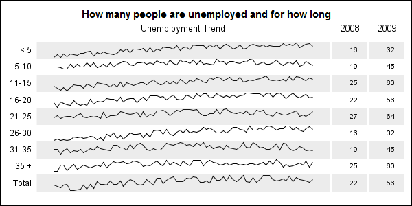
When viewing time series data, often we only want to see the trend in the data over time and we are not so concerned about the actual data values.  With multiple time series plots, forecasting software can find clusters to help us view series with similar trends. Recently I saw a graph showing the trend of unemployment

Data Visualization
Sanjay Matange 4
It pays to be discrete

Often we have the need to display multiple columns of data in a graph, and we want to introduce some separation into their placement in the graph. Or, we want to display a bar chart of multiple response variables, and place the values side-by-side, like in a grouped bar chart. For both