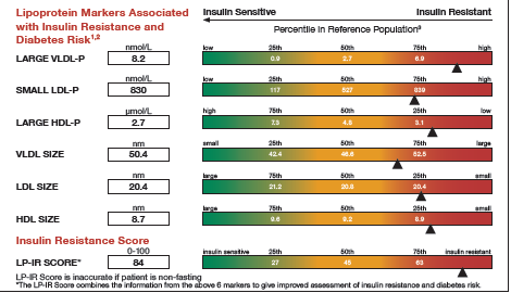
It was almost two weeks ago that I got started making a display for lab tests for a subject, based on a graph I saw on the web for an article on this blog. This graph is a part of a larger panel display of the lab values for a

It was almost two weeks ago that I got started making a display for lab tests for a subject, based on a graph I saw on the web for an article on this blog. This graph is a part of a larger panel display of the lab values for a
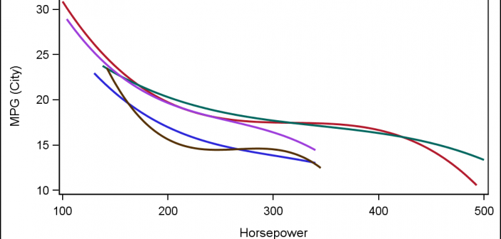
Often, the topic of an article is motivated by a question from a user. A satisfactory resolution of the situation is usually a good indication of a topic that may be of interest to other users. On such question was posed to me by a user this weekend. He wanted to display fit
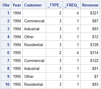
The GCHART procedure has a popular option called G100 to display all the subgroups in % format such that all the subgroup values add up to 100% for each group. Each subgroup is labeled with its own % values. SGPLOT procedure does not such an option, but with a little bit of
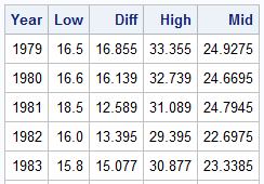
Browsing graphs on the web, this graph caught my eye: The Arctic Sea Ice Volume Graph. My interest is not so much in the debate on Climate Change or Global Warming. To me, this graph has some interesting features that can help show the benefits of plot layering to

One of the most popular graph amongst clinical and pharmaceutical users is the Survival Plot as created from the LIFETEST Procedure. This is one graph that users most often want to customize. See Creating and Customizing the Kaplan-Meier Survival Plot in PROC LIFETEST - Warren F. Kuhfeld and Ying So, SAS Institute
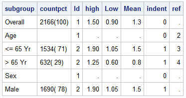
Most simple graphs generally include graphical representation of data using various plot type such as bar charts, scatter plots, histograms, box plots step plots and more. Both SG procedures and GTL provide many easy ways to create such graphs. However, for many real world use cases, we need to display related textual data in
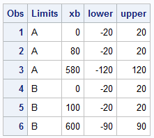
Recently a user new to GTL and SG procedures asked how to create a Bland-Altman graph on the SAS Communities site. He included an image of the resulting graph to indicate what he wanted, I described to him how that graph can be created, but since he is new to the art
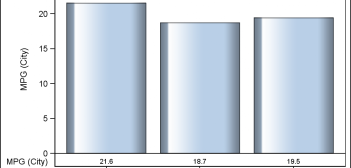
Creating a Bar Chart with a table of statistical data aligned with the bars is a popular topic. With SAS 9.4, creating such graphs gets easier with the new AXISTABLE statement in GTL and SG procedures. But some use cases can flummox the latest gizmos. Such is the case I ran into recently. Here
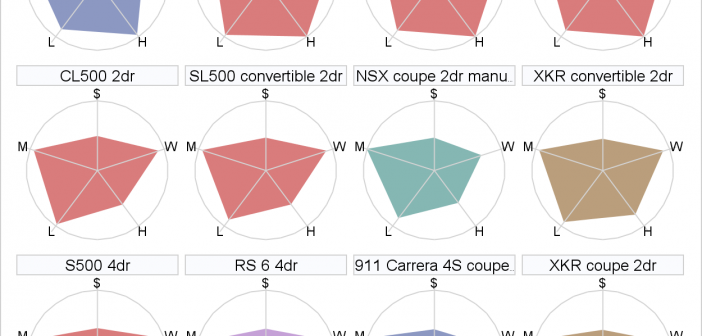
Are you in the market for a new car? Perhaps you are researching how the various parameters of cars match up to each other? Well, in SAS 9.4 Maintenance 1 release, ODS Graphics will support a new versatile plot: the polygon plot. As the name suggests, it lets you draw
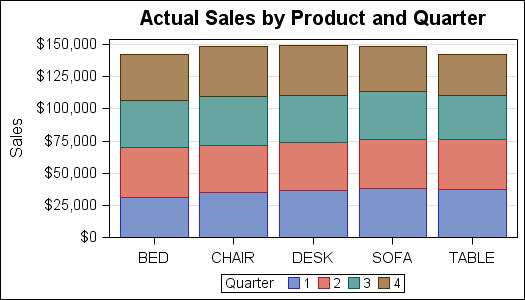
A couple of weeks back we had a question on how to make a bar chart with stacked and clustered groups. User also wanted to display the value for each stacked segment below the bars. The article Bar Charts with Stacked and Cluster Groups shows how to create such a