Search Results: heatmap (22)

Data Visualization
Sanjay Matange 0
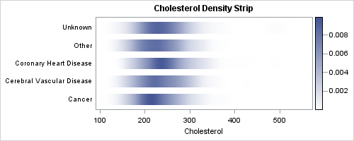
Density Strip Plot

In the previous post on Violin Plots, we discussed the process to create custom density plots.  This work was done in collaboration with SAS user James Marcus.  This is the second installment on the same topic - Creating Density Strip Plots.  We will use the same data and process to compute

Data Visualization
Sanjay Matange 4
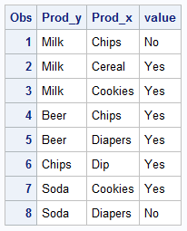
Beer, diapers and heat map

The parable of beer and diapers is often related when teaching data mining techniques.  Whether fact or fiction, a Heat Map is useful to view the claimed associations.  A co-worker recently enquired about possible ways to display associations or dependency between variables.  One option is to show the dependency as a node