In the past few weeks, I have written two posts on SG annotation and on saving and then modifying the graphs that analytical procedures produce:
Modifying dynamic variables in ODS Graphics
Annotating graphs from analytical PROCs
Today, I finish this series with one more post. This one shows how you can annotate graphs with multiple panels. If you want to fully understand today's post, you will need to understand my previous two blogs. Those posts show you how to run an analytical procedure, output the data object that underlies a graph, save the dynamic variables in an ODS document, process either the template or the PROC SGRENDER call to incorporate the dynamic variables, and then modify the graph. In this example, you will learn how to use a macro to add ANNOTATE statements to each LAYOUT OVERLAY code block in a template that an analytical procedure uses. This enables you to send annotations to each panel and use panel-specific drawing spaces. In contrast, my previous blog showed you how to add a single ANNOTATE statement to the template, which enables annotation but does not provide the ability to specify panel-specific drawing spaces. This example also modifies the data object and the graph template.
I hope that everyone cringed after reading the last sentence. Modifies the data object? Really? Yes, there are times when it makes sense. However, you should never change the data that underlie a graph. This example changes the data object in order to change which parts of the graph are labeled; no numbers are changed.
This example works with the standardized coefficients progression plot in PROC GLMSELECT. The following step creates the plot:
ods graphics on;
proc glmselect data=sashelp.baseball plots=coefficients;
   class league division;
   model logSalary = nAtBat nHits nHome nRuns nRBI nBB
                     yrMajor|yrMajor crAtBat|crAtBat crHits|crHits
                     crHome|crHome crRuns|crRuns crRbi|crRbi
                     crBB|crBB league division nOuts nAssts nError /
                     selection=forward(stop=AICC CHOOSE=SBC);
run; |
Click on a graph to enlarge.
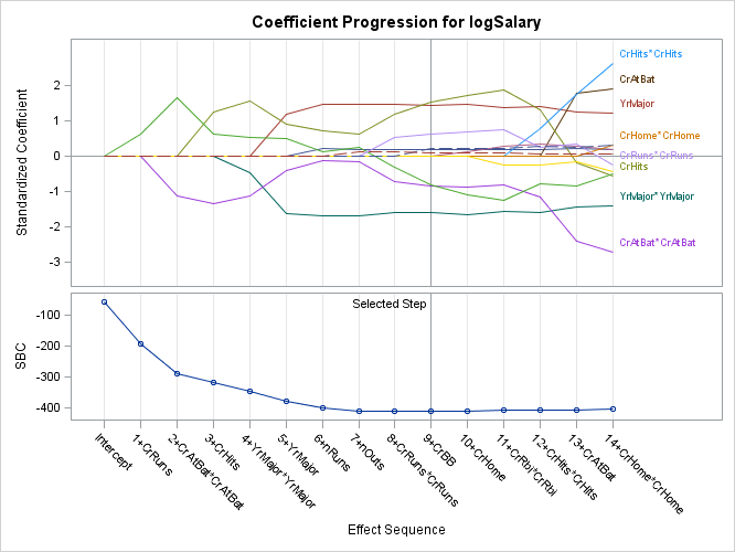
The graph shows how the coefficients change as new terms enter the model. PROC GLMSELECT labels some of the series plots. It is common in this graph for several coefficients to have similar values in the final model. PROC GLMSELECT tries to thin labels to avoid conflicts. For example, the first term that enters the model after the intercept is CrRuns. Its label is not displayed since it would conflict with the label for CrHits. In this example, you will learn how to select a different set of labels to display. In particular, you will display labels for the standardized coefficients in the selected model that are outside the range -1 to 1. This requires you to change the data object to change which series plots are labeled. Then you can add annotation to highlight the selected model. In PROC GLMSELECT, the final model does not usually correspond to the end of the progression of the coefficients. In this case, it corresponds to the model that is displayed at the reference line at step 9.
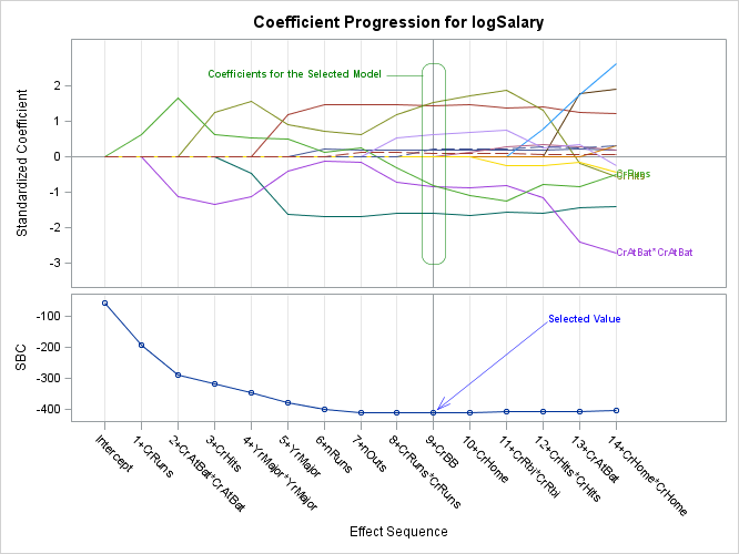
You can preview the results as they will be after annotation next.
You begin by creating a data object and storing the graph along with the dynamic variables in an ODS document:
ods document name=MyDoc (write);
proc glmselect data=sashelp.baseball plots=coefficients;
   ods select CoefficientPanel;
   ods output CoefficientPanel=cp;
   class league division;
   model logSalary = nAtBat nHits nHome nRuns nRBI nBB
                     yrMajor|yrMajor crAtBat|crAtBat crHits|crHits
                     crHome|crHome crRuns|crRuns crRbi|crRbi
                     crBB|crBB league division nOuts nAssts nError /
                     selection=forward(stop=AICC CHOOSE=SBC);
run;
ods document close; |
The next step reads the data object, extracts the parameter labels for the coefficients that are greater than 1 and less then -1 in the selected model, and outputs to a macro variable the number of the last step:
data labelthese(keep=parameter rename=(parameter=par));
   set cp end=eof;
   if eof then call symputx('_step', step);
   if step eq 9 and (StandardizedEst gt 1 or StandardizedEst lt -1);
run; |
This step relies on knowing that the selected model was found in step 9. If you are writing a general purpose program to do this modification, you can process the __outdynam data set that the macro makes below, output the value of the variable _ChosenValue, and then run the preceding step.
The next step processes the data set that was created from the data object:
data cp2;
   set cp;
   match = 0;
   if step ne &_step then return;
   do i = 1 to ntolable;
      set labelthese point=i nobs=ntolable;
      match + (par = parameter);
      end;
   if not match then parameter = ' ';
   if nmiss(rhslabelYvalue) then rhslabelYvalue = StandardizedEst;
run; |
This data object is typical of the data objects that are used to make graphs. It has several components of different sizes and missing values elsewhere. The last part of the data set contains the coordinates and strings that are needed to label each profile. The preceding step sets the parameter value to blank in the last step (the one that corresponds to the labels) for all but the terms with the most extreme coefficients. When the Y coordinate for a label is missing (because PROC GLMSELECT suppressed it due to collisions), the Y coordinate value is restored.
The next step provides the macro that contains the code that modifies the graph template:
%macro tweak;
   if index(_infile_, 'datalabel=PARAMETER') then
      _infile_ = tranwrd(_infile_, 'datalabel',
                          'markercharacterposition=right markercharacter');
   if index(_infile_, 'curvelabel="Selected Step"') then
      _infile_ = tranwrd(_infile_, 'curvelabel="Selected Step"', ' ');
%mend; |
It performs two changes. By default, labels are positioned by using the DATALABEL= option in a SCATTERPLOT statement. This step removes that option and instead specifies the MARKERCHARACTER= option. You can use the MARKERCHARACTER= option to position labels precisely at a point. In contrast, the DATALABEL= option moves labels that conflict. The first IF statement also adds the option MARKERCHARACTERPOSITION=RIGHT so that labels are positioned to the right of the coordinates. This change is based on the idea that sometimes it is better for labels to be precisely positioned, even if they collide. You can additionally modify the label coordinates if minimizing collisions is important. The TRANWRD (translate word) function performs the change, substituting a longer string from a shorter string. The second IF statement removes the curve label. You will later add it back in through SG annotation.
The next step creates the SG annotation data set:
data anno;
   length ID $ 3 Function $ 9 Label $ 40;
   retain X1Space Y1Space X2Space Y2Space 'DataPercent' Direction 'In';
   length Anchor $ 10 xc1 xc2 $ 20;
   retain Scale 1e-12 Width 100 WidthUnit 'Data' CornerRadius 0.8
          TextSize 7 TextWeight 'Bold'
          LineThickness 0.7 DiscreteOffset -0.3 LineColor 'Green';

   ID       = 'lo1';            Function  = 'Text';
   Anchor   = 'Right';          TextColor = 'Green';
   x1       = 55;               y1        = 94;
   Label    = 'Coefficients for the Selected Model';
   output;

   Function = 'Line';           x1        = .;
   X1Space  = 'DataValue';      X2Space   = X1Space;
   xc1      = '9+CrBB';         xc2       = '8+CrRuns*CrRuns';
   y1       = 94;               y2        = 94;
   output;

   Function = 'Rectangle';      Y1Space   = 'WallPercent';
   Anchor   = 'BottomLeft';     y1        = 10;
   Height   = 80;               Width     = 0.6;
   output;

   ID       = 'lo3';            Width     = 100;
   Function = 'Text ';          Label     = 'Selected Value';
   X1Space  = 'DataPercent';    Y1Space   = X1Space;
   Anchor   = 'Left';           TextColor = 'Blue';
   x1       = 86;               y1        = 84;
   output;

   Function = 'Arrow';          LineColor = 'Blue';
   X1Space  = 'DataValue';      X2Space   = X1Space;
   xc1      = '9+CrBB';         xc2       = '12+CrHits*CrHits';
   y1       = 4;                y2        = 83;
   DiscreteOffset = .1;         x1        = .;
   output;
run; |
This step creates a data set with five observations:
1) the text 'Coefficients for the Selected Model'
2) a line from the text to the rectangle
3) a rectangle with rounded corners that surrounds the coefficients for the selected model
4) the text 'Selected Value'
5) an arrow pointing from the text to the selected value
This SG annotation data set has many variables and options. More will be said about the SG annotation data set after the graph is displayed. Fully explaining SG annotation is beyond the scope of this blog.
The template processing macro, %ProcAnnoAdv, is next:
%macro procannoadv(data=, template=, anno=anno, document=mydoc, adjust=,
                   overallanno=1);

   proc document name=&document;
      ods exclude properties;
      ods output properties=__p(where=(type='Graph'));
      list / levels=all;
   quit;

   data _null_;
      set __p;
      call execute("proc document name=&document;");
      call execute("ods exclude dynamics;");
      call execute("ods output dynamics=__outdynam;");
      call execute(catx(' ', "obdynam", path, ';'));
   run;

   proc template;
      source &template / file='temp.tmp';
   quit;

   data _null_;
      infile 'temp.tmp';
      input;
      if _n_ = 1 then call execute('proc template;');
      %if &adjust ne %then %do; %&adjust %end;
      call execute(_infile_);
      if &overallanno and _infile_ =:     '   BeginGraph' then bg + 1;
      else if not &overallanno and index(_infile_, '   layout overlay')
         then lo + 1;
      if bg and index(_infile_, ';') then do;
         bg = 0;
         call execute('annotate;');
      end;
      if lo and index(_infile_, ';') then do;
         lo = 0;
         lonum + 1;
         call execute(catt('annotate / id="lo', lonum, '";'));
      end;
   run;

   data _null_;
      set __outdynam(where=(label1 ne '___NOBS___')) end=eof;
      if nmiss(nvalue1) and cvalue1 = '.' then cvalue1 = ' ';
      if _n_ = 1 then do;
         call execute("proc sgrender data=&data");
         if symget('anno') ne ' ' then call execute("sganno=&anno");
         call execute("template=&template;");
         call execute('dynamic');
      end;
      if cvalue1 ne ' ' then
         call execute(catx(' ', label1, '=',
                      ifc(n(nvalue1), cvalue1, quote(trim(cvalue1)))));
      if eof then call execute('; run;');
   run;

   proc template;
      delete &template;
   quit;
%mend; |
This macro is similar to the %ProcAnno macro that I provided and explained in my previous blog. The macro adds the ANNOTATE statements to the template and calls PROC SGRENDER with the appropriate dynamic variables specified. You can specify a macro name in the ADJUST= argument to insert code into the macro to edit the graph template. In this case, you will add the macro %Tweak. You can set the ANNO= option to blank to prevent PROC SGRENDER from specifying the SGANNO= option. By default, when OVERALLANNO=1, a single ANNOTATE statement is added to the template (as in my previous blog). In this example, OVERALLANNO=0 and an ANNOTATE statement is added to each layout overlay. The following statements are added to the template:
annotate / id="lo1"; annotate / id="lo2"; annotate / id="lo3"; |
You can use the three IDs in your annotation data set to modify each of the three overlays. In this template, the first layout is unconditionally used and either the second and or third layout is conditionally used. In this example, the first and third layouts are used.
The following step runs the macro and creates the modified graph:
%procannoadv(data=cp2, template=Stat.GLMSELECT.Graphics.CoefficientPanel,
adjust=tweak, overallanno=0) |
This SG annotation data set is large. There are many variables, and varying subsets are used for each annotation. The output shown in the links below list the relevant subsets.
Click to see a subset of observation 1
Observation 1 positions text in the LAYOUT OVERLAY labeled 'lo1'. It specifies coordinates based on the percentage of the data area. The string is anchored on the right, next to the line.
Click to see a subset of observation 2
Observation 2 draws a line in the LAYOUT OVERLAY labeled 'lo1'. The X coordinates are in the space 'DataValue'. Since the X axis variable is a character variable, the variables x1c and x2c are used. When the variables x1 and x2 exist for other observations, they must be set to missing for this observation. The Y coordinates are in the space 'DataPercent', and the variables y1 and y2 provide coordinates. Each pair of X and Y coordinates specifies one end of the line. The discrete offset of -0.3 moves the line 0.3 data units to the left from the coordinates specified in (x1c, y1) and (x2c, y2).
Click to see a subset of observation 3
Observation 3 draws a rounded rectangle in the LAYOUT OVERLAY labeled 'lo1'. There is one X and one Y coordinate. The X coordinate is in the data space and the Y coordinate is in the wall percentage space. The rectangle is anchored in the bottom left (that is where drawing starts), then it is drawn with a height of 80% of the wall and a width of 0.6 times the width of a discrete cell. The discrete offset of -0.3 moves the rectangle 0.3 data units to the left from the coordinates specified in (x1c, y1). The CornerRadius variable controls the degree of rounding. The result is a rounded rectangle centered around the reference line for the selected step.
Click to see a subset of observation 4
Observation 4 positions text in the LAYOUT OVERLAY labeled 'lo3'. Notice that the layout has changed with this observation. The text is anchored on the left, next to the arrow.
Click to see a subset of observation 5
Observation 5 draws an arrow in the LAYOUT OVERLAY labeled 'lo13'. The X coordinates are in the space 'DataValue'. Since the X axis variable is a character variable, the variables x1c and x2c are used. When the variables x1 and x2 exist for other observations, they must be set to missing for this observation. The Y coordinates are in the space 'DataPercent', and the variables y1 and y2 provide coordinates. Each pair of X and Y coordinates specifies one end of the arrow. The discrete offset of 0.1 moves the arrow 0.1 data units to the right from the coordinates specified in (x1c, y1) and (x2c, y2). The Scale variable scales the size of the arrowhead. The Direction variable points the arrow in (toward x1c and y1).
In summary, this example builds on examples in my previous posts to show you a small part of the flexibility of ODS Graphics. You can modify graph templates, dynamic variables, and you can use SG annotation to customize the graphs that analytical procedures produce. While not shown here, you can also change styles. You can even (cringe!) modify the data object.