Many users of SGPLOT and GTL know how to mix and match various plot statements to create graphs, sometimes in ways not originally intended. You are also aware that you can go a step beyond, and use these systems to create completely non-standard graphs such as the Spiral Plot, the Polar Graph, the Euler Diagram and more.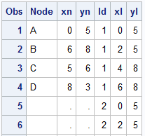
The other day I was asked to create a diagram. I created a simple one with the SGPLOT procedure, with four nodes, and three links. The four nodes A, B, C and D have the (x, y) positions shown in columns Xn and Yn. The three links have ids of 1, 2 and 3. These are drawn using the Series plot, each having 4 points, with first starting at right of the "From" node and ending at the left of the "To" node. Two additional intermediate points are provided. The "Node" and "Link" data is merged into the table shown on the right.
 This data is plotted using the SGPLOT procedure, using a series plot to draw the links, and scatter plot to draw the nodes and the node ids. Graph is shown on the right. SGPLOT program is shown below, some options are trimmed to fit. Please see linked file at the bottom for the full program.
proc sgplot data=diagram dattrmap=attrmap;
series x=xl y=yl / group=id name='b';
scatter x=xn y=yn / group=node datalabel=node
datalabelpos=center;
keylegend 'b' / linelength=20;
run;
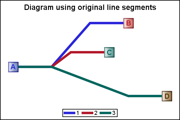
 We can use the SmoothConnect option to avoid the sharp angles as shown on the right. Note, this result is less than satisfactory, as the curves are required to pass through each of the points in the data. This causes the curves to bend in the opposite direction of the curve as can be seen at the start of each link near node A. The three links are not co-linear at the start. Also, at each penultimate node, the curve bends the other way, as can be seen in the blue link to the left of the node.
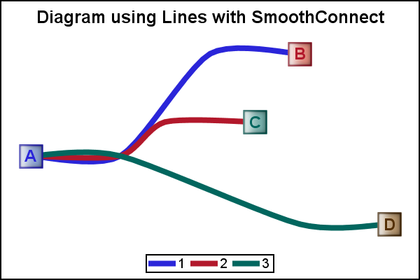
 Now, for a diagram, it is not really necessary that the link pass through each of the intermediate nodes. Those are merely there to set a path for the links. Only the start and end of the path must be on the first and last point.
In the graph on the right we get the desired effect. Here, each link starts and ends in the right point, but the curve does not necessarily pass through the intermediate points. The points are used as "control points' to compute a quadratic Bezier Spline. Then we use the series plot to draw the spline.
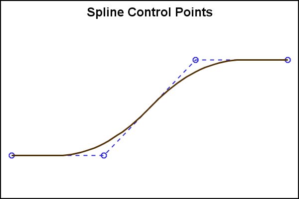 The graph on the right shows the spline curve and the control points. The original series plot points are used as the control points for the spline. The spline starts out as a straight line segment from the 1st vertex half way to the 2nd vertex. Now, from this point, a quadratic curve is calculated to the point half way between the next line segment. This continues for all the remaining segments, till we reach the half way point of the last segment. Then, the last segment is again a straight segment to the final vertex.
The benefit of this computation is that the curve is always at a tangent to the first and last segments, thus ensuring the slope of those segments. Here, we want them to be horizontal. The portion of the curve in between goes smoothly from one segment to the next. The program includes the BezierMacro() that computes the points for the quadratic Bezier Spline given the original control points. For more details, see this WikiPedia page on Quadratic Splines.
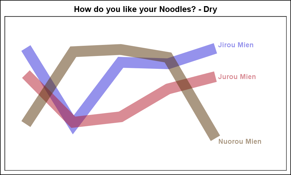 While I was in Beijing, the Chinese terms we learned the quickest were "Mien" for noodles, and other derivatives like "Jiruo Mien" for Chicken Noodles. It was essential to know this at a minimum to order food at Mr. Lee's, the local fast food place. Here are my versions of the graphs for the "Dry Noodles" and the "Wet Noodles", given the original data. Click on the graph for a higher resolution image.
The programs below were written using some SAS 9.4 graph features, but these are not essential for this use case. You can run it at SAS 9.3, and just remove the offending options.
 SAS 9.4 Programs:
Macro: BezierMacro
Diagram: Diagram
Noodle: NoodleGraph
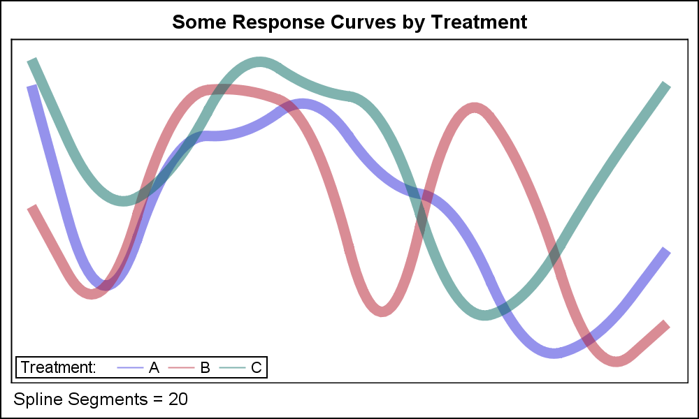
At the right is another use case with longer series plots to draw the response curves by treatment.
 Note: Bezier curves may NOT be appropriate where the curve needs to pass through each point, but can be useful where the points for the series plot are control points to draw a smooth curve.