This classic start to a romantic poem assumes that the correct colors are always assigned to the correct flowers; but, for those who create graphs for reports, consistent color assignment can be more of a challenge than an assumption. This challenge is particularly true for the display of group values. Typically, plots without group classifiers can have their attributes assigned in a predictable way throughout the report. However , the assignment of style attributes for group values is dependent on the order of the data. If order was the only issue, you could sort your datasets the same way for each graph in the report and get the consistency you need. The problem is that you occasionally get datasets where some group values are dropped. Even when these datasets are sorted, the “holes” in the data cause the style assignments to get out of alignment.
To demonstrate the point, notice the style alignment problems in the plots below. The first plot displays results for three varieties of irises. The second plot, from a different dataset, does not contain any data for the “Setosa” variety.
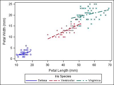
proc sgplot data=sashelp.iris; reg x=petallength y=petalwidth / group=species; run; |
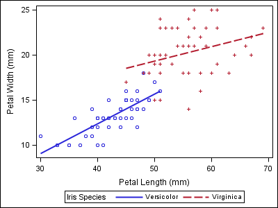
data iris; set sashelp.iris; where species ne "Setosa"; run; proc sgplot data=iris; reg x=petallength y=petalwidth / group=species; run; |
Notice that the two varieties in the second plot now have the wrong style properties when compared to the first plot, which could make the report harder to follow.
In ODS Graphics, there are two ways to deal with this situation in a predictable way. The first solution works with SAS 9.2 and up, but requires you to use the Graph Template Language (GTL) to create your plot. Most GTL plot statements that support the GROUP option also have an option called INDEX. This option takes a numeric column of index values (starting from 1) that index into the graph data style elements in the ODS style. An index of “1” corresponds to GraphData1, “2” to GraphData2, and so on. To solve the assignment problem, create an index column in your data and reference it from the template.
data iris; set sashelp.iris; where species ne "Setosa"; if (species eq "Setosa") then index=1; else if (species eq "Versicolor") then index=2; else if (species eq "Virginica") then index=3; else index=1; /* Index must be non-missing */ run; proc template; define statgraph irisfit; begingraph; layout overlay; regressionplot x=petallength y=petalwidth / group=species index=index name="fit"; scatterplot x=petallength y=petalwidth / group=species index=index; discretelegend "fit"; endlayout; endgraph; end; run; proc sgrender data=iris template=irisfit; run; |
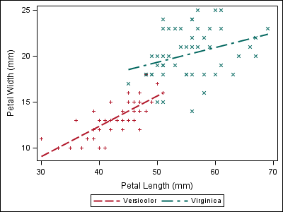
Now, the style attributes line up with the first plot, even though “Setosa” data is not present.
In SAS 9.3, we introduced a powerful new feature in both GTL and the SG procedures called an “attribute map”. This feature give you that ability to assign visual attributes to specific group values and (in GTL) to numeric ranges. The attributes from the map are assigned to the group values regardless of data order. Therefore, no addition to or manipulation of the original input data is needed.
In the SG procedures, you use this feature by creating a separate, reusable dataset for mapping the values to the attributes. In this dataset, you can control the ODS style elements use for fills, lines, and markers, as well as specify literal values for attributes. The data step below creates an attribute map that I will use in the next two examples.
data irisattrs; retain id "myid" linepattern "solid"; length value $ 11 linecolor $ 6 markercolor $ 6 markersymbol $ 6; input value $ linecolor $ markercolor $ markersymbol $; cards; Setosa purple purple circle Versicolor gold gold plus Virginica red red x ; run; |
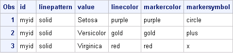
All column names in this dataset are reserved (see the documentation for the full list). The ID and VALUE columns are required; the rest are optional columns you add based on your need. The ID column contains a name that you create to identify the attribute map. This value is referenced from the plot statement by using the ATTRID option. Because attribute maps are referenced by ID value, a dataset can contain multiple attribute maps, which can by very convenient when sharing a standard set of attribute maps among many people.
In the following examples, the attribute map data set created above is used in two different SG procedures to create a consistent look in the output. The data set is specified on the procedure using the DATTRMAP option, and the attribute map ID is referenced from the ATTRID option.
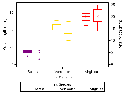
proc sgplot data=sashelp.iris dattrmap=irisattrs nocycleattrs; yaxis min=0; y2axis min=0; vbox petallength / category=species group=species attrid=myid nofill discreteoffset=-0.2 boxwidth=0.4; vbox petalwidth / category=species group=species attrid=myid y2axis nofill discreteoffset=0.2 boxwidth=0.4; run; |

proc sgscatter data=sashelp.iris dattrmap=irisattrs; matrix sepallength sepalwidth petallength petalwidth / group=species attrid=myid ellipse; run; |
For those who write GTL templates, there are two types of attribute maps supported: one for discrete values (like the examples above) and one for continuous numeric ranges. The range attribute map supports both single color assignments to ranges, as well as gradient color specifications. Attribute maps in GTL are very powerful and worthy of a follow-up post. Stay tuned for part 2!


9 Comments
Good grief. Could it be anymore complicated?
The article discusses multiple different ways to get consistent color (or marker symbol, etc.) for groups, regardless of their order or even presence in the data. New options to directly set the color list will be included in SAS 9.4. We would love to hear your suggestions on what else could make this easier.
Pingback: Roses are red, violets are blue… (part 2) - Graphically Speaking
Pingback: Specify the colors of groups in SAS statistical graphics - The DO Loop
I had a similar problem where different parameters to be plotted need to have each line consistently identified by subject colour, and line type for treatment, even though not all 30+ subjects have any values for all parameters. A quick google suggested use index as in:
proc sgplot;
series x=&x.A y=Active / group=sbjnoA index=sbjnoA lineattrs=(pattern=1 thickness=2);
series x=&x.P y=Placebo / group=sbjnoP index=sbjnoP lineattrs=(pattern=2 thickness=2);
to have consistent colours. It would be perfect as subjects are already numbered 1,2,3... within treatment for anonymity and I don't need to choose and write out 30+ colours. BUT, as has happened before, the useful index option is only for PROC TEMPLATE, which I never have used. Why can't such a useful option be in SGPLOT?
Hello,
Thanks for the useful tutorial. I am stuck in a fairly simple problem but I can't find the solution. I plotted my data using SGPLOT with a linear regression (reg y=Margin_clearance x=Tumor_size). Now I would like to have one regression line but my observations grouped in different colors. When I use the option /group=Differentiation degree=1 clm, then I got different regression lines for all groups. I would like to have different colors for the different groups so you can distinguish them in the plot but one regression line for all observations. Is that possible?
Thanks,
Stijn
Hey Stijn,
The best way to create that display is to render the original observations in a separate SCATTER plot. Your code will look something like this:
proc sgplot data=mydata;
reg y=Margin_clearance x=Tumor_size / nomarkers degree=1 clm;
scatter y=Margin_clearance x=Tumor_size / group=Differentiation;
run;
Hope this helps!
Dan
Pingback: Advanced ODS Graphics: Range Attribute Maps - Graphically Speaking
Pingback: Advanced ODS Graphics: Range Attribute Maps - Graphically Speaking