Here is the promised follow up on the Dashboard graph. In the previous article, I posted the code to create a panel of bullet KPIs displaying three different metrics. For each KPI, I used 5 columns of data which resulted in a wide and inconvenient structure.
A more convenient data structure is shown below. In this case, the data for each KPI is classified by the name of the metric. Any one metric can have fewer or more observations. For a large panel of KPIs, this data structure is more manageable and extensible.
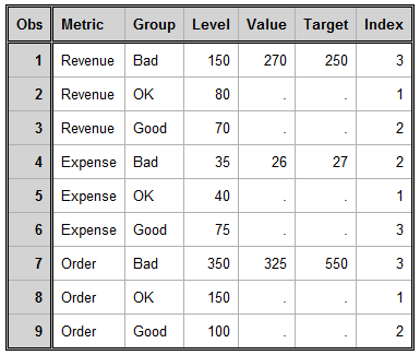
This data structure works really well for a LAYOUT DATALATTICE where we can just assign the ROWVAR=Metric. The layout would automatically generate the three cells for us, and use the appropriate subset of the data for each cell. The restriction is that contents of each cell will have the same structure.
That is not the case here, as we can see the second row has a reverse axis. Also, we are using custom labels on the left of each KPI. So, to make this custom layout we need to use a LAYOUT LATTICE. Every plot statement in a LAYOUT LATTICE will "see" all the observations of a column. So, we need a way to subset the data used for each cell to only the observations with the same value of the "Metric" variable. The way to do this is to use the ifc() and ifn() functions. The usage is as follows:
x=eval (ifc (metric eq 'Revenue', metric, ' ')); y=eval (ifn (metric eq 'Revenue', value, .)); |
In the usage above, the first parameter expression is evaluated, and if true, the second parameter is returned. If false, the third parameter is returned. So, now the code needed to draw the BarCharts and ScatterPlots in each cell is as follows:
barchart x=eval(ifc(metric EQ 'Revenue', metric, ' ')) y=level / orient=horizontal; scatterplot x=eval(ifn(metric EQ 'Revenue', target, .)) y=eval(ifc(metric EQ 'Revenue', metric , ' ')); |
Note: Since ORIENT=Horizontal, the X & Y roles for BarChart are flipped. X is used for vertical axis, and Y for horizontal. We should really think of X as Category and Y as Response.
Using these eval functions for the X and Y roles of the plot statements, each cell will still see all the observations. However, the observations not matching the value "Revenue" will be set to missing.
One point to remember is that for a ScatterPlot, the data range for each axis is computed independently based on all the data seen for that axis. So, we have to use the IFN() function to also set the unnecessary values for the linear axis to missing.
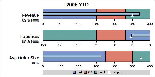
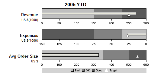
I have also added the use of a dynamic to control the color of the needle so the same template will work both for LISTING and JOURNAL style. I am sure there is plenty of scope to further automate this program with macro code. Here are the graphs.
Style=Listing:
Style=Journal:


7 Comments
Pingback: PharmaSUG update
Very helpful graphics. I'd like to add dates (start date, end date, current date, target date) to the top axis, but am having difficulty figuring out how to modify the data and layout options to include this second axis.
The graph is created using the GTL LAYOUT LATTICE. With SAS 9.3, you can enable the X2 axis, and use that to label the date values. You will need to associate one of the plots with x2 axis, and make sure the axis ranges for X and X2 are properly aligned.
Another question is how can I make this dynamic in the number of rows? Assume all bars have the exact same barchart & scatterplot options (one is not reversed), but there can be a dynamic number of groups. I'd like to store that number in a macro variable &n, and then loop from 1 to &n to produce &n bars on a single plot. Is that possible? Proc template hangs if I try to execute a macro within it, and I can't call %do while inside proc template. What are my options?
This graph is created using the GTL LAYOUT LATTICE to populate each plot individually. However, if you do not need to reverse one of the plots, then you can use the LAYOUT DATALATTICE that can produce a set of graphs, one for each value of the panel variables(s) with common x axis.
If all the x data range values are the same for each bar, proc SGPANEL will be easier. Let us say your class variable is "Product". Then, set up your data for each KPI for each value of the product. Then use proc SGPANEL as follows:
proc sgpanel data=foo;
PANELBY product / ;
vbarparm category=product/ response=response;
scatter y=product x=target;
run;
If each x axis needs to be independent, they you will have to use LAYOUT DATALATTICE, with columndatarange=data.
However, I do think you should be able to use macro programming with %do. In that case, you would use a LAYOUT LATTICE. But I think DATALATTICE will be easier.
Hi Sanjay:
I am using your KPI_Panel_group template for some of my organizations metrics and have noticed a small issue where sometimes the high band does not go all the way to the end of Axis and is truncated because the axis is displaying to a level higher the total of all three band levels. Can you tell me is there a way or an option within the GTL procedure to not have the axis projected past the end point of the high band?
From what you said, it sounds like the axis is choosing the next available "nice" tick value beyond your data. To disable the possibility of that happening, set LINEAROPTS=(THRESHOLDMAX=0) in the correct AXISOPTS bundle. Let me know if that works for you.