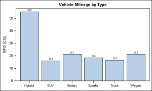
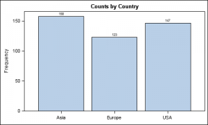
Here are a couple of bar charts showing the city mileage of cars by Type and Origin using the SGPLOT procedure from the sashelp.cars dataset.
title 'Vehicle Mileage by Type'; proc sgplot data=cars; format mpg_city 4.1; vbar type / response=mpg_city stat=mean datalabel; xaxis display=(nolabel); run; |
title 'Counts by Country'; proc sgplot data=cars; vbar origin / datalabel; xaxis display=(nolabel); run; |
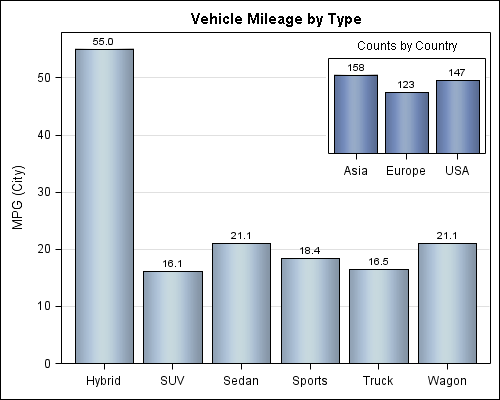
Pretty simple and straigntforward so far. But, now we want to do something more interesting. In the first graph of Mileage by Type, there is a whole lot of empty space at the upper right. How can I insert the second graph of the frequency counts into this space? With GTL, it is relatively easy. Here is the graph and the code.
proc template; define statgraph cars_inset_bar_bar; begingraph; entrytitle 'Vehicle Mileage by Type'; layout overlay / yaxisopts=(griddisplay=on) xaxisopts=(display=(ticks tickvalues)); barchart x=type y=mpg_city / stat=mean skin=modern barlabel=true; layout overlay / width=25pct height=30pct halign=right valign=top walldisplay=(outline) opaque=false yaxisopts=(display=none) xaxisopts=(display=(ticks tickvalues)); barchart x=origin / fillattrs=graphdata1 barlabel=true skin=modern; entry halign=center "Counts by Country" / valign=top location=outside; endlayout; endlayout; endgraph; end; run; /*--Nested graph--*/ proc sgrender data=cars template=cars_inset_bar_bar; format mpg_city 4.1; run; |
Here is the basic idea:
- I created a template using a LAYOUT OVERLAY, and placed the first BARCHART in it with the appropriate options.
- Within this layout, I inserted another LAYOUT OVERLAY. This layout is given a small width and height, and aligned to the top right. I also set options to turn off the background and wall fill, and set the axis options to reduce clutter.
- Within the second layout, I added the 2nd BARCHART with the appropriate options.
- I added an entry with LOCATION=outside to simulate a title for the inset.
That is pretty much it. We have a compact graph that utilizes the available space and provides more information about the data. The visuals stay together when shared.
I did encounter one problem. If the axes of the two plots are compatible, as we have here using two bar charts, all is well. Same would be true if using other compatible plots such as scatter, series, histogram, etc.
However, if I try to insert a HISTOGRAM as an inset into the BARCHART, even though these are two different graphs, an axis conflict is reported, and one of the graphs is not drawn. This looks like a bug and we will address it in the next release. But, what to do in the meanwhile?
Well, there is a "workaround". Each layout has two sets of X and Y axes, that are independent of each other. So,if I want to inset a histogram into the bar chart, I can use the X2 axis for the histogram, and then, turn off the main X2 axis display and turn on the X2axis DisplaySecondary. Here is the graph and the code.
proc template; define statgraph cars_inset_bar_hist; begingraph; entrytitle 'Vehicle Mileage by Type'; layout overlay / yaxisopts=(griddisplay=on) xaxisopts=(display=(ticks tickvalues)); barchart x=type y=mpg_city / stat=mean skin=modern barlabel=true; layout overlay / width=25pct height=30pct halign=right valign=top walldisplay=(outline) opaque=false yaxisopts=(display=none) x2axisopts=(display=none displaysecondary=(ticks tickvalues)); histogram mpg_city / xaxis=x2 fillattrs=graphdata1; entry halign=center "Distribution of Milage" / valign=top location=outside; endlayout; endlayout; endgraph; end; run; /*--Nested graph of different types--*/ proc sgrender data=cars template=cars_inset_bar_hist; format mpg_city 4.1; run; |
You are not restricted to one nested inset, and can add more if it makes sense. Here I have used SAS 9.2 code, but with SAS 9.3, you have even more options to use Pie Chart and other plot types as insets.
Full Program: Full SAS 92 Code




7 Comments
Chris, you should sort the data on the graph. It'll be easier to read that way (i.e.: hybrid, then sedan/wagon, then sports, etc...)
This is a useful tip! I have needed this functionality to associate a value in one graph with the image of another graph that explains the value. For an example, see the graph at http://blogs.sas.com/content/iml/2011/02/04/divide-and-count-a-test-for-spatial-randomness/
And with SAS 9.3, you have more optioins to create the annotations (DRAWARROW, DRAWTEXT, etc) to help associate the items.
Sanjay, thank you for this, it's really helped me to produce a plot where I have the main graph showing the percentage difference and the nested graph showing the actual changes.
Do you know the reason why in the SAS 9.2 help guide, there is not any information on the WIDTH, HEIGHT, HALIGN and VALIGN options available in the LAYOUT statement? Also I was wondering if it was possible for someone to specify exactly where they want the nested graph to go please?
Thanks!
You are right, I need to update the code. You need to place the nested LAYOUT OVERLAY into a LAYOUT GRIDDED. Layout GRIDDED has the necessary WIDTH, HEIGHT, HALIGN and VALIGN options to position it correctly. Place the Layout Overlay inside the GRIDDED, and it will work right. With SAS 9.3, you can provide a fractional value for VALIGN and HALIGN between 0.0 and 1.0. So, you can position it with more precision. Note, if you use PCT for width and height, the size will be percent of the GRAPH size, not wall size.
Thank you for this Sanjay!
Hi Sanjay, are you able to provide an update to this code for SAS v9.4? I have just tried your code, however I only see the histogram insert, not the main barchart. I tried inserting the layout gridded for the nested layout, but it only centered the insert - still does not show the barchart.