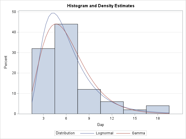
A previous article discusses various ways to overlay a density curve on a histogram in SAS. SAS provides several procedures that handle this task for common univariate probability distributions such as normal, lognormal, and gamma. If you define and use a less common distribution, you can write a GTL template that overlays the histogram and a custom density estimate, or you can use a HIGLOW statement to display the histogram and use the SERIES statement to overlay a density curve. Today's article extends the previous articles by showing how to overlay multiple density curves on a histogram, as shown in the graph to the right.
An overview of the technique
To overlay multiple custom curves on a histogram, use the following steps:
- Use the %EmulateHistogram macro to create a data set that contains the bins for the histogram. The heights of the bins can be on the count scale or on the percentage scale.
- Create a data set that contains the density curves you wish to overlay. These are usually created by using the PDF function in SAS. However, you must rescale the PDF to match the scale of the histogram.
- Merge the two data sets.
- Use the HIGHLOW statement in PROC SGPLOT to emulate a histogram. Use the SERIES statement to overlay the curves.
The following sections demonstrate each step.
Call the %EmulateHistogram macro
The first step is to call the %EmulateHistogram macro. The Plates data set and the %EmulateHistogram macro are defined in the previous article. The %EmulateHistogram macro writes a data set called _HistBins that contains variables (_MIDPT_, _COUNT_, _PCT_, and _ZERO_) that are used to create the high-low plot. It also creates several useful macro variables (_VARNAME, _BINSTART, _BINEND, _BINWIDTH, and _NOBS). The following statement runs the macro on the Gap variable in the Plates data set:
/* The %EmulateHistogram macro is defined at https://blogs.sas.com/content/iml/2025/10/13/high-low-emulate-histogram.html */ %EmulateHistogram(dsIn=Plates, varIn=Gap) /* creates the _HistBins data set */ |
Create scaled density estimates in long form
The second step is to create a data set that contains the (x,y) coordinates of the curves. You can convert a density to the count or percentage scale by multiplying the height of a density curve by a scaling factor. Let h be the width of the histogram bins and let n be the number of observations. If f(x) is the density estimate, then:
- Count scale: an estimate for the count scale is n*h*f(x).
- Percent scale: an estimate for the percent scale is 100%*h*f(x).
The parameter n is stored in the _NOBS macro. The parameter h is stored in the _BINWIDTH macro. Both macros were created by the call to the %EmulateHistogram macro.
As an example, the following DATA step creates density estimates for the Lognormal(1.7, 0.5) and the Gamma(4.1, 1.5) distributions. These are chosen because they are familiar distributions, and we can check the results by using PROC UNIVARIATE, which can overlay these curves automatically. The value of this technique, however, is for distributions that are NOT supported by any SAS procedure.
The technique is easiest if you store the PDFs in the "long form", which means that there is a group variable (Distrib) that contains a unique name for each curve, and two variables (_X and PDF) for the (X,Y) values of the curves. It evaluates the PDFs on the range of the histogram bins, which is [b1-h/2, bn+h/2], where b1 is the center of the first bin, bn is the center of the last bin, and h is the bin width. These values are stored in the _BINSTART, _BINEND, and _BINWIDTH macros, respectively. It then scales the PDFs onto the count and percentage scales by using the formulas in the previous paragraph.
/* Create a data set that evaluates the PDF for density estimates. Scale the curves to PCT and COUNT scales. This data set is in the LONG form, so use a GROUP= option to graph the curves. _X : name of the variable on the X axis at which to evaluate the PDF Pred_Pct : 100*h*PDF(x), which scales the PDF onto the percentage scale Pred_Count : n*h*PDF(x), which scales the PDF onto the count scale Distrib : Group variable with unique values for each curve See https://blogs.sas.com/content/iml/2024/06/19/scale-density-curve-histogram.html */ /* For this example, evaluate the Logn(1.7, 0.5) and the Gamma(4.1, 1.5) distributions on the range of the histogram bins. */ data _Curves; length Distrib $10; keep Distrib _x Pred_Pct Pred_Count; label Distrib="Distribution" _x="&_varName" Pred_Pct = "Predicted Percentage" Pred_Count="Predicted Count"; array Distribs[2] $10 _TEMPORARY_ ('Lognormal' 'Gamma'); /* unique names for curves */ array Params[2,2] _TEMPORARY_ (1.7 0.5 /* lognormal estimates (zeta, sigma) */ 4.1 1.5 ); /* gamma estimates (alpha, sigma) */ nPts = 50; /* number of evaluation points for curves */ do i = 1 to dim(Distribs); Distrib = Distribs[i]; p1 = Params[i,1]; p2 = Params[i,2]; do _x = &_binStart - &_binWidth/2 to &_binEnd + &_binWidth/2 by (&_binEnd - &_binStart + &_binWidth)/(nPts-1); PDF = PDF(Distrib, _x, p1, p2); /* density scale */ Pred_Pct = &_binWidth * 100 * PDF; /* percent scale */ Pred_Count = &_NOBS * &_binWidth * PDF; /* count scale */ output; end; end; run; |
Merge the data sets
The third step is to merge the _HistBin and _Curves data sets:
/* merge the histogram and curve data sets */ data Overlay; set _HistBins _Curves; run; |
Overlay the histogram and density curves
The fourth and last step is to use PROC SGPLOT to overlay the histogram and the model curves. You can use the HIGHLOW statement to display the histogram. You can use the SERIES statement to display the curves. The two statements should use the same scale:
- For the percentage scale: use HIGH=_PCT_ on the HIGHLOW statement and use Y=PRED_PCT on the SERIES statement.
- For the count scale: use HIGH=_COUNT_ on the HIGHLOW statement and use Y=PRED_COUNT on the SERIES statement.
The following call to PROC SGPLOT displays the graph by using the percent scale:
title "Histogram and Density Estimates"; proc sgplot data=Overlay; highlow x=_midpt_ low=_zero_ high=_pct_ / type=bar barwidth=1; series x=_x y=Pred_Pct / group=Distrib nomissinggroup; yaxis min=0 offsetmin=0 grid; xaxis values=(&_binStart to &_binEnd by &_binWidth) valueshint; run; |
Summary
SAS provides several built-in procedures to overlay a histogram and density estimates for common probability models. If you want to overlay a density estimate from a custom distribution, you can either use a GTL template or use the technique shown in this article, which uses the HIGHLOW statement to display a histogram and the SERIES statement to overlay curves. This process is simplified if you use the %EmulateHistogram macro to create a data set that can be merged with the data for the curves. Remember to scale the heights of the curves to match the scale of the histogram.

3 Comments
Rick,
I think you do not need to calculate these PDF by hand.
PROC UNIVARIATE already offer these data, just save it and plot it ?
Here is an example:
data Plates;
label Gap = 'Plate Gap (mm)';
input Gap @@;
datalines;
7.46 3.57 3.76 3.27 4.85 17.41 2.41 7.77 7.68 4.09
2.52 5.12 5.34 16.56 7.42 3.78 7.14 11.21 5.97 2.31
5.41 8.05 6.82 4.18 5.06 5.01 2.47 9.22 8.8 3.44
5.19 13.02 2.75 6.01 3.88 4.5 8.45 3.19 4.86 5.29
15.47 6.9 6.76 3.14 7.36 6.43 4.83 3.52 6.36 10.8
;
ods select none;
ods output histogram=plot;
proc univariate data=plates;
histogram gap/lognormal gamma ;
run;
ods select all;
data Overlay;
set plot;
zero=0;
label CurveLabel='Distribution';
run;
title "Histogram and Density Estimates";
proc sgplot data=Overlay;
highlow x=BinX low=zero high=BinCount / type=bar barwidth=1;
series x=CurveX y=CurveY / group=CurveLabel nomissinggroup;
yaxis min=0 offsetmin=0 grid;
xaxis values=(3 to 18 by 3) valueshint;
run;
Yes, these curves are supported by PROC UNIVARIATE, which will automatically overlay them on a histogram. The value of the
technique is for less-common distributions that are NOT supported by PROC UNIVARIATE or PROC SEVERITY.
For example, the folded normal distribution.
But I didn't want to complicate the ideas in this article by introducing complicated and obscure distributions.
Hi! This is a Very nice solution.
However, in my paper "Fast and Exact Computation of All Quantiles for Very Large Amounts of Data" I wanted to combine a curve (created using SERIES statement in SGPLOT) and Histograms.
See e.g. Fig 6.
BUT that was NOT easy. My solution was to use %ANNOTATE and %RECTANGLE - 63 of them. I have been looking for easier and faster ways of creating this diagram.
A lot of code. Simple when you have learned it (But NOT before that).
BARWIDTH is above fixed for the HIGHLOW statement. Will the HIGHLOW statement be further developed?
Another way to put it: %ANNOTATE is REALLY GREAT - but you MUST have to time to learn it and to try it out. I would very much like a %ANNOTATE with more Warnings and Error messages.