SAS has several procedures that can fit a probability distribution to data, plot a histogram, and overlay one or more density estimates:
- PROC UNIVARIATE in Base SAS enables you to overlay parametric density curves from about 20 common continuous probability distributions, such as normal, lognormal, and gamma. It also enables you to overlay a nonparametric kernel density estimate.
- PROC SEVERITY in SAS/ETS software enables you to overlay density curves for severity models. It also enables you to define your own probability distribution and overlay a fit from that distribution on the histogram.
In addition to these built-in models, SAS supports ways for you to define your own probability distribution and fit the parameters, typically by using maximum likelihood estimation. The visualization of these models requires overlaying a curve (the model density) on a histogram (the empirical distribution), which is not as easy as I wish it were. I like to use PROC SGPLOT, which is designed to overlay "compatible plot types." However, the only plot statement compatible with the HISTOGRAM statement is the DENSITY statement, which supports only normal curves and kernel density estimates. Specifically, you cannot combine the HISTOGRAM statement and a SERIES statement because those plot types are not compatible.
There are two ways to work around this issue:
- You can write a GTL template that overlays the histogram and a custom density estimate.
- You can use a high-low plot to emulate a histogram. The HIGLOW statement and the SERIES statement are compatible statements, so it's easy to overlay one or more curves.
Recently, I needed to overlay an arbitrary number of curves. I wanted the same code to work whether I had one, two, three, or more curves to overlay. For this application, it is easier to use the "high-low emulation" technique. To simplify the process, this article provides a SAS macro that creates a data set and macro variables that you can use to emulate a histogram by using the HIGHLOW statement. A subsequent article shows how to overlay multiple density estimates.
Example data
First, let's create some example data. The documentation for PROC UNIVARIATE uses a data set of measurements (in mm) of the gaps between 50 welded plates. The following SAS DATA step creates the data:
data Plates; label Gap = 'Plate Gap (mm)'; input Gap @@; datalines; 7.46 3.57 3.76 3.27 4.85 17.41 2.41 7.77 7.68 4.09 2.52 5.12 5.34 16.56 7.42 3.78 7.14 11.21 5.97 2.31 5.41 8.05 6.82 4.18 5.06 5.01 2.47 9.22 8.8 3.44 5.19 13.02 2.75 6.01 3.88 4.5 8.45 3.19 4.86 5.29 15.47 6.9 6.76 3.14 7.36 6.43 4.83 3.52 6.36 10.8 ; |
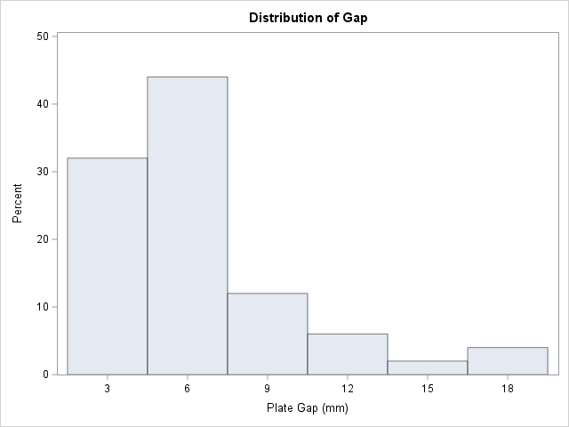
You can use PROC UNIVARIATE to create a histogram of the data, which is shown above. The next section creates a similar histogram by using the HIGHLOW statement in PROC SGPLOT.
Create data for a high-low plot
The high-low plot requires a data set that contains three variables:
- The X location for the middle of each bar.
- The Y location of the top of each bar.
- The Y location of the bottom of each bar.
You can use the OUTHIST= option on the HISTOGRAM statement in PROC UNIVARIATE to obtain a data set that contains the middle of each bar and the height of each bar. You can manually add a variable that has the constant value 0, which represents the bottom of the bars.
To simplify the process, I wrapped the relevant steps in a macro, which you can call whenever you need to use the high-low plot to emulate a histogram. The syntax for the macro call is documented below. The macro also creates several macro variables that contain useful information such as the width of the bins and the location of the first and last bins.
/* Syntax: %EmulateHistogram(dsIn=DATASET, varIn=VARIABLE) where DATASET = name of a SAS data set VARIABLE= name of variable in data set whose distribution you want to model The macro does the following: 1. Writes a data set called _HistBins that contains variables _MIDPT_ : Centers of histogram bins _COUNT_ : Frequency count in each bin _PCT_ : Percentage of observations in each bin _ZERO_ : The constant value 0, which is the lower boundary of the high-low plot 2. Creates the following macro variables: &_VARNAME : the name of the variable whose distribution is modeled &_BINSTART : the value of the center of the first bin &_BINEND : the value of the center of the last bin &_BINWIDTH : the width of the bins &_NOBS : the number of nonmissing observations in the data You can emulate a histogram by using the HIGHLOW stmt in PROC SGPLOT: proc sgplot data=_HistBins; highlow x=_midpt_ low=_zero_ high=_obspct_ / type=bar barwidth=1; yaxis min=0 offsetmin=0 grid; xaxis values=(&_binStart to &_binEnd by &_binWidth) valueshint; run; */ %macro EmulateHistogram(dsIn=, varIn=); %global _varName _binStart _binEnd _binWidth _NObs; proc univariate data=&dsIn noprint; var &varIn; histogram &varIn / outhist=_HistBins(rename=(_OBSPCT_=_PCT_)) noplot; output out=_HistOut n=_NOBS_; /* number of nonmissing observations */ run; data _HistBins; set _HistBins; _ZERO_ = 0; /* add baseline for histogram */ label _MIDPT_=&varIn _PCT_="Percent" _COUNT_="Count"; run; /* create some useful macro variables */ data _null_; set _HistBins end=EOF; if _N_=1 then call symputx("_binStart", _MIDPT_); h = dif(_MIDPT_); if EOF then do; call symputx("_binEnd", _MIDPT_); call symputx("_binWidth", h); call symputx("_varName", "&varIn"); end; run; data _null_; set _HistOut; call symputx("_NOBS", _NOBS_); run; %mend; |
Let's call the macro on the Gap variable in the Plates data set. Running the macro creates a data set named _HistBins and several macro variables.
%EmulateHistogram(dsIn=Plates, varIn=Gap) /* creates the _HistBins data set */ proc print data=_HistBins; run; |
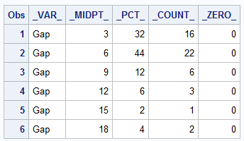
The output data set is displayed. This histogram has only six bins. The first bin is centered at Gap=3. The last bin is centered at Gap=18. The width of the bins is 3 mm, which is the difference between adjacent midpoints. You can see that the _MIDPTS_ variable provides the center of the bins. The height of the bins is provided by the _COUNT_ variable (the bin counts) or the _PCT_ variable (the bin percentages).
The macro defines several macro variables. You can use the %PUT statement to display their values in the SAS log. These statistics can be useful for customizing the high-low plot.
%PUT The following macro variables have been defined:; %PUT &=_varName &=_binStart &=_binEnd &=_binWidth &=_NObs; |
The following macro variables have been defined: _VARNAME=Gap _BINSTART=3 _BINEND=18 _BINWIDTH=3 _NOBS=50 |
Emulate a histogram by using the high-low plot
When you use the HIGHLOW statement to emulate a histogram, use the TYPE=BAR option to display the high-low plot as bars. You can use the BARWIDTH=1 option to eliminate gaps between adjacent bars. In essence, the HIGHLOW statement emulates a "HISTOGRAMPARM" statement, which is not a supported statement in PROC SGPLOT.
title "High-Low Plot: Emulation of a Histogram"; proc sgplot data=_HistBins; highlow x=_midpt_ low=_zero_ high=_pct_ / type=bar barwidth=1; /* or use _COUNT_ to use the count scale */ yaxis min=0 offsetmin=0 grid; xaxis values=(&_binStart to &_binEnd by &_binWidth) valueshint; run; |
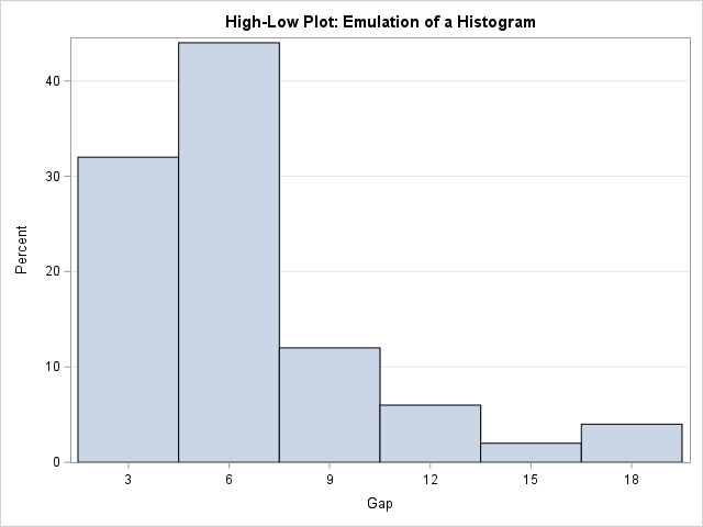
The high-low plot looks similar to the histogram that was created by PROC UNIVARIATE. I used three macro variables to place tick marks at the center of the bins. If you do not manually specify the tick values, the X axis will contain ticks in locations that might not correspond to the centers of the bars.
Summary
PROC UNIVARIATE (and PROC SEVERITY) enable SAS users to overlay about 20 common density curves on a histogram of data. To overlay a custom density curve requires some manual effort. For one curve, you can use a GTL method to overlay the histogram and the curve. For overlaying multiple curves, you can emulate a histogram by using a high-low plot. The %EmulateHistogram macro in this article enables you to quickly create a data set and macro variables that you can use on the HIGHLOW statement in PROC SGPLOT. The high-low plot is compatible with many other plot types, including the SERIES statement, so this is the first step towards overlaying custom density curves on a "histogram." In a subsequent article, I show how to create and overlay custom density curves.

1 Comment
Pingback: Overlay multiple custom density curves on a histogram in SAS - The DO Loop