Get the right information, with visual impact, to the people who need it
Finding patterns in big data with SAS/GRAPH

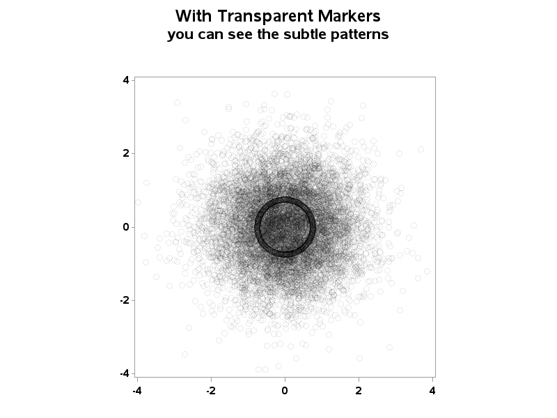
When working with "big data" you usually have too many points to view in a plot, and end up subsetting or summarizing the data. But now, in SAS 9.3, you have an alternative! For example, the following scatter plot of 10,000+ points is just a visual "blob": But using a new
