Get the right information, with visual impact, to the people who need it
Analyzing 60 years of tornado data with an animation

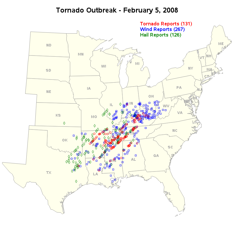
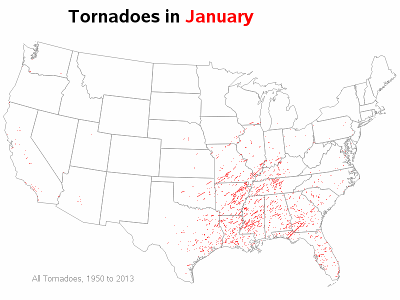
With tornadoes in the news lately, I wondered how I might could use SAS to analyze tornado data. How about animating 60 years of tornado path data? ... I was using Google to search for ways to analyze tornado data, and found an example on ustornadoes.com that animates the tornado