Data Visualization

Get the right information, with visual impact, to the people who need it

Data Visualization
Ian Jones 0
Time for VirtualOil 2.0?

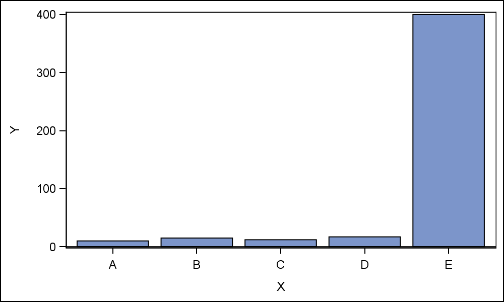
Since our last VirtualOil update in May, oil prices have continued to take a beating. As the chart of the rolling five-year portfolio shows, much of our strip of options is now out-of-the-money and the average value per barrel of that optionality has sunk below $7. No surprise then that

Data Visualization
Sanjay Matange 0
Broken Axis Redux

Often when the data includes some extreme difference in measures or some outliers, the plot of the data points can get skewed due to the need to accommodate the extreme outliers.  The bulk of the observations get squeezed into a smaller region of the plot.  While this may be useful

1 383 384 385 386 387 538