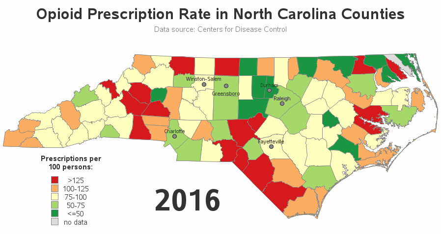
Get the right information, with visual impact, to the people who need it
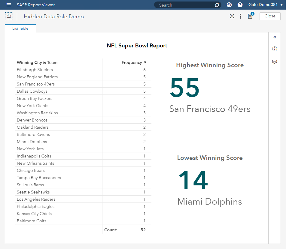
The power behind a Hidden Data Role in SAS Visual Analytics

SAS Visual Analytics 8.2 introduces the Hidden Data Role. This role can accept one or more category or date data items which will be included in the query results but will not be displayed with the object. You can use this Hidden Data Role in: Mapping Data Sources. Color-Mapped Display