Axis values display

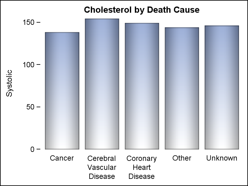
Displaying nicely rendered axis values reduces clutter and makes the graph more readable. With SAS 9.4, we added the ability for splitting x-axis tick values on white space to create a nice and readable x-axis as shown in the graph on the right. It is always a challenge to fit