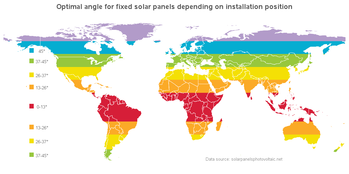
In recent years, solar panels have become much more economical, and therefore more popular. But because of the curvature of the Earth, the angle at which you need to install the panels varies, depending on where you live. In this example, I demonstrate how to visualize this kind of data
Tag: solar
Using a peekaboo map to align your solar panels
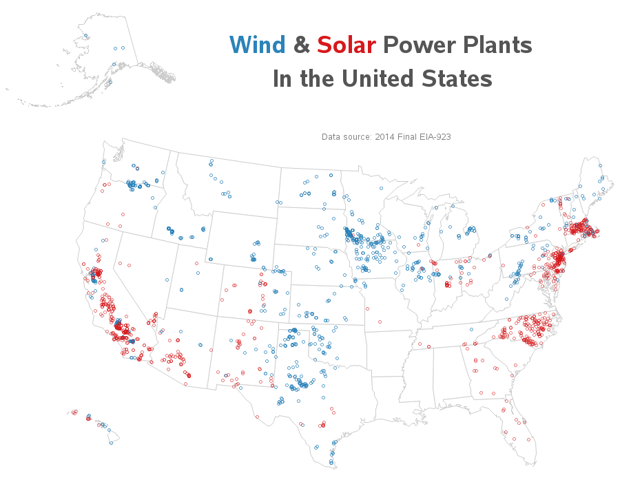
Solar and wind power in the United States
Where is solar and wind power generated in the US? Let's visualize this data on a map... I recently saw the following map on the metricmaps.org website. It caught my attention because it looks like North Carolina has a lot of solar power plants, whereas our neighboring states have very few.
What's the solar power potential in your area?
Have you ever wondered whether the area where you live is a good location for producing solar power? Let's create a SAS map to help find out! To get you in the right frame of mind, here is an awesome picture of some Arizona sunshine, that my good friend Eva