Let's take a look at the design and implementation of SAS functions in financial calculations. We'll do this through examples calculating and analyzing the monthly payment, interest, and principal for CPM/CAM mortgages.

Let's take a look at the design and implementation of SAS functions in financial calculations. We'll do this through examples calculating and analyzing the monthly payment, interest, and principal for CPM/CAM mortgages.

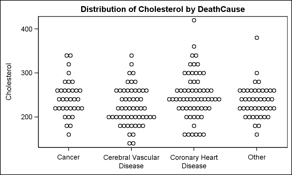
A Turnip Graph displays the distribution of an analysis variable. The graph displays markers with the same (or close) y coordinate by displaying the markers spread out over the x-axis range in a symmetric pattern. Recently, a question was posted on the SAS Communities page regarding such a graph. Here is an example of

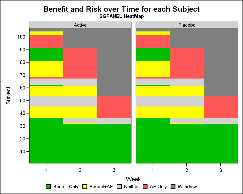
Let us continue our review of the Clinical Graphs included in the CTSPedia repository. Today, I noticed this Heatmap of Benefits and Risks over Time for Subjects in a study by Treatment, submitted by Max Cherny using "R" code. I thought it would be a good exercise to see how to build this