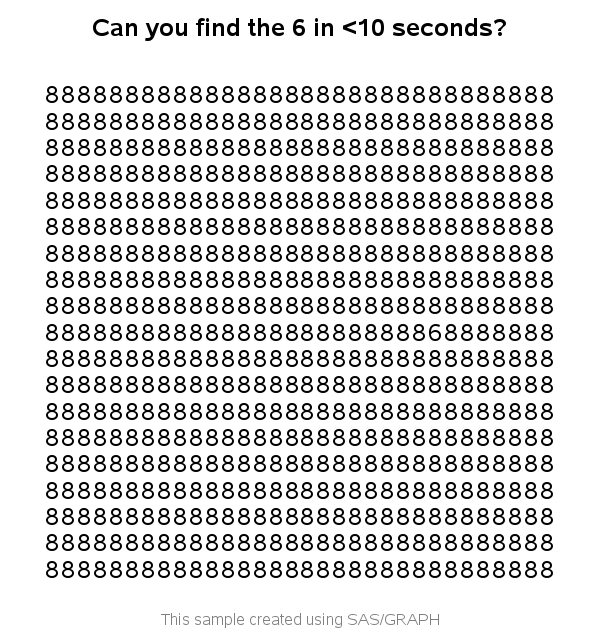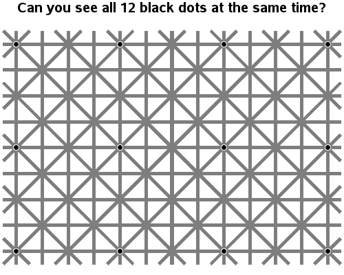
Hopefully if you're viewing the eclipse today, you'll be using one of the safe methods that won't harm your eyes! ... But if you're somewhat of a trickster, here's an optical illusion you can send your friends after the eclipse, that might make them wonder (just for a second) if
Tag: perception
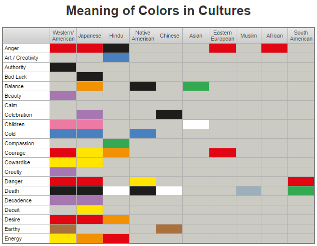
Choosing great colors for a graph is sometimes the most difficult part. And here is yet another thing you need to worry about ... sometimes colors represent different things in different cultures! In this blog post, I improve a graphic to help you get a grasp on those color-to-culture relationships.
When using visual analytics, it's important to realize that WYSIWYG (what you see is what you get) is not always true. By recognizing a few optical illusions and tricks, you might become a better data analyst ... and have some fun along the way. Let's start with the Koffka Rings
My blog posts focus on visual data analysis, and many of them use geographical maps. Therefore I hope you will have fun with a quick geography quiz, which I created using SAS/Graph ... And what, you might
I recently saw a cool graph showing the US import/export trade deficit. But after studying it a bit, I realized I was perceiving it wrong. Follow along in this blog, to find out what the problem was, and how I redesigned the graph to avoid it. I was looking through dadaviz.com
I saw the dress photo as blue & black. If you're a female, even if we perceived the exact same color, you might might not have said 'blue & black'. That's because women have a larger color vocabulary than men, and you might have elaborated on exactly which blue and
I'm always trying to find new uses for SAS - this time I've written a proof-of-concept that shows how you might use SAS to create charts that test for color blindness. If nothing else, I think it's a fun example :) First, I did a Google search, and looked at several