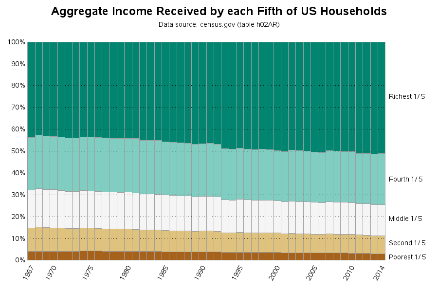
Building a better income inequality graph
I hear a lot of talk about income inequality in the US ("the rich get richer..." and such) - especially as elections approach. I also see a lot of graphs, and they all seem to define their numbers slightly differently. I'm not in a position to improve the way income

