Tag: HighLow Plot

Data Visualization
Sanjay Matange 0
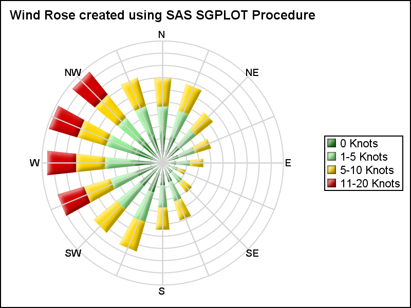
Polar Graph - Wind Rose

Last week I posted an article on displaying polar graph using SAS.  When the measured data (R, Theta) are in the polar coordinates as radius and angle, then this data can be easily transformed into the XY space using the simple transform shown below.     x=r*cos(theta * PI / 180);     y=r*sin(theta * PI

Data Visualization
Sanjay Matange 0
CandleStick Chart

A HighLow plot is very popular in the financial industry, often used to track the periodic movement of a stock or some instrument or commodity.  The CandleStick Chart is one specific type of high low plot, purportedly originating in Japan for tracking of financial instruments in the rice trade. Creating a

Data Visualization
Sanjay Matange 0
Swimmer plot

At PharmaSUG 2014 in San Diego, I had the pleasure of attending "Swimmer Plot: Tell a Graphical Story of Your Time to Response Data Using PROC SGPLOT", by Stacey Phillips.  In this paper, Stacey presented an interesting graph showing the effects of a study drug on patients' tumor size. Stacey

1 2 3 4 7