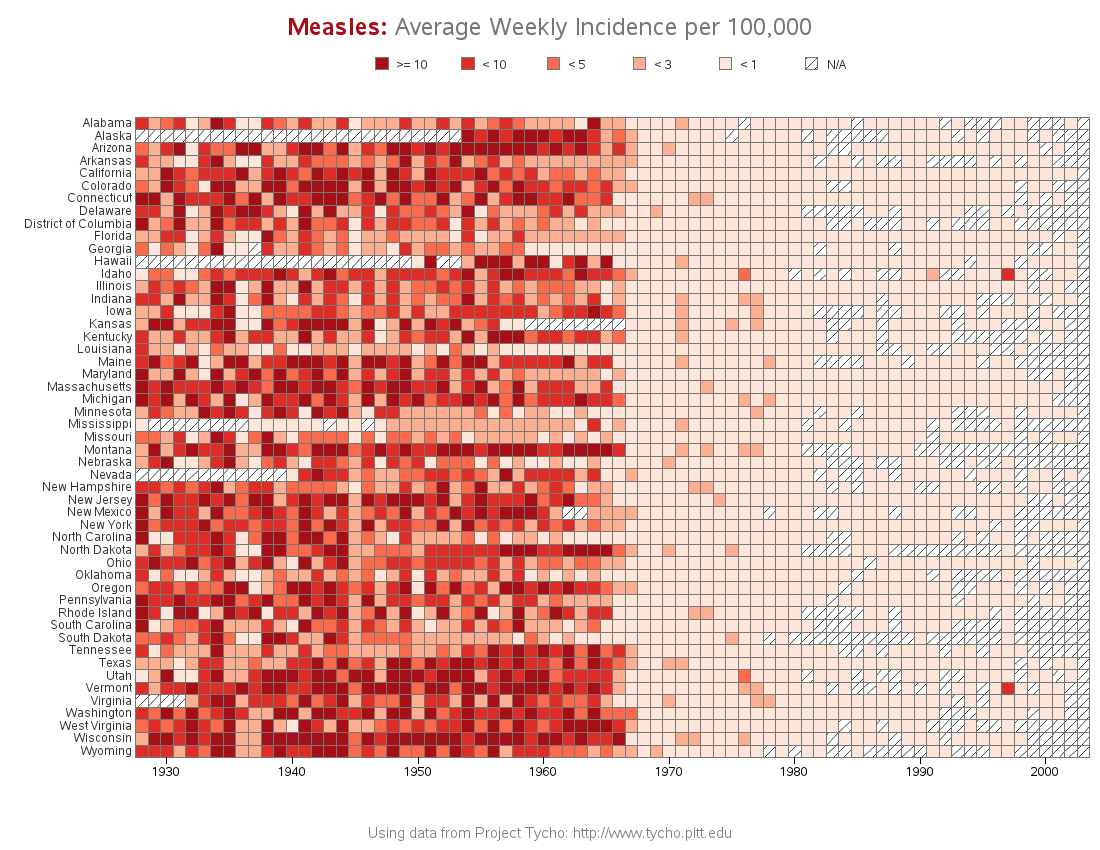
The Wall Street Journal recently published some graphs about seven infectious diseases, and I tried using SAS to improve the graphs ... it's a veritable infectious disease (graph) bake-off! Let's start with Measles ... here's a screen-capture of WSJ's measles graph: In general, their graph is eye-catching, and I learned a lot
Tag: health analytics
How to make infectious diseases look better

The promise of integrated care for mental illness prevention and treatment
The impact of mental illness on individuals, families, the health system and even the economy is broad and significant. In this, the latest post in my mental health series, I’d like to talk about what can be done to help. Prevention and early detection are just parts of an integrated
Building a better meningitis map
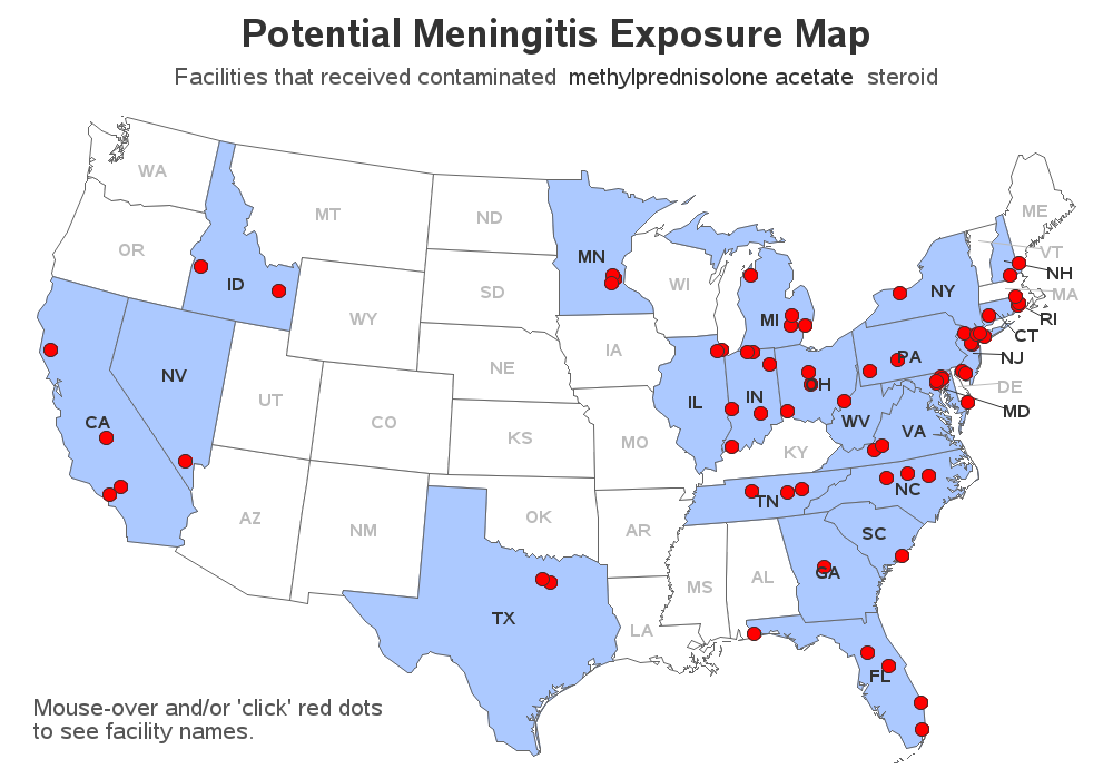
You've all heard about the recent meningitis outbreak, right? Being a data-guy and a map-guy, I went looking for maps related to the outbreak. I found the following map on the Centers for Disease Control (CDC) website. It shows the states that received the recalled drug used in epidurals (for back