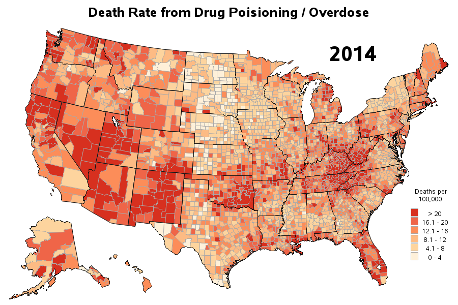
Drug overdose deaths are on the rise in the US

Lately I've seen several articles about drug overdose deaths being on the increase. But I didn't really like the graphs in those articles, so I tried to create some better ones using SAS ... For example, here's a map from the National Center for Health Statistics website (see the 3rd dashboard/tab