Analysis of clinical data is easier when the data is presented in a visual form. Clinical graphs have special requirements to deliver study data together in one concise graph, often with statistical information that is aligned with the data values on the x or y axis. SAS SG Procedures and GTL provide you the features you need to create effective clinical graphs. Also see “Clinical Graphs using SAS”, a SAS Press.
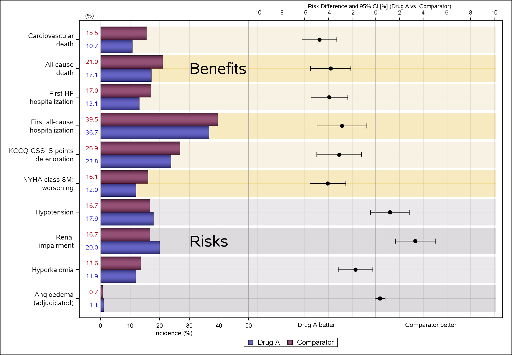
Clinical Graphs - Risk Difference Plots

Often I have written articles that are motivated by some question by a user on how to create a particular graph, or how to work around some shortcoming in the feature set to create the graph you need. This time, I got a question about Clinical Graphs that were mostly working