We have updated our software for improved interpretability since this post was written. For the latest on this topic, read our new series on model-agnostic interpretability.
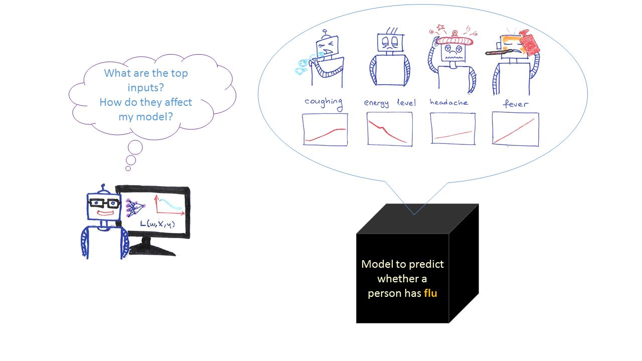
Assessing a model`s accuracy usually is not enough for a data scientist who wants to know more about how a model is working. Often data scientists want to know how the model input variables work and how the model’s predictions change depending on the values of the input variables. They can use this information to find the flaws in their models, to select the best model, and to explain their models to stakeholders such as credit card applicants, and medical patients.
Finding the important variables is helpful to discovering the main drivers. But they don`t provide information about the relationship between input variables and predictions.
Partial dependence (PD) and individual conditional expectation (ICE) plots illustrate the relationships between one or more input variables and the predictions of a black-box model. They are both visual, model-agnostic techniques. For example, a PD plot can show whether estimated car price increases linearly with horsepower or whether the relationship is another type, such as a step function, curvilinear, and so on. ICE plots can explore even deeper to explore individual differences and identify subgroups and interactions between model inputs.
Partial dependence plots
A partial dependence (PD) plot depicts the functional relationship between a small number of input variables and predictions. They show how the predictions partially depend on values of the input variables of interest. For example, a PD plot can show whether the probability of flu increases linearly with fever. It can show whether high energy level will decrease the probability of having flu. PD can also show the type of relationship, such as a step function, curvilinear, linear and so on.
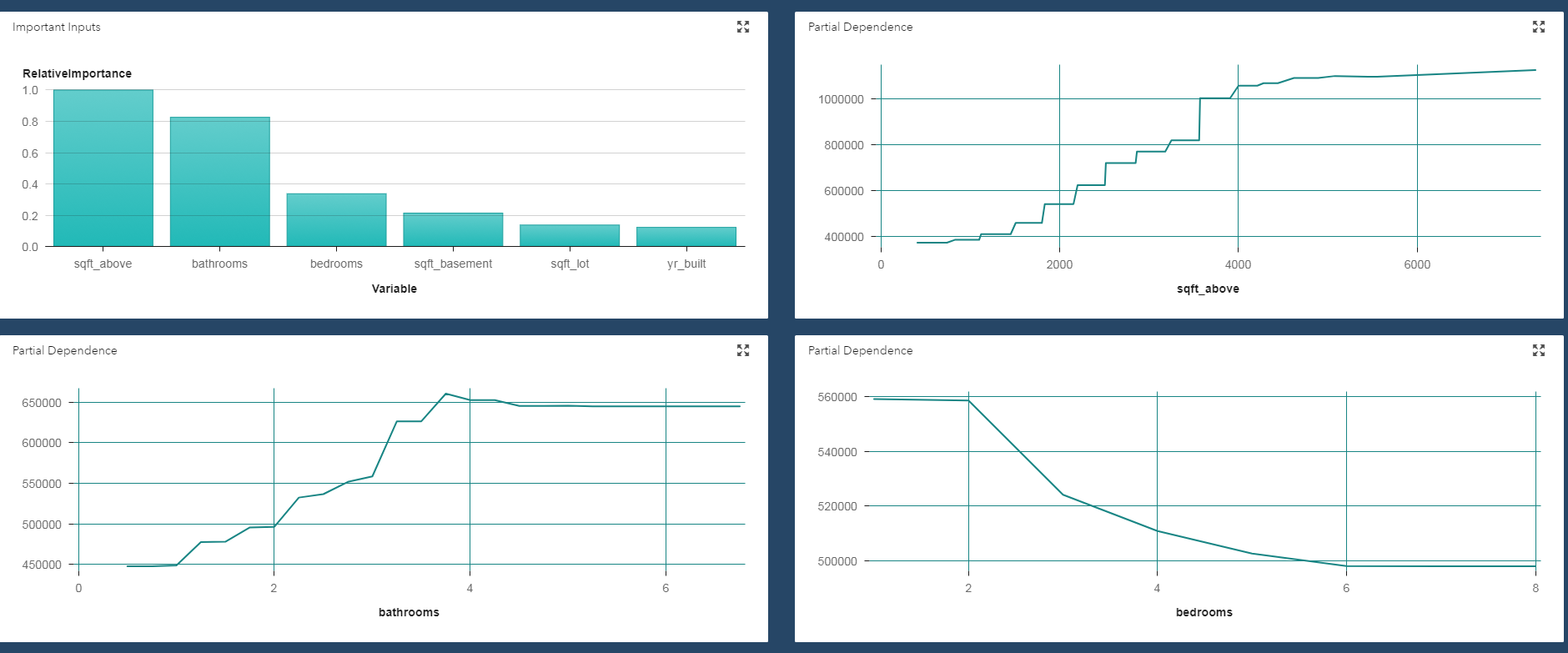
The simplest PD plots are 1-way plots, which show how a model’s predictions depend on a single input. The plot below shows the relationship (according the model that we trained) between price (target) and number of bathrooms. Here, we see that house prices increase as we increase the number of bathroom up to 4. After that it does not change the house price.
PD plots look at the variable of interest across a specified range. At each value of the variable, the model is evaluated for all observations of the other model inputs, and the output is then averaged. Thus, the relationship they depict is only valid if the variable of interest does not interact strongly with other model inputs.
Since variable interactions are common in actual practice, you can use higher-order (such as two-way) partial dependence plots to check for interactions among specific model variables.
Individual conditional expectation (ICE) plots
PD plots provide a coarse view of a model’s workings. On the other hand, ICE plots enable you to drill down to the level of individual observations. They help you to explore individual differences and identify subgroups and interactions between model inputs. You can think of each ICE curve as a kind of simulation that shows what would happen to the model’s prediction if you varied one characteristic of a particular observation. To avoid visualization overload, ICE plots only show one model variable at a time.
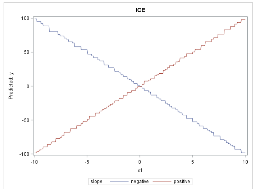
The PD function in the figure below is essentially flat, giving the impression that there is no relationship between X1 and the model’s predictions.
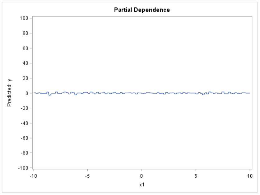
When we look at the ICE plots, they present a much different picture: the relationship is strongly positive for one observation, but strongly negative for the other observation. So contrary to what the PD plot tells us, the ICE plot shows that X1 is actually related to the target; it’s just that there are strong differences in the nature of that relationship, depending on the values of the other variables. Basically, ICE plots separate the PD function (which, after all, is an average) to reveal interactions and individual differences.
You can easily compute PD and ICE plots for your machine learning models. However, if you want efficiency for large data sets, you might need to make some adjustments. For example, you can bin selected variables, or you can sample or cluster your data set. Those techniques can give you reasonable approximations of the actual plots much more quickly.
If you want to learn more about PD and ICE plots, Ray Wright wrote a great paper that shows how PD and ICE plots can be used to compare and gain insight from machine learning models, particularly so-called “black-box” algorithms such as random forest, neural network, and gradient boosting. In his paper he also discusses limitations of PD plots and offers recommendations about how to generate scalable plots for big data. The paper includes SAS code for both types of plots.
You can also check github for the %partialDep macro to create a PD plot for each requested input that is appropriate to that input’s measurement level.
Watch the webinar: Implementing AI Systems with Interpretability, Transparency and Trust