In SAS Viya, users can customize a project management environment by using a file that contains metadata about the organization’s project progress. This process allows the management team to track and interact with the project’s ongoing steps.
Another tool that can be used for project planning is SAS' optimization procedure, PROC OPTMODEL. This allows the user to select when projects can be run due to budgetary or workforce concerns.
Project Status
The Project Status can be achieved through a dataset that contains metadata about the project. There are several ways to accomplish this, but a good place to start is to construct the file as shown in Figure 1.
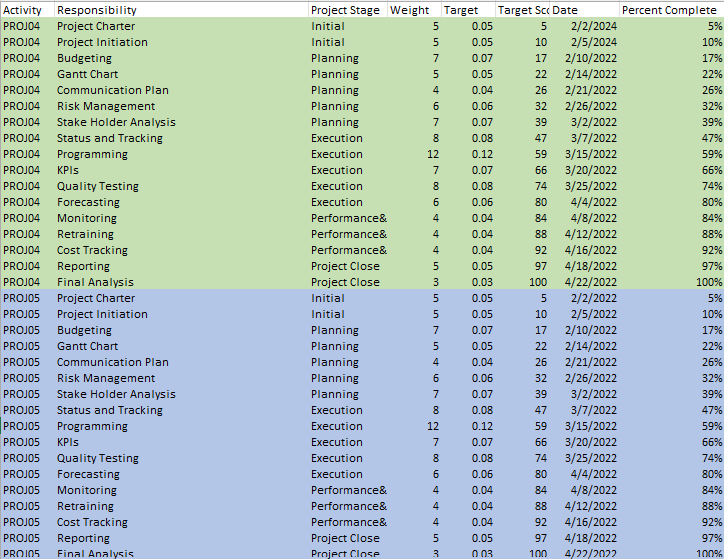
This metadata contains columns with specific values that will help us interact with the Visual Analytics Objects.
The Activity object contains the same value for every line of a particular project. In this case, PROJ04 is the project. This project has 17 steps (this can be seen in the “Responsibility” column) to completion, going from Project Charter to Final Analysis. This gives us a specific tracker telling us where the user currently is with the project.
The Project Stage is a general area where we give the approximate stage of the project and provides another opportunity to add more informational data to the dataset.
Then we have the Weight, Target and Target Score columns to add in the progress bar for the visualization. The time data gives us the chance to use a time series chart to see where we are in the project. Another progress metadata visual comes in the form of Percent Complete. Each of these columns can be used for different use cases in the visualizations. It’s to give the user more options when choosing their visuals.
Moving to Viya
The dataset can be used to create this interactive visual when moving to SAS Viya.
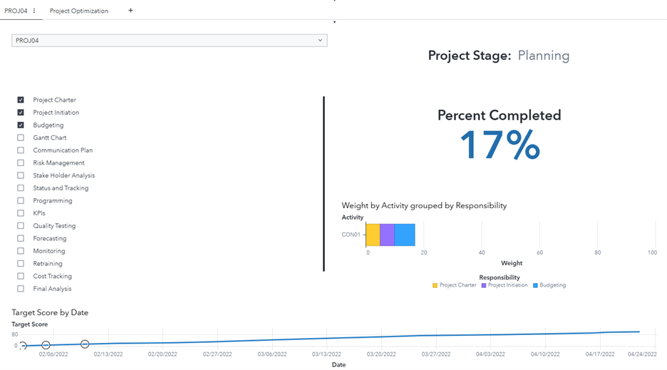
This visualization (Figure 2) uses a drop-down list with the Activity column, a checklist with the individual project steps with the Responsibility column, a key value indicator for the Project Stage and Percent Completed columns. Percent Completed uses a custom calculation to aggregate the Weight column for each step that’s completed from the checklist and reflects that on the bar chart. Lastly, the time series chart at the base of the visualization updates for each step selected. Notes can be added with a Text Object to track any occurrences within the project.
The drop down and checklist have had their Actions tab selected to interact with the Key Values, Bar chart, and Time Series chart.
Project Optimization
Optimization requires a specific structure to the dataset. In my code, it was placed into SAS through the datalines.
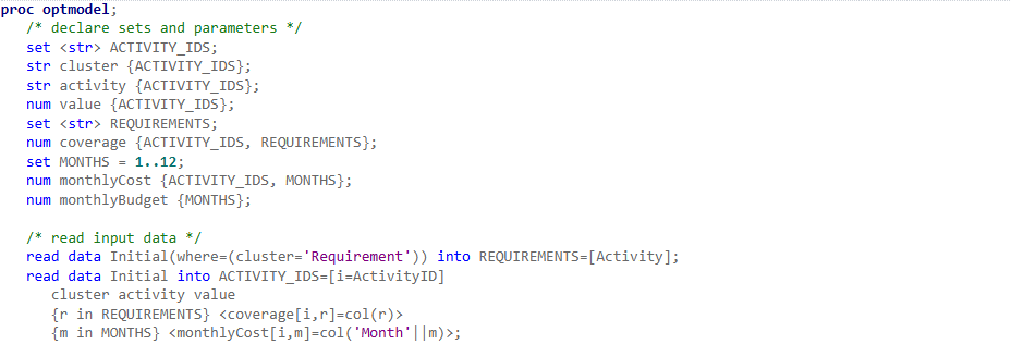
This code uses the data in the Initial dataset with the limitations of the ProjectSetup data. The ProjectSetup data is used to give us a monthly budget/workforce estimation. Once this is run, output dataset is created. This dataset then needs to be transposed using a SAS task (or code).
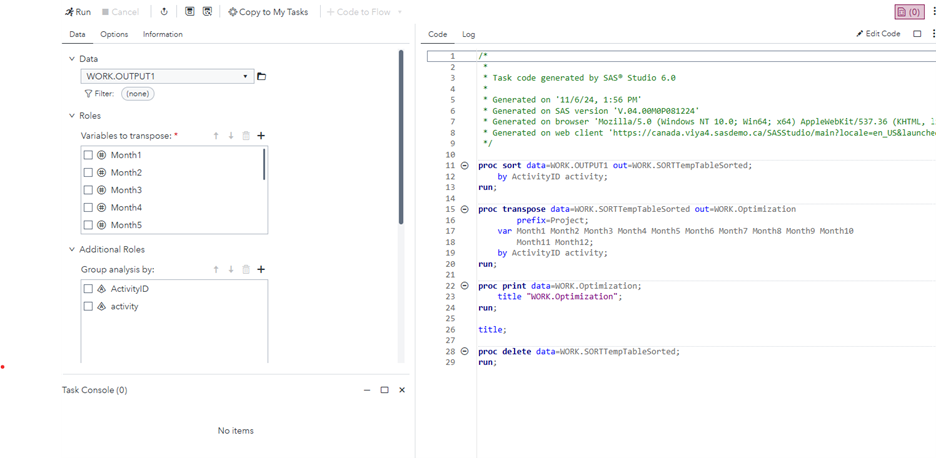
Using the Months as the roles and the ActivityID and activity as the additional roles, the dataset can now be used to produce a visualization.
Using this new dataset, we can create a bar chart with the activity and Month values in a stacked format giving us Figure 5.
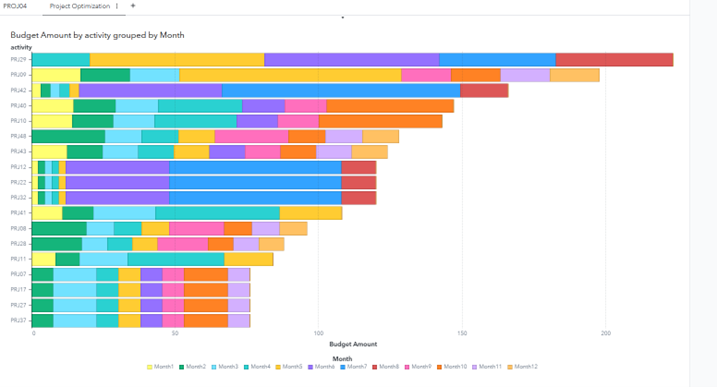
This allows us to visualize the monthly allocations for each project and set up our projects for optimal budgetary use.
This optimization method can also be expanded upon by using a Job Object in VA to replace the limit values for each project. This allows us to change those values and rerun the optimization, updating the visual and budget allocations.
Summary
This article shows us how to setup both a project management/status visualization as well as a project optimization code for us to allocate budget for each project. This is important to know because it becomes an additional benefit to using SAS Viya across business units.

