This blog is a continuation of a previous blog that discussed creating simulated data sets. If you have not seen it, you might want to review it, especially if you are not familiar with the RAND function.
The program that I'm going to show you simulates a drug study with three groups (Placebo, Drug A, and Drug B), two genders, and correlated values of systolic blood pressure (SBP) and diastolic blood pressure (DBP).
proc format; ❶ value $Gender '0' = 'Male' '1' = 'Female'; run; data Study; call streaminit(13579); ❷ do i = 1 to 30; do Drug = 'Placebo','Drug A','Drug B'; ❸ Subjec + 1; ❹ Gender = put(rand('Bernoulli',.5),1.); ❺ SBP = rand('Normal',160,10) - 20*(Drug = 'Drug A') ❻ - 30*(Drug = 'Drug B') - 5*(Gender = '1'); DBP = .5*SBP + 40*rand('Uniform'); ❼ SBP = round(SBP); ❽ DBP = round(DBP); output; end; end; drop i; format Gender $Gender.; run; |
❶ Create a character format that will be used to format Gender.
❷ Because this is a drug study, you want to be able to reproduce the same random sequence at a later time. If you use the same argument in CALL STREAMINIT in another program, you will create identical random streams.
❸ Remember that SAS DO LOOPS can use character values. This is very handy.
❹ This SUM statement is generating the variable Subject.
❺ The Bernoulli distribution with the second argument set to .5, will assign gender (0 or 1) with a probability of .5 for both. The PUT function in this statement is doing a numeric-to-character conversion.
❻ This is a very interesting statement. You start by choosing values for SBP from a normal distribution with a mean of 160 and a standard deviation of 10. The logical expressions such as (Drug = 'Drug A') returns a 1 if the expression if true and 0 otherwise. By multiplying this by a numeric value, you can adjust the means in the three groups. The Placebo group will have a mean close to 160—the subjects in drug group A will be approximately 20 points lower than the Placebo group and the subjects in drug group B will be approximately 30 points lower than the Placebo group. Finally, females will be approximately 5 points lower than males.
❼ DBP will be correlated with SBP because it includes a proportion of SBP in the calculation. (See the previous simulated data blog for more details about generating correlated pairs.)
❽ Although I could have added the ROUND function when SBP and DBP were created, it makes the program a bit easier to read by rounding the values in separate statements.
The figure below shows the first nine observations in the simulated Study data set. This figure as well as all the box plots and the scatter plot that follow, were created using built-in SAS Studio tasks in the cloud version called SAS OnDemand for Academics.

The next figure is a box plot with SBP as the displayed variable. As a quick review, a box plot shows a vertical line at the median (in the middle of the box). The lower and upper edges of the box represent values at the 25th and 75th percentile respectively. The diamond in the box represents the mean. The distance between the 25th and 75th percentiles is called the inter-quartile range. Finally, any points more than 1.5 inter-quartile ranges below the 25th percentile or above the 75th percentile are plotted as circles and considered outliers. You can see one outlier in the placebo group in the left portion of the box plot below.
Notice that the means are approximately where you expect them to be (Placebo around 160, Drug A around 140, and Drug B around 130. The means are slightly lower because half of the subjects are female and their systolic blood pressures were designed to be approximately 5 points lower than the males.

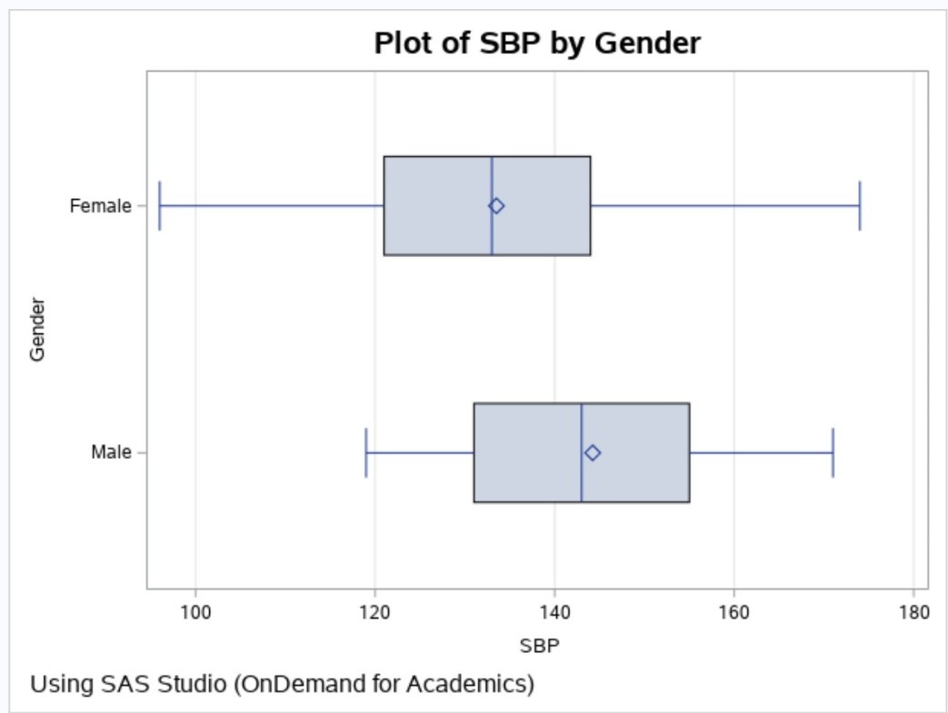
Here is a plot of SBP by Gender.
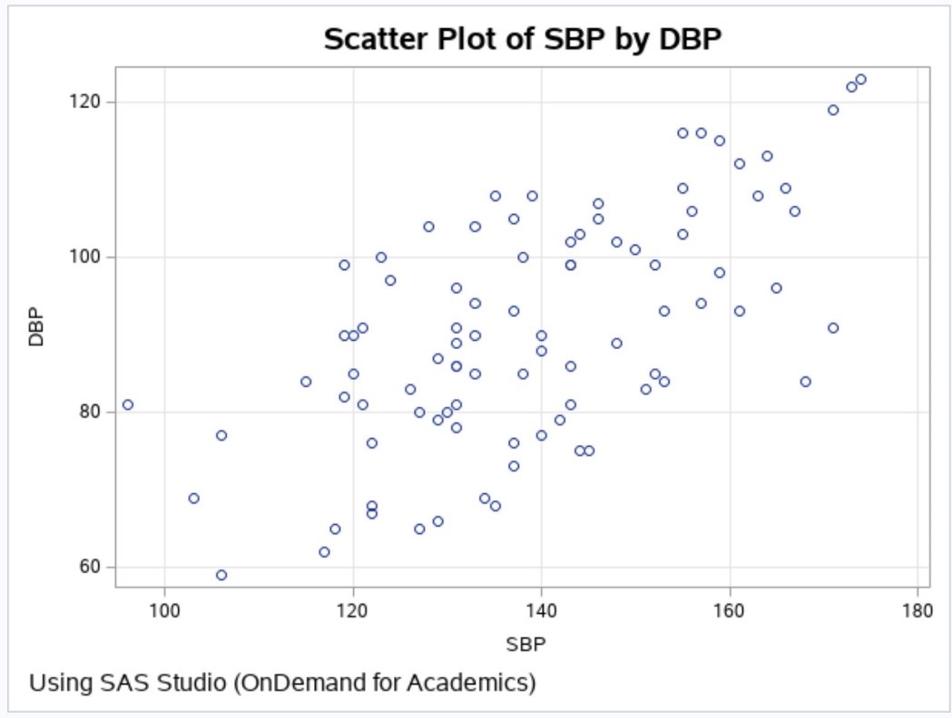
The last figure is a plot of SBP by DBP. Notice that the values are correlated (the Pearson r is approximately .64).
Using techniques similar to this program, combined with methods in the previous simulation blog, you should be able to create your own custom simulated data sets.
1 Comment
I should have mentioned in my blog, that the definitive book on simulating data is "Simulating Data with SAS", by Rick Wicklin (support.sas.com/Wicklin). Rick is an expert on random number generators and simulating data.