 Moving Average (MA) is a common indicator in stocks, securities and futures trading in financial markets to gauge momentum and confirm trends. MA is often used to smooth out short-term fluctuations and show long-term trends. But most MA indicators have big lags in signaling a changing trend. To be faster to capture a trend reversal, several New MA indicators are now available that more quickly detect trend changes – and of those, the Hull Moving Average (HMA), is one of the most popular. This post demonstrates its superiority.
A closer look at HMA
Developed by Alan Hull, it's faster and thus a more useful signal than others. Its main advantage over general MA indicators is its relative smoothness as it signals change. Commonly-used MA indicators include Simple Moving Average (SMA), Weighted Moving Average (WMA) and so on. SMA calculates the arithmetic mean of the prices, which gives individual value equal weight. WMA averages individual values with some predetermined weights.
Since moving averages are computed from prior data, all MA indicators suffer a significant drawback of being a lagging indicator. Even in a shorter-period of moving average, which has less lag than one with a longer period, a stock price may drop sharply before a MA indicator signals the trend change. The Hull Moving Average (HMA) uses weighted moving average and the square root of the period instead of the actual period itself, which leads it to be more responsive to most recent price activity, whilst maintaining smoothness.
According to Alan Hull, the formula for HMA is:
We see that the major computing components in HMA are three WMAs. Refer to the specification here, we have the corresponding WMA formula as pictured below. In the WMA formula, the weight of each price value is related to the position of the value and the period length. The more recent the higher weights, and the shorter of the period the higher weights.
HMA in action
In the remainder of this post, I will show how to calculate HMA of a stock price using calculated items in SAS Visual Analytics and show that HMA gives faster upward/downward signals than SMA. I use the data from SASHELP. STOCK with ‘IBM’ as an example. The data needs to be sorted by the date and a column (named ‘tid’) added to hold the sequence number before loading into SAS Visual Analytics for calculation. The data preparation codes can be found here. After loading the data into SAS Visual Analytics, we can start by creating the calculated items. Here, I set the period length to 5 in calculation (i.e. =5 in the formula) and calculate HMA for ‘Close’ price of IBM stock for example.
1. Calculate the first WMA like so...
... using the AggregateCells operator in SAS Visual Analytics. I name it as 'WMA(5/2 days)'. Have the data value in, note I’ve rounded the (5⁄2) to an integer of 3. That is, the aggregation is starting from the previous two (-2) row and ending at current row (0). The corresponding formula of the calculated item ‘WMA(5/2 days)’ in SAS VA is:
AggregateCells(_Sum_, ( 'Close'n * 'tid'n ), default, CellIndex(current, -2), CellIndex(current, 0)) / AggregateCells(_Sum_, 'tid'n, default, CellIndex(current, -2), CellIndex(current, 0))
2. Similarly, calculate the second in SAS Visual Analytics:
Name it as ‘WMA(5 days)’. The corresponding formula is:
AggregateCells(_Sum_, ( 'Close'n * 'tid'n ), default, CellIndex(current, -4), CellIndex(current, 0)) / AggregateCells(_Sum_, 'tid'n, default, CellIndex(current, -4), CellIndex(current, 0))
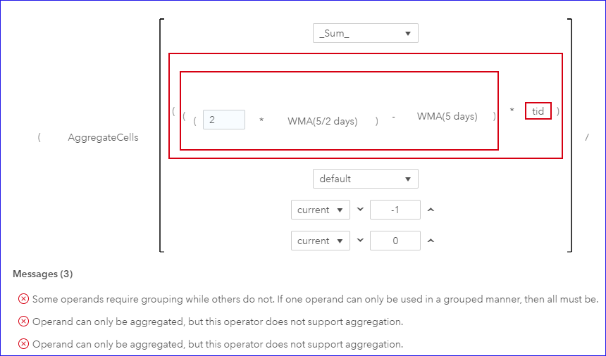
3. Now we calculate the HMA, which computes the third WMA using the two WMAs we get from above calculation. In SAS Visual Analytics, if we directly apply a similar approach for the last WMA calculation, it will show message of operands requiring group. So here, I need a workaround to make the aggregation work.
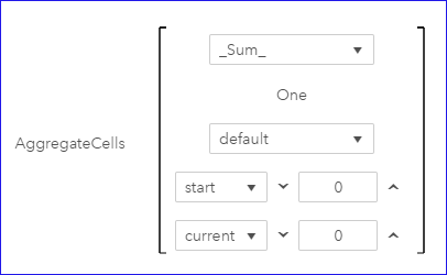
4. To work around the problem, I create an aggregated item named ‘sumtid’ to indicate the row sequence number in an aggregation way. To do this, firstly create a calculated item named ‘One’ with the constant value 1; then use AggregateCells operator creating the ‘sumtid’ to get the current row number: AggregateCells(_Sum_, 'One'n, default, CellIndex(start, 0), CellIndex(current, 0)).
5. Now we can compute the HMA in a similar way as we do for previous two WMAs. Name it as ‘HMA for close (5 days)’. Since int(√(5 ))=2, the starting position of the aggregation is set to the previous row (-1) and the ending position is set to the current row (0). Note the operands are now using the aggregated item ‘sumtid’. The formula for the ‘HMA for close (5 days)’ item is:
AggregateCells(_Sum_, ( ( ( 2 * 'WMA(5/2 days)'n ) - 'WMA(5 days)'n ) * 'sumtid'n ), default, CellIndex(current, -1), CellIndex(current, 0)) / AggregateCells(_Sum_, 'sumtid'n, default, CellIndex(current, -1), CellIndex(current, 0))
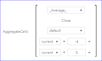
So far, we’ve created the Hull Moving Average of IBM stock Close price and saved it in the calculated item ‘HMA for close (5 days)’. We can easily draw its time series plot in SAS Visual Analytics. Now, I'll create a Simple Moving Average of ‘SMA for the close (5 days)’ with an equal weight, and then compare it with the HMA. The formula for ‘SMA for the close (5 days)’ is: AggregateCells(_Average_, 'Close'n, default, CellIndex(current, -4), CellIndex(current, 0))
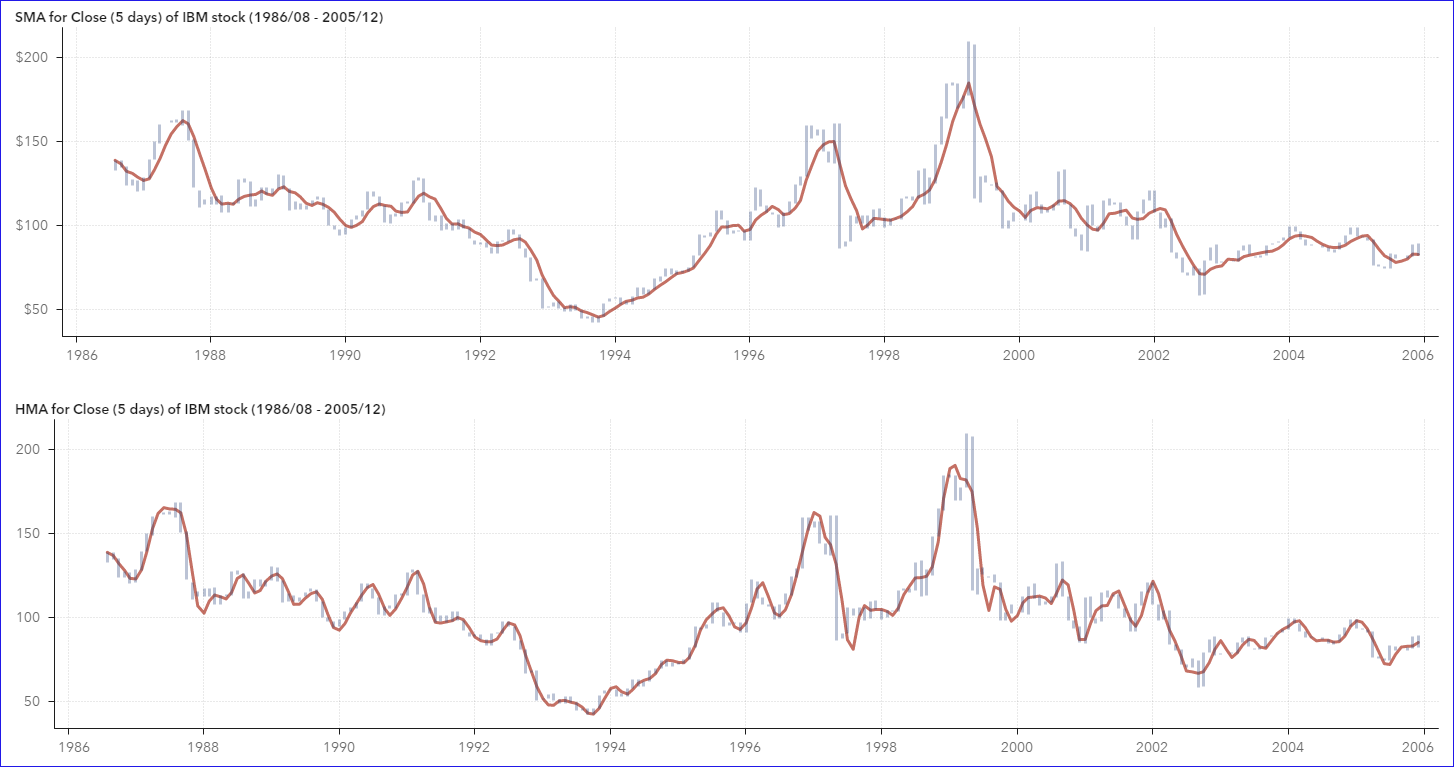
Now let’s visualize the ‘SMA for the close (5 days)’ and ‘HMA for close (5 days)’ respectively. In below chars, each grey vertical bar shows the monthly price span of IBM stock, and the red lines correspond to SMA and HMA respectively. With the upper SMA line, we see constant lags with price changing and poor smoothness. And with bottom HMA line, we see rapid keep-up with price activities while maintaining good smoothness.
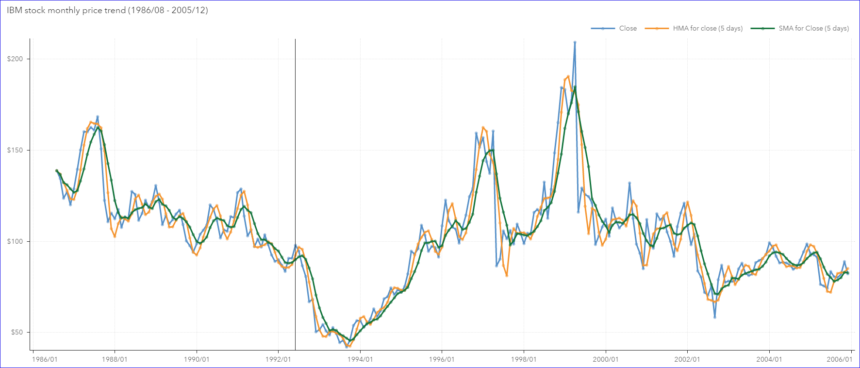
Below is the comparison of the ‘SMA for the close (5 days)’, ‘HMA for close (5 days)’ and the Close price. Besides smoothing out some fluctuations in Close price, the HMA indeed gives better signal than SMA does in indicating a turning point when there is an upward/downward trend reversal. Note the obvious lags of SMA compared to HMA. For example, compare the trends around the reference line in the visualization below. The Close price reached to a local peak at Jun1992 and started to go down from Jul1992. HMA quickly reflected the downward turn with one lag at Aug1992, while SMA still showed the rising trend in the meantime. SMA started to go down with one more lag to give the reversal signal.
Now it’s easy to understand why HMA is a better indicator than SMA to signal the reversal point. What has been your experience with HMA?




5 Comments
Great example, I was able to follow this and replicate it in my VA. I was happy to see how to overcome aggreagtion problem. The only thing, I did not know how to draw the price span as bars. It looks much nicer for comparison than lines. What kind of graph is it? regards Karolina
Hi Koralina,
The price span bars are from the customer graph, which I created with a vector plot and a time-series plot. When disable the arrow option in the vector plot in SAS Graph Builder, and adjust the line width, they will show as span bars.
Regards
Cindy
Rick Wicklin published a related post on how to create a customer time-series smoother with SAS/IML software: https://blogs.sas.com/content/iml/2019/09/16/hull-moving-average-sas.html
Awesome!
Useful! Thanks.