Data density estimation is often used in statistical analysis as well as in data mining and machine learning. Visualization of data density estimation will show the data’s characteristics like distribution, skewness and modality, etc. The most widely-used visualizations people used for data density are boxplot, histogram, kernel density estimates, and some other plots. SAS has several procedures that can create such plots. Here, I'll visualize the kernel density estimates superimposing on histogram using SAS Visual Analytics.
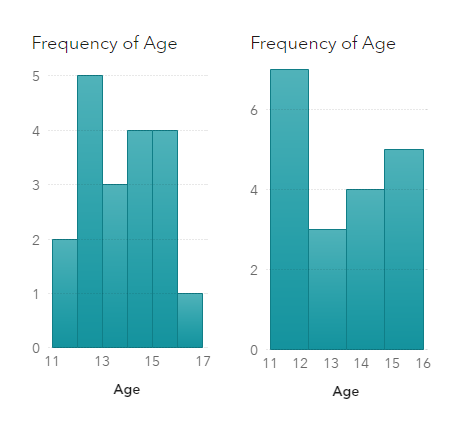
A histogram shows the data distribution through some continuous interval bins, and it is a very useful visualization to present the data distribution. With a histogram, we can get a rough view of the density of the values distribution. However, the bin width (or number of bins) has significant impact to the shape of a histogram and thus gives different impressions to viewers. For example, we have same data for the two below histograms, the left one with 6 bins and the right one with 4 bins. Different bin width shows different distribution for same data. In addition, histogram is not smooth enough to visually compare with the mathematical density models. Thus, many people use kernel density estimates which looks more smoothly varying in the distribution.
Kernel density estimates (KDE) is a widely-used non-parametric approach of estimating the probability density of a random variable. Non-parametric means the estimation adjusts to the observations in the data, and it is more flexible than parametric estimation. To plot KDE, we need to choose the kernel function and its bandwidth. Kernel function is used to compute kernel density estimates. Bandwidth controls the smoothness of KDE plot, which is essentially the width of the sliding window used to generate the density. SAS offers several ways to generate the kernel density estimates. Here I use the Proc UNIVARIATE to create KDE output as an example (for simplicity, I set c = SJPI to have SAS select the bandwidth by using the Sheather-Jones plug-in method), then make the corresponding visualization in SAS Visual Analytics.
Visualize the kernel density estimates using SAS code
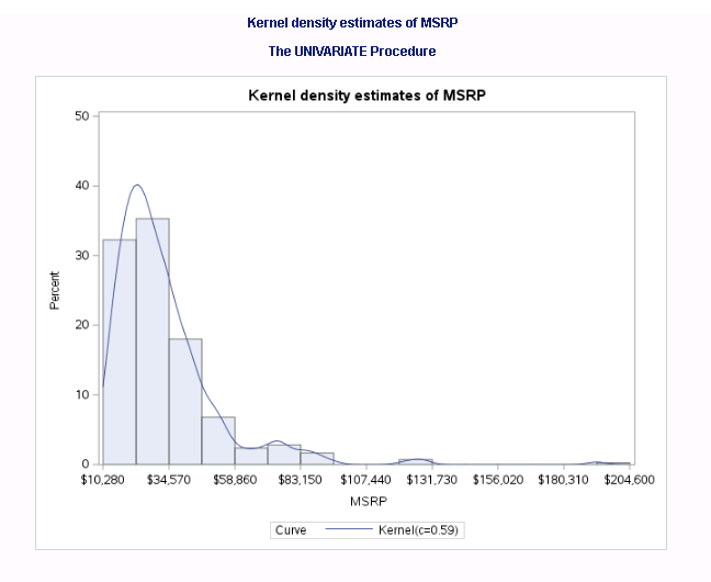
It is straightforward to run kernel density estimates using SAS Proc UNIVARIATE. Take the variable MSRP in SASHELP.CARS dataset as an example. The min/max value of MSRP column is 10280 and 192465 respectively. I plot the histogram with 15 bins here in the example. Below is the sample codes segment I used to construct kernel density estimates of the MSRP column:
title 'Kernel density estimates of MSRP'; proc univariate data = sashelp.cars noprint; histogram MSRP / kernel (c = SJPI) endpoints = 10280 to 192465 by 12145 outkernel = KDE odstitle = title; run; |
Run above code in SAS Studio, and we get following graph.
Visualize the kernel density estimates using SAS Visual Analytics
- In SAS Visual Analytics, load the SASHELP.CARS and the KDE dataset (from previous Proc UNIVARIATE) to the CAS server.
- Drag and drop a ‘Precision Container’ in the canvas, and put a histogram and a numeric series plot in the container.
- Assign corresponding data to the histogram plot: assign CARS.MSRP as histogram Measure, and ‘Frequency Percent’ as histogram Frequency; Set the options of the histogram with following settings:
-
Object -> Title: No title;
Graph Frame: Grid lines: disabled
Histogram -> Bin range: Measure values; check the ‘Set a fixed bin count’ and set ‘Bin count’ to 15.
X Axis options:
Fixed minimum: 10280
Fixed maximum: 192465
Axis label: disabled
Axis Line: enabled
Tick value: enabled
Y Axis options:
Fixed minimum: 0
Fixed maximum: 0.5
Axis label: disabled
Axis Line: disabled
Tick value: disabled
- Assign corresponding KDE data to the numeric series plot. Define a calculated item: Percent as (‘Percent of Observations Per Data Unit’n / 100) with the format of ‘PERCENT12.2’, and assign it to the ‘Y axis’; assign the ‘Data Value’ to the ‘X axis.’ Now set the options of the numeric series plot with following settings:
-
Object -> Title: No title;
Style -> Line/Marker: (change the first color to purple)
Graph Frame -> Grid lines: disabled
Series -> Line thickness: 2
X Axis options:
Axis label: disabled
Axis Line: disabled
Tick value: disabled
Y Axis options:
Fixed minimum: 0
Fixed maximum: 0.5
Axis label: enabled
Axis Line: enabled
Tick value: enabled
Legend:
Visibility: Off
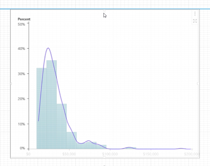
- Now we can start to overlay the two charts. As can be seen in the screenshot below, SAS Visual Analytics 8.3 provides a smart guide with precision container, which shows grids to help you align the objects in it. If you hold the ctrl button while dragging the numeric series plot to overlay the histogram, some fine grids displayed by the smart guide to help you with basic alignment. It is a little tricky though, to make the overlay precisely, you may fine tune the value of the Left/Top/Width/Height in the Layout of VA Options panel. The goal is to make the intersection of the axes coincides with each other.
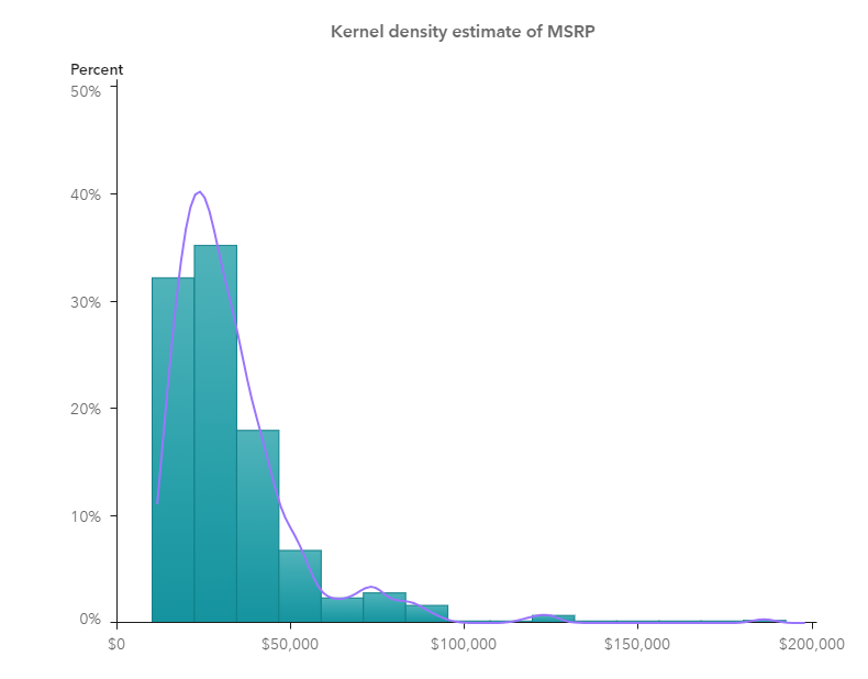
After that, we can add a text object above the charts we just made, and done with the kernel density estimates superimposing on a histogram shown in below screenshot, similarly as we got from SAS Proc UNIVARIATE. (If you'd like to use PROC KDE UNIVAR statement for data density estimates, you can visualize it in SAS Visual Analytics in a similar way.)
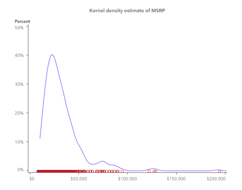
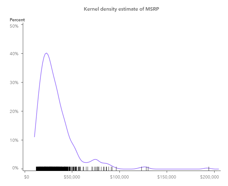
To go further, I make a KDE with a scatter plot where we can also get impression of the data density with those little circles; another KDE plot with a needle plot where the data density is also represented by the barcode-like lines. Both are created in similar ways as described in above histogram example.
So far, I’ve shown you how I visualize KDE using SAS Visual Analytics. There are other approaches to visualize the kernel density estimates in SAS Visual Analytics, for example, you may create a custom graph in Graph Builder and import it into SAS Visual Analytics to do the visualization. Anyway, KDE is a good visualization in helping you understand more about your data. Why not give a try?