Introduced with SAS Visual Analytics 8.2 is a new object named: Key Value. The intent of this object is call attention to an aggregated value for a measure, a category, or both. For additional specifics, see the documentation here.
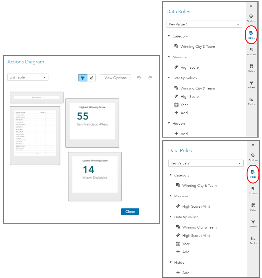
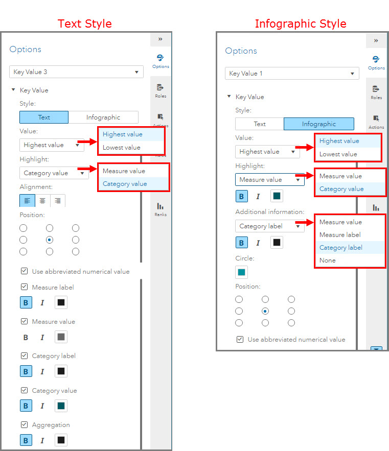
The Key Value object has two styles available: Text or Infographic. For both styles you will need to select if you want to return the highest or lowest value as well as if you want to highlight the Measure or Category value.
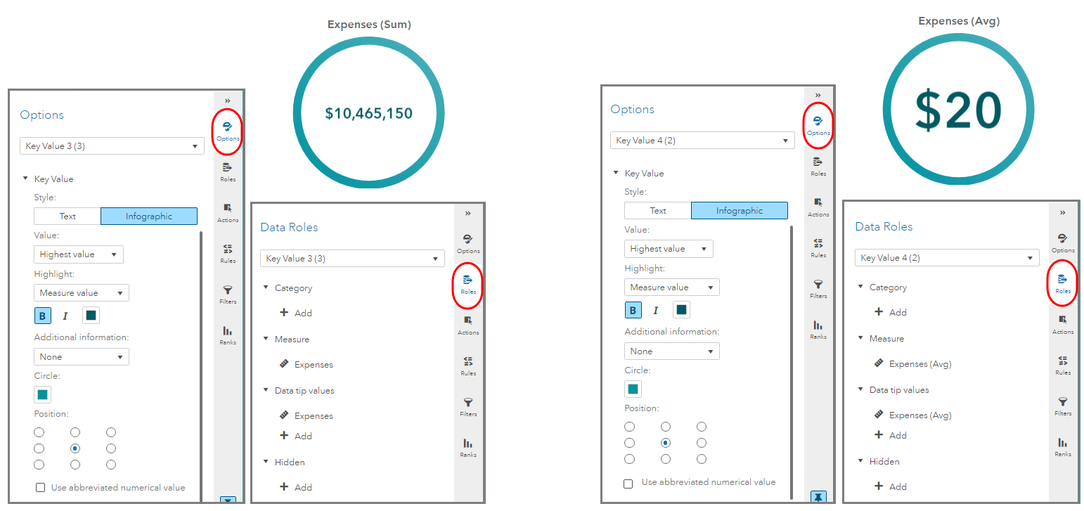
If you are using the Infographic style then there will be an additional drop down to add a label for the measure value, measure label, category label or none.
I’ve mocked up several reports to show some of the combinations available to give you an idea of what the Key Value object can look like. Toward the end of the blog, I will add additional reports to provide design ideas for placement and action assignments. Click on any image to enlarge.
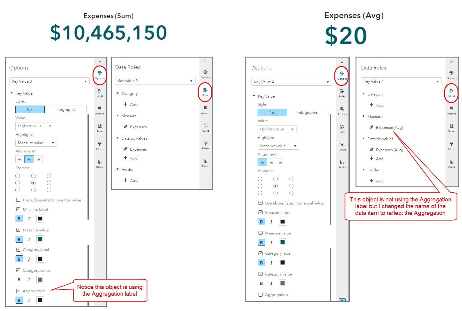
Text Style with Measure Value Highlight
Here you can see in the report, I am highlighting two measure values. Both are representing the Highest value but I selected one to show the aggregation and the other not. I was able to mimic similar headings by renaming my data item. Be sure to look at the Options and Roles pane for the assignments to understand how I accomplished this.
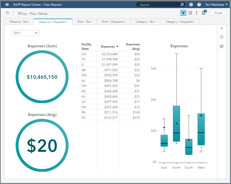
Infographic Style with Measure Value Highlight
Here is the same information represented using the Infographic style. Seeing the same report using the different styles allows you to quickly determine the most powerful and appropriate visualization to meet your needs. We cannot control the size of the circle, only the color. In this case, the circles are different thicknesses because of the number of characters used to represent the measure values inside the visual.
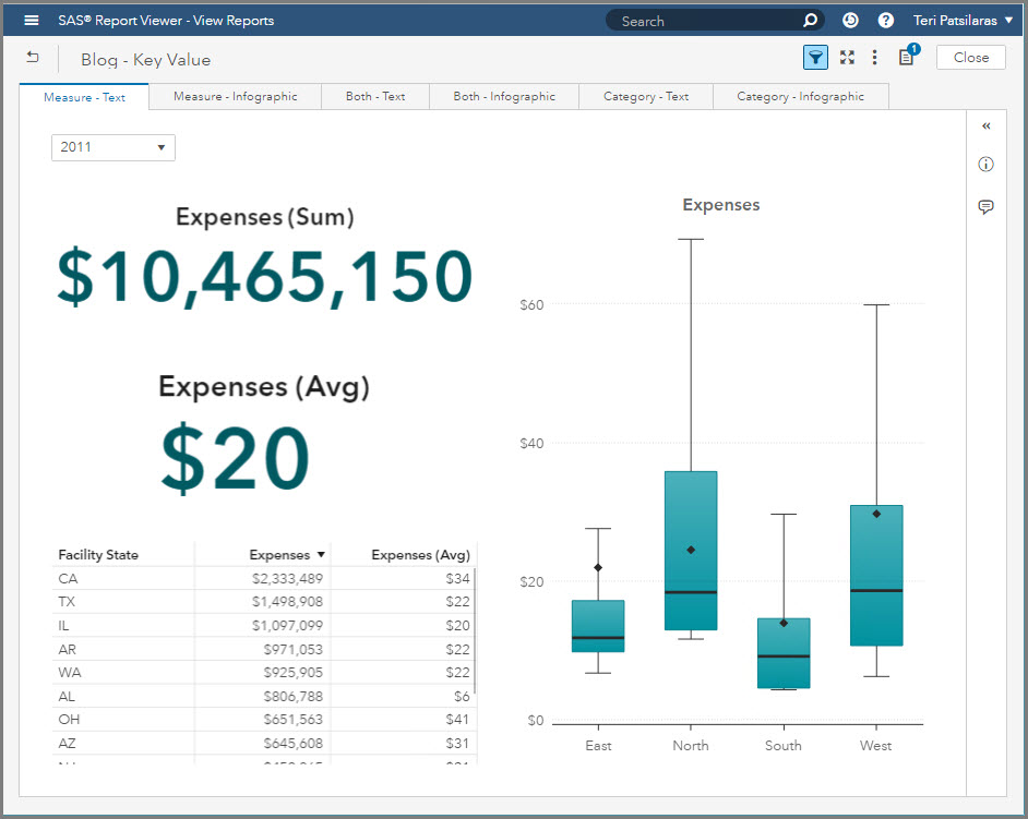
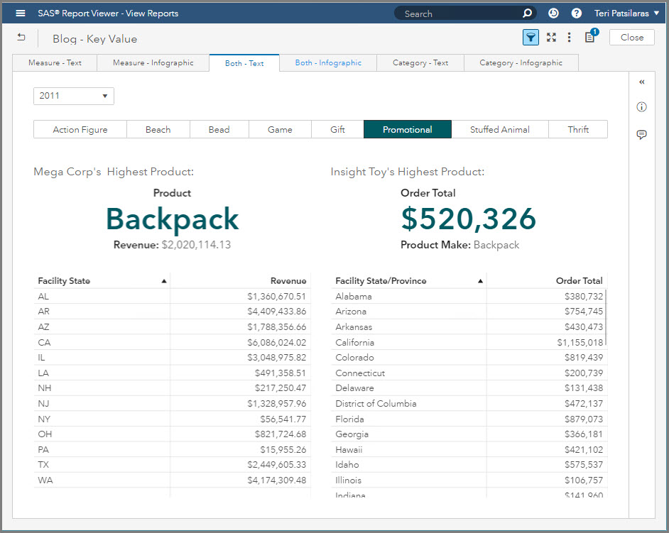
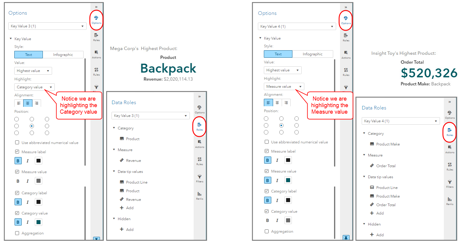
Text Style displaying both Measure Value and Category
In this report, I have shown how to use the Text style to display both a Category value and a Measure value. As you can see, only one can be Highlighted, i.e. given the largest font. Notice that in this report I used the object’s Title to help explain the key value being displayed, this is a recommended best practice.
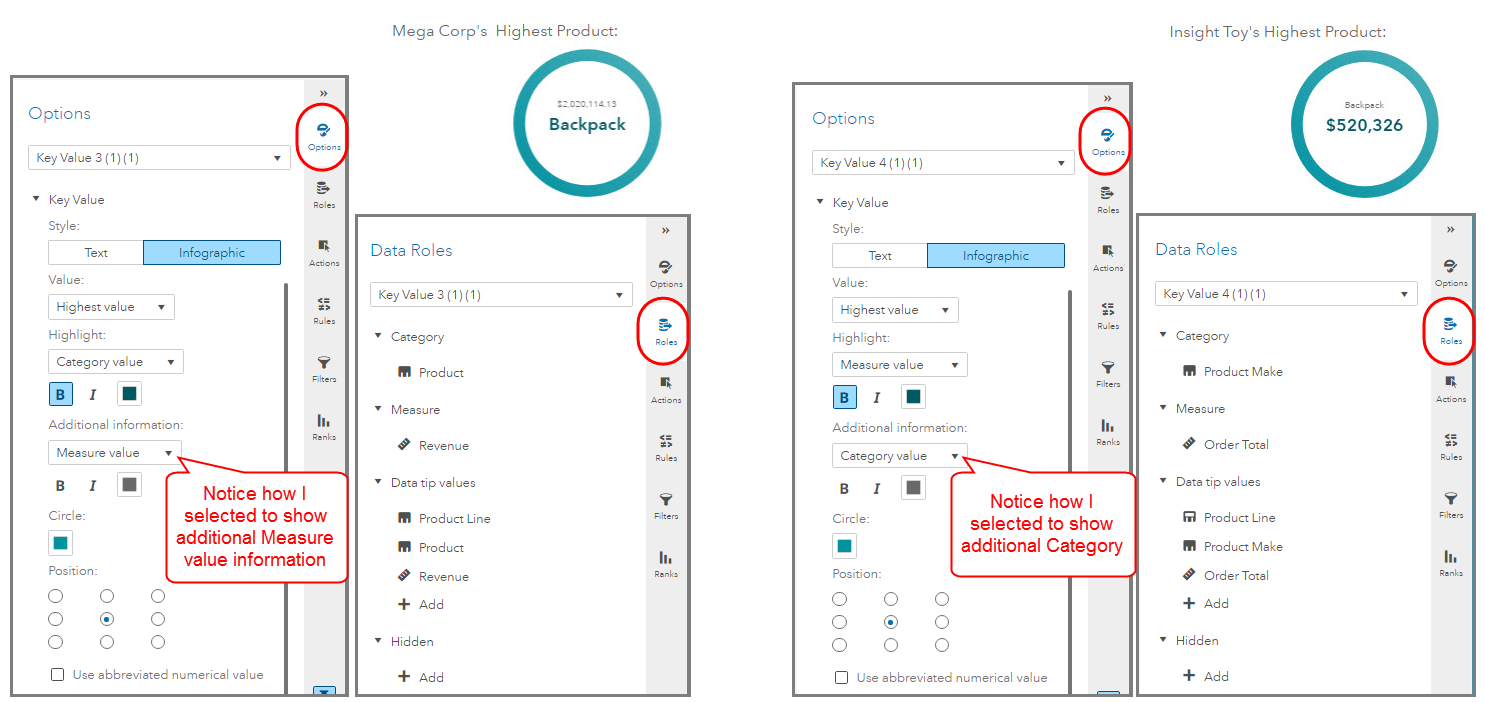
Infographic Style displaying both Measure Value and Category
Below I am using the Infographic style and notice in the Options pane below that I had to use the Additional information attribute to better label the data. Make sure that when you are in the design phase and toggling between text and infographic to review and test the available Key Value Style attributes to better label the visual.
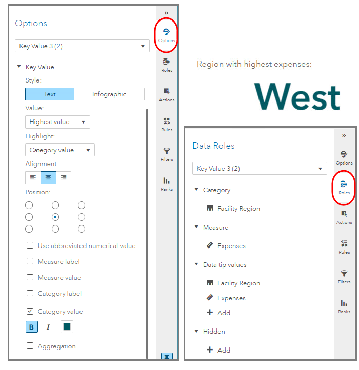
Text Style with Category Value Highlight
In this report, I show how to highlight the Category value using the Text style. Since I chose to not use any of the available label attributes it is critical that I use the object’s Title to better explain the key value displayed.
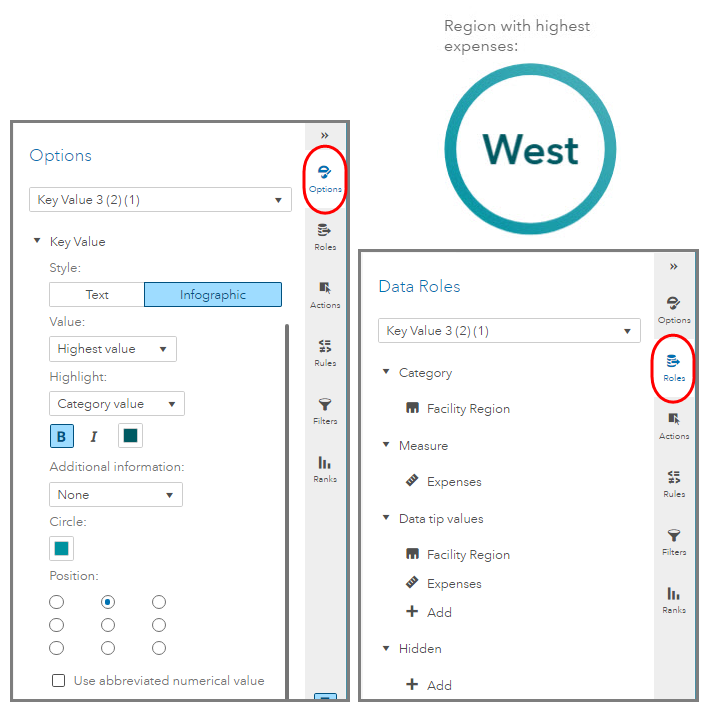
Infographic Style with Category Value Highlight
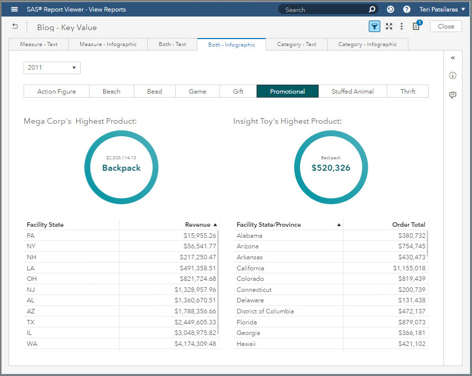
In this report, you can see how I changed the layout from the previous report to make the Key Value object side-by-side the other report objects. If you are interested in using the Infographic style with the circle enabled then you may have to adjust your report design to accommodate for the space the circle needs to display. Remember not to shy away from adding white space to your report, it can assist when adding emphasis to a particular visual, in this case a key value.
Summary
Some important things to remember about using the Key Value object in your reports:
- Use the Key Value object’s Title to inform your users what the number or category value represents so there is no ambiguity as to if they are looking at the maximum or minimum value.
- When determining which style you prefer, Text or Infographic, it may be easier to make a duplicate of the Page and then adjust the style attributes till you find the desired combination.
- Take time to adjust the arrangement of objects on your report to get the most pleasing configuration. Don’t shy away from leaving white space in your report. You can also experiment with the Container object using the Precision container type to layer the Key Value object.
- The Key Value object will be affected by Report and Page Prompts like any other report object and you can even define Actions to filter the Key Value object.
Here are some additional examples of using the Key Value object:
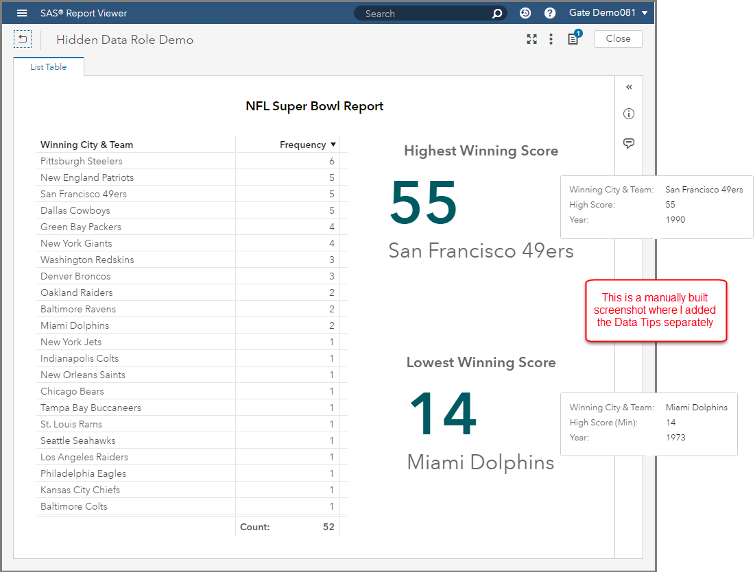
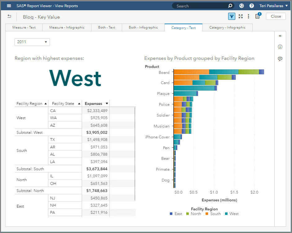
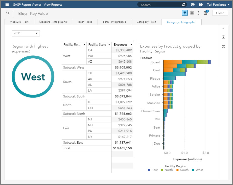
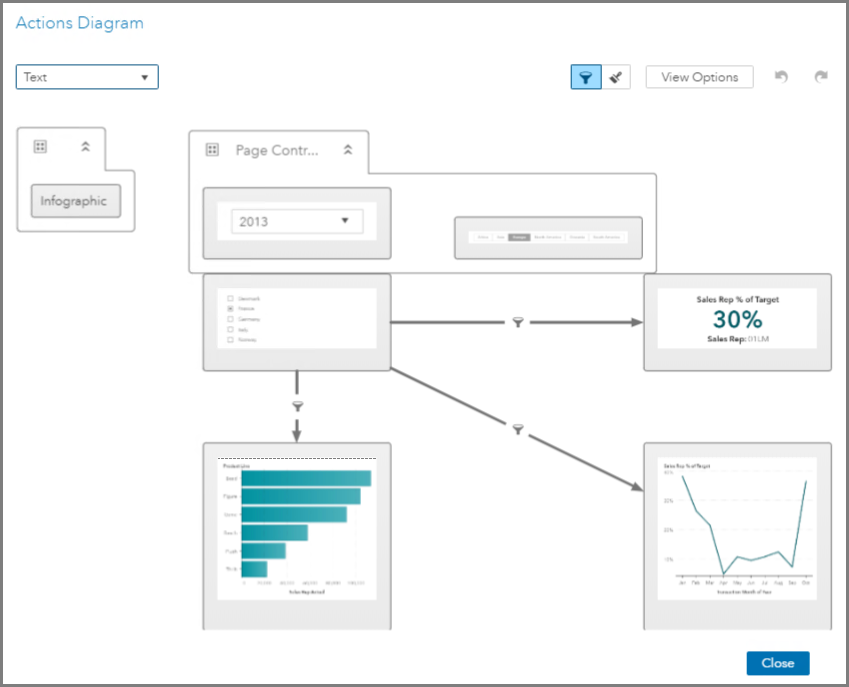
In this example, you can see from the Actions Diagram how the Key Value object is being filtered. First, by the two page prompts and second, there is a direct filter action defined from the List Control object
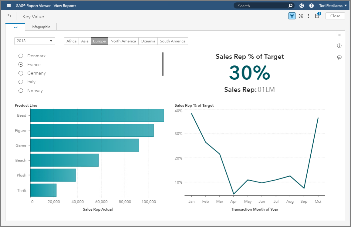
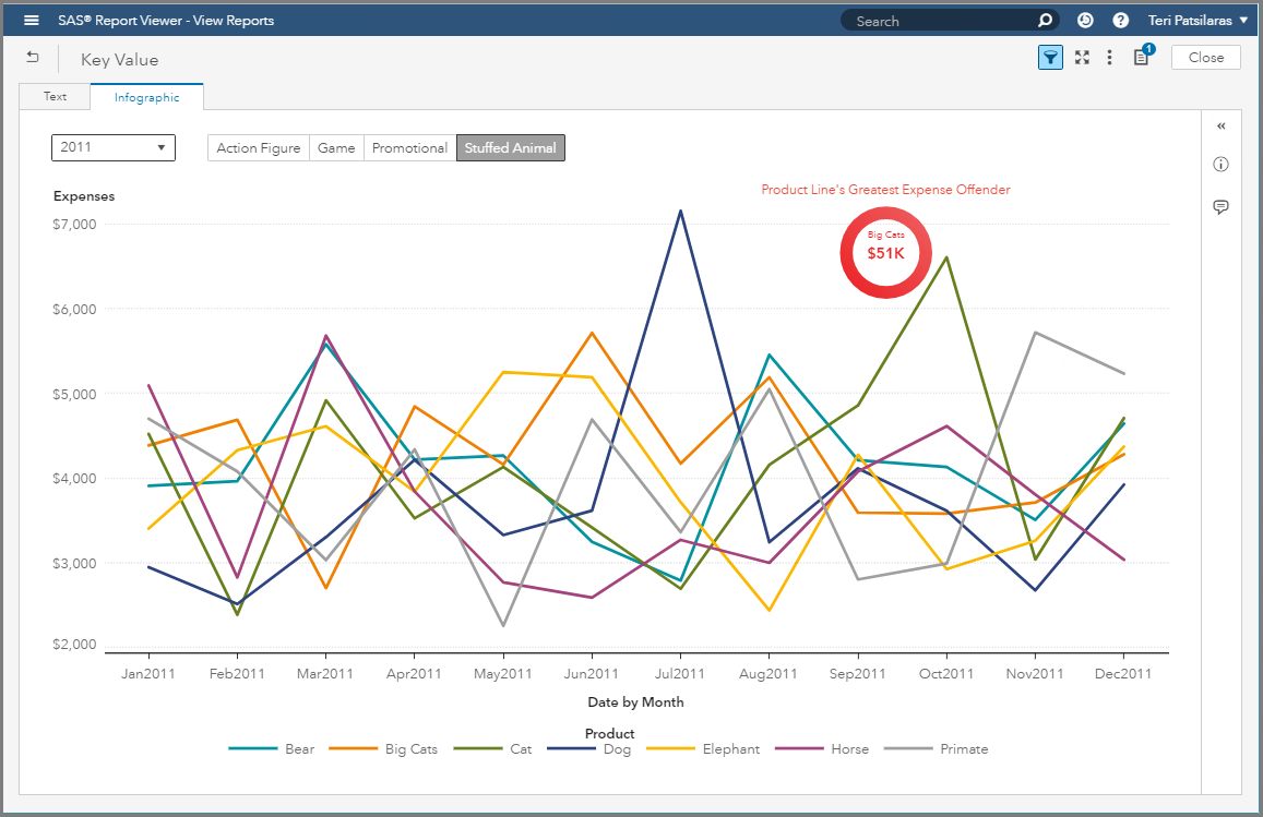
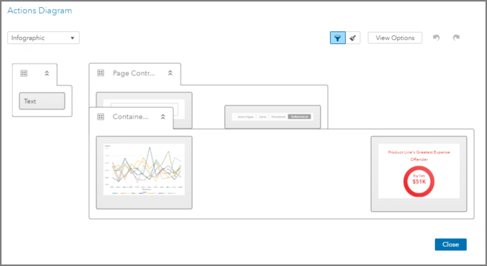
In this example, we can see from the Actions Diagram that I used the Container object. I then selected the Precision container type and overlaid the Key Value object on the Line Chart. The only filters applied to these report objects are the page prompts.
And in this last example, you can see how I have no Report or Page prompts or any other filters impacting the Key Value objects. Therefore, these values are representative for the entire data.